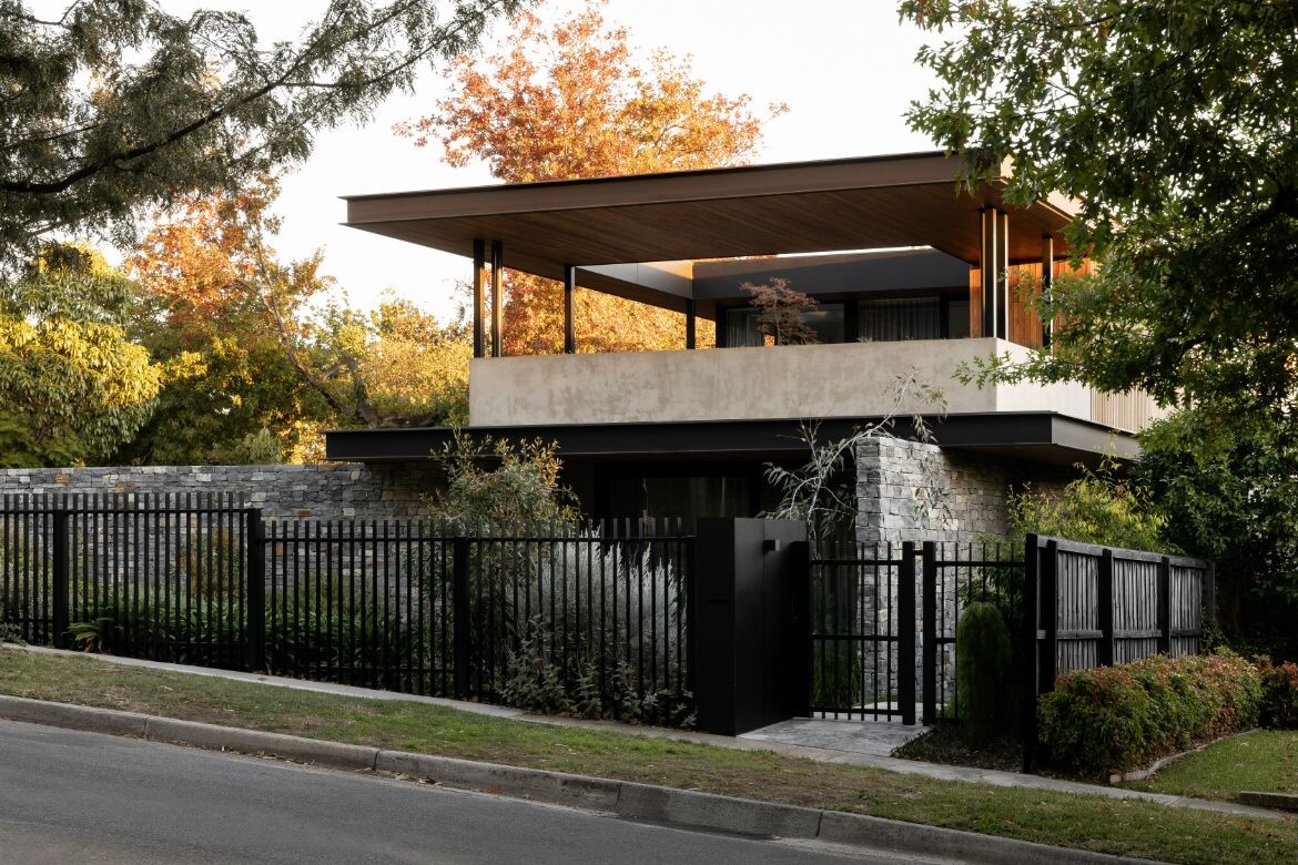
How do you balance the desire for open views while considering the need for privacy? The Lookout is a residence defined by a peaceful loftiness.
Leveraging the steep slope of the street, a high garden wall wraps around the property on two sides to create a sunken oasis. “The house sits about one and half metres below the footpath level. The clients didn’t want anybody to be able to see in, but they also wanted to have an aspect and be able to look out,” explains Anna Rozen, founder and principal architect of A for Architecture. The high walls direct the line of sight up into the tree canopies, balancing the dual need for privacy and outlook.
Story continues below advertisement
The clients, Michael and Jen, are a retired couple with grown-up children and now grandchildren who often come to stay, as well as lots of extended family from interstate. Like many downsizers, their beloved family home, while full of memories, was becoming too much to manage. While on a walk in the area one day, they passed a vacant lot and thought, “this might be a good place to build the house for the rest of our lives”.
Starting with a blank slate meant Rozen was able to design exactly to the couple’s needs, while factoring in how they will age in place. In addition to creating a quiet place of retreat, the spatial planning across two levels sees the ground floor more akin to a single dwelling, with the upper level able to be opened up or closed off for guests.
The ground floor includes a large kitchen, dining and living set on one length of the central courtyard.
Story continues below advertisement
A study and sewing room look out to the garden and pool along the other side, with the main bedroom and ensuite at the front on the northern elevation to the street obscured by native landscaping.
Upstairs are rumpus and spare rooms for when family come to stay, which open out to an elevated upper deck area. A large rectangular void lets light and nature flood through. Despite being open with an expansive view, there is a sense of enclosure and separation up here, and Rozen points out the raised planters.
Story continues below advertisement
Designed in collaboration with landscape architect Penny Starr, raised planters line the boundary of the deck and along the high wall in the garden. “The idea is that raised planter boxes make it easier to garden as you get older, as you’re not having to bend down,” explains Rozen.
The selection of plants in less accessible areas are drought resistant and low maintenance. There are many features throughout the residence that consider ease of use without being overt. Draw pulls and door handles, for example, are wide and solid; the butler’s pantry is cavernous and connects to an entrance from the garage so groceries can be brought straight in. Openings are wide and floor transitions are frictionless, even when stepping out to the courtyard.
Beyond the functional needs for now and into the future, Rozen has considered how to make a new build filled with meaning. The process of transposing a lifelong family home into something new is no easy feat.
In The Lookout, Rozen has captured elements of sentimentality and introduced them in new ways. For instance a tropical fish tank in the original home was always the centrepiece of conversation during parties and has been reimagined in the living area of this new home. In the ensuite and ground-floor powder room, expanses of opulent green marble not only make a statement but are another choice that harks back to what was special in the old home.
Materiality throughout is refined. Rather than overwhelm with a medley, Rozen has skilfully incorporated finishes in large stretches. A timber-lined ceiling – another nod to the previous home – is paired with a blue-tinged Jindera dry stone cladding. The combination, along with the exaggerated eaves, denote a subtle reference to Frank Lloyd Wright.
Something more difficult to communicate through images alone is the sense of peace felt in this home. There is a spaciousness without veering into ostentation; large windows and sliding doors let in dappled light as it passes through the established trees.
“Every design decision was very intentional,” shares Rozen, something that is apparent in the inviting warmth and the way that everyday activities have been elevated.
Project details
Architecture & Interiors – A for Architecture
Photography – Timothy Kaye
Builder – Belair Builders
Landscape designer – Penny Starr
Stylist – Madeline McFarlane
Location – Melbourne, Australia
Traditional Custodians – Wurundjeri People
This article originally appeared in issue #56 of Habitus, the Coastal Living issue