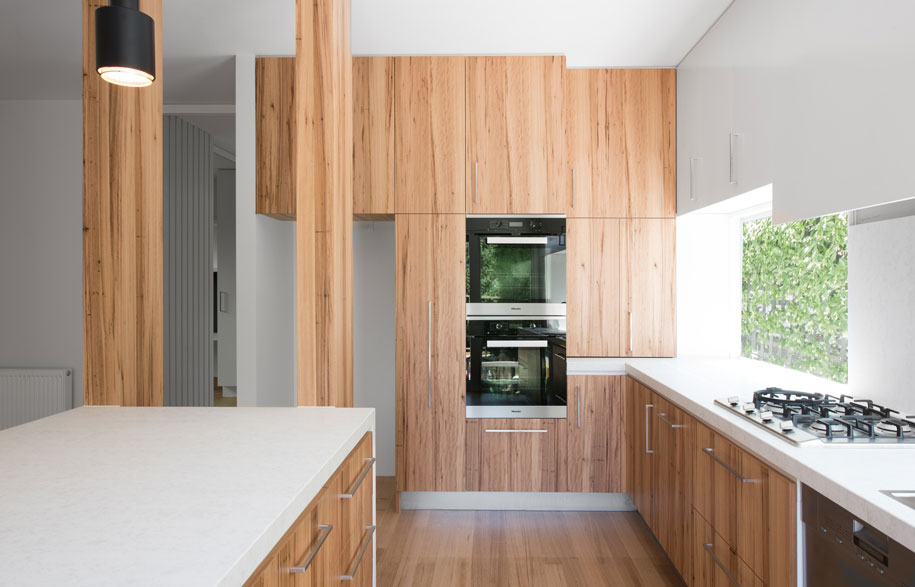
A quiet and delightful interior takes centre stage in the reworking of this former ‘volume build’ family home by Windust Architects. Annie Reid takes a closer look.
Story continues below advertisement
The property began life as a mock Palladian in the leafy Melbourne suburb of Malvern, but now lives and breathes a ‘new formality’, which unashamedly heralds a quiet conservatism in line with the client’s intellectual aesthetic.
While well built, the home suffered from inadequately arranged spaces, dated materiality and key design flaws – the kitchen was too small, the living room too narrow and the dining area too large.
Story continues below advertisement
Director Anthony Windust and interior design director, Junko Windust proposed flipping these spaces to create a lighter, more defined home with a contemporary twist.
“By also moving the spaces around, we linked into the idea that the right design should have been done in the first place,” Windust says.
The informal living space was moved to the rear, which enables access to northern light and a direct connection to the outside garden.
Story continues below advertisement
A formal living area and feature study with glass doors was brought to the front, along with a powder room.
Finally, the kitchen was enlarged and opened up with a new adjacent dining space, where the living space previously existed.
With the house’s Palladian façade of geometric patterning and linearity, Windust opted to express these sensibilities throughout the interior.
Of particular note are the vertical 2-pak strip panels that cleverly activate key walls and tie each space together.
“This linearity is expressed right through the formal lounge, along the study and then winds back through to the dining room,” he says.
The palette complements the design with a focus on neutral colours and subtle expressions of timber and stone, including Studio Italia stonework and dark steel.
With a focus on natural grains against a neutral background, the house now responds peacefully with the owners’ daily priorities.
“It sets a nice stage for the activities that go on inside, such as reading, quiet work and coming together at the end of each day,” Windust says.
Its name – Straight laced – is a playful representation of the project as an unassuming student in the classroom.
“This home is like someone who doesn’t feel the need to show off or desperately stand out, demonstrating that good interior design does not require gimmicks to be relevant,” he says.
Windust Architects
windust.com.au