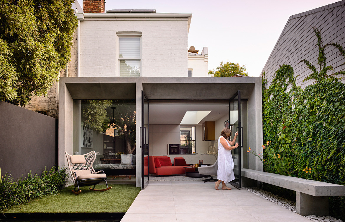
Henry House comprises a passively designed rear extension by WALA to an Edwardian-era terrace house in East Melbourne.
WALA’s clients, and the residents of Henry House, are a semi retired yet wholly active couple who were looking to downsize from their family home and move closer towards the city. They love entertaining and would regularly host their friends and adult children in their previous home. This is not something they wanted to relinquish so the new house, though smaller, needed to comfortably accommodate regular guests and extended visits.
Story continues below advertisement
The terrace they found was long and narrow, with a site frontage of 6.1 metres. Located in East Melbourne and built in 1878, the size and layout was typical of terraces of the Victorian era. It was also perfect for WALA’s clients, who didn’t want a large house and appreciated the location for its close proximity to local amenities.
Large pivoting glass doors define the rear façade and connect the indoors to the garden.
Story continues below advertisement
The brief was for a low maintenance rear extension (fortuitously north facing) that did not encroach on the garden but did expand the indoor living areas. Additionally, the clients wanted to retain the three bedrooms in the original house. “We were faced with a challenge to fit as much as we could into a very restricted floor space,” says Weian Lim of WALA.
Story continues below advertisement
Through the entry corridor that traverses the original house and culminates at the rear addition, one finds the contemporary, open plan kitchen/living/dining area. “A large stand-alone brass-coloured kitchen rangehood is a statement piece that anchors the kitchen in an otherwise open plan space,” says Weian. The brass is echoed sparingly through the rest of the house. Beneath the kitchen benches, mirrored kickbacks suggest floating furniture.
The shape of the concrete eaves on the rear façade was custom designed to maximise the sunlight during winter.
The house transitions respectfully from old to new by acknowledging the different architectural styles of each period. Decorative heritage features of the original architecture have been retained and restored, providing a contrast to the restrained minimalist design of the extension. Natural materials such as timber, concrete and steel help frame these simple geometric shapes.
Large pivoting glass doors define the rear façade and connect the indoors to the garden whether they are open or not. Teamed with a large skylight above the kitchen these elements draw natural light into the internal spaces. A floating daybed behind a glass wall has the same effect and – visible from the entry hallway – connects the garden view to the house from the first step inside. On the other side a cantilevered concrete bench extends from the living room well into the backyard further suggesting a connection between interior and exterior spaces.
Natural materials such as timber, concrete and steel frame simple geometric shapes.
The clients were interested in adopting passive design principles where possible. As the rear extension was north facing, WALA proposed a tiled floor over a concrete slab in order for it to function as thermal mass. The shape of the concrete eaves on the rear façade was custom designed to maximise the sunlight during winter. “The concrete eave is intentionally designed to align with the same sun angle during the winter solstice so as to maximise the amount of direct sun hitting the tiled floor on slab, thereby storing as much heat as possible in thermal mass during the colder periods in the year,” says Weian.
The residents have enjoyed the house in its full glory since practical completion in September 2019. However, having lived in the house during construction (this was staged in order for them to do), the finished product is twice as nice. As intended, “This space has become their sanctuary in the city,” concludes Weian.
WALA
wa-la.net
Photography by Derek Swalwell
Dissection Information
Interior Stylist, Bea + Co
Landscape Designer, Nadia Gill Landscape Architect
Landscaping, Good Soil and Water
Fiandre Plain Core floor tiles from Artedomus
Oro kitchen counter from YDL Stone
Parachilna Aball pendant from Ke-Zu Furniture
Dita Double Console by Lignet Roset from DOMO
Yanzi suspension lamp by Neri&Hu from Artemide
Wall Step pendant from Volker Haug
Seymour Low Swivel Armchair from King Living
L’Imprevu Sofa by Lignet Roset from DOMO
Kitchen appliances by Miele
Qasair kitchen rangehood
We think you might also like Concert Hall House by Pandolfini Architects