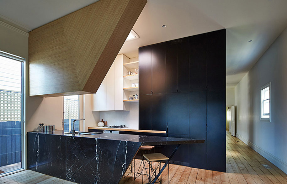
In response to a briefing focused on light, FMD Architects revamp Kelvin House with an emphasis on lines, angles, and the natural colours of timber.
FMD Architects beautifully responded to Kelvin House’s light-centric refurbishment brief with steep angles, strong lines, and a liberal use of timber. Most prominent in the briefing was the direction to “refurbish the existing single fronted terrace… and construct a new deck which maximises access to the north light while providing shade from the western sun”.
Story continues below advertisement
What resulted is a north-oriented triangular deck with triangular criss-crossing timber beams above, providing structure and battened screening to filter light onto the open deck. Also lining the deck is a planter box vertically screened to the west.
Inside Kelvin House is more timber detailing juxtaposed with the central black joinery that contains the bathroom, laundry, study, shelving and kitchen, designed to “define the transition from the old to new spaces”. On the corner of the joinery is a sharply angled bookshelf covering half of two sides of the joinery and showing timber edges to contrast with its black backing.
Story continues below advertisement
A clever black marble island bench is the star of the kitchen, featuring sharp angles and concealing multiple bar stools underneath. The triangular angles are a recurring motif, “reiterating the forms of the deck [and] establishing a dialogue between the inside and the outside”.
Story continues below advertisement
FMD Architects
fmdarchitects.com.au
Architects: FMD Architects
Project Team: Fiona Dunin, Andrew Carija, Alice Edmonds, Caroline Tan, Alan Chan and Rob Kolak
Builder: Latrobe Building Service P/L
Structural Engineer: Perrett Simpson P/L
Photography by: Peter Bennetts