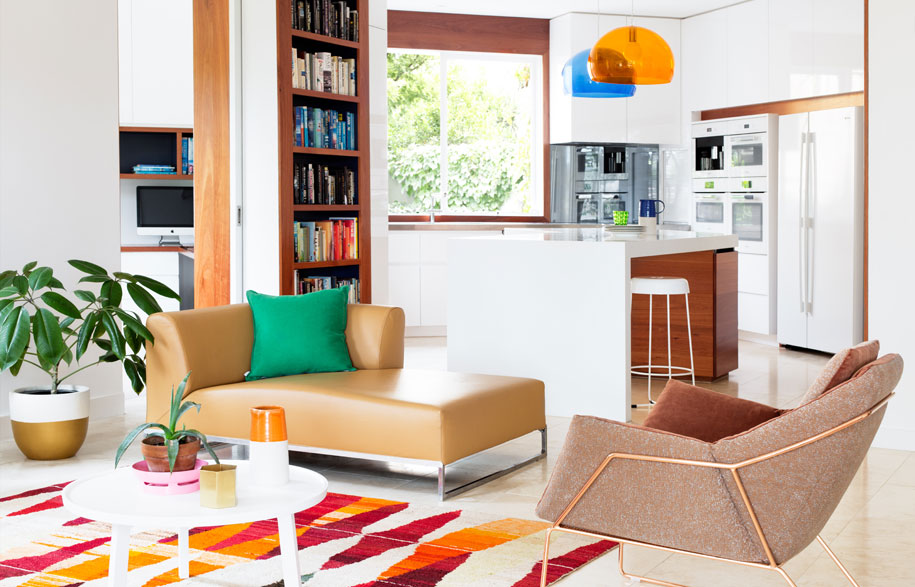
This spacious apartment in Glenferrie celebrates early 80s glamour and the suburb's tennis culture. Habitus Living Digital Editor, Ashley Tucker chats to Monique Woodward, architect at WoodWoodWard Architecture about these design influences, and some of the interior design solutions employed that make it a colourful and joyful space to live in.
Can you please explain the story of the residents and how your design solutions were influenced by them?
Story continues below advertisement
Only a cross-court back-handed winner fit-out would do for this early 80s glamour with a late 70s hangover apartment block a short lob away from Australia’s spiritual home of tennis. The bougie suburb of Glenferrie is home to many retirees looking to age-in-place and this spacious gem provided just that opportunity. Interestingly, this lively older couple are actually the parents of our Forever House clients. Having spent much time there, it’s understandable that some of the greatest hits reappear.
Can you tell us about the design brief and approach?
The brief: design us a joyful colourful space that will make us smile. We have many clients who have spent most of their time in heritage family homes and this is their chance to enjoy a fresh modern aesthetic. A purge of old furniture can be good for the soul and crisp white walls were a must for the clients.
Story continues below advertisement
Can you please explain some of the design solutions and responses to practical concerns?
Story continues below advertisement
The Corian and solid timber V-shaped island bench is the signature design outcome of the renovation. Derived formally from offsetting the new walls of full-height joinery that wrap the existing walls of the apartment, the shape is both functional and ergonomic. This provided an informal table for four (probably grandchildren) with plenty of bench area for the chief, and even more at Christmas time.
Melissa Bright from Make Architecture spoke recently at the MPavilion about how homes now operate more like efficient work spaces than blank spaces for random happenings. Demolishing the wall between the old kitchen and living / dining changed the entire space, making it a light filled, aesthetically pleasing, functional workhorse. Flanking the new opening are two massive bookcases to hold the clients novels. It’s as though every wall is working hard or multi-tasking.
Can you explain a little bit about the design process?
We asked all our clients to suspend their traditional understandings of how architecture is made and make a scrap book of spaces they like but mostly of objects they loved or owned – objects with a story. In this instance we were given a beautiful navy vase and an apricot scarf.
Sometimes the references play out rather literally – these two colours informed the choice of the two Kartell FL/Y suspension lamps (oldies but goodies). But more often than not, it’s the nuances that provide more juicy design opportunities.
Can you tell us about some of the pieces you chose?
A pair of WOWOWA’s own copper Rosella pendants hang in the living room – a lovely reminder as, like the couple, Rosellas mate for life.
The Loom rug was our colour muse. The 80s terracotta coloured building exterior set up the use of the beautiful orange Sydney blue gum timber, but the rug instantly gave that fabulous colour injection.
Many of the furniture pieces are from Café Culture + Insitu who also stock WOWOWA’s solid brass cast Monroe pendants.
What are some unique, interesting elements of their home?
The beauty of these older apartments is they were designed for owner occupiers as an appealing alternative to a standalone house. Rather than the current investment vehicle paradigm, they are big – surprisingly big and spacious for a two bedder. On the ground floor their title also included the garden around the property. The plan twists and turns to create interesting spaces that allow the home to feel cosy for two or big enough for grandchildren to stay over.
We also really enjoyed the old existing letter boxes in the main foyer and the 80s glass bricks.
How does the physical environment impact on how humans interact with the space and each other?
A brief must-have was two study spaces. This played out as a hybrid man-cave/spare bedroom/television zone, with a “lady” computer nook in the main kitchen area – very stylish and where the action is.
Are there particular features of the design that enable or express a particular way of living?
With the mantra ‘life’s too short for boring spaces’ we advocate for an in-depth design process to unpack what that means for each household. Our Forever House project was one of our first renovations and since then we have focussed on designing family homes for people who want to invest emotionally and experiment with making the house an expression of them. We find it extremely rewarding and the stylish bed head, to me exemplifies the chic playfulness that is seen throughout the Kooyong Apartment. Game, set, match.
Photography by Martina Gemmola
Styling by Ruth Welsby
WOWOWA Architecture & Interiors
wowowa.com.au