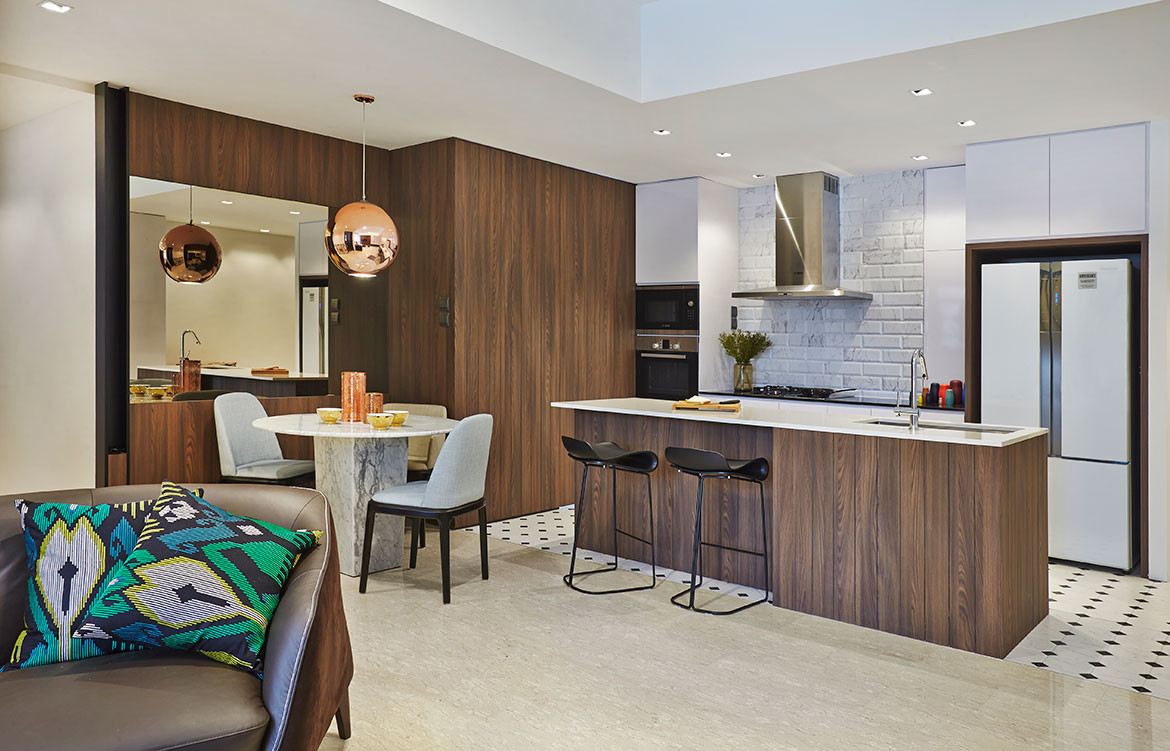
Despite the space constraints often associated with apartments in Singapore, interior design studio Mimimology have thoughtfully designed open concept spaces that organically lead occupants from room a to room b without sacrificing distinct spaces.
When it comes to interior design, it can be a challenge to make a home deeply relaxing while still maintaining an orderly appearance. In this apartment, the team from Minimology wanted to design an efficient home was both practical and luxurious. What they have come up with is a sleek home defined by clean lines, subtle hints of luxury and a clever interplay of patterns.
Story continues below advertisement
In the shared area that forms the nucleus of the apartment, the living room, dining room and kitchen come together in one cohesive space. Dark walnut laminates are paired with clean, white surfaces and the result is an interior that exudes warmth and cosiness without sacrificing a sense of elegance befitting the space.
Story continues below advertisement
The main focus here is the living room feature wall. Minimology crafted a design using walnut laminates laid out in a chevron pattern. Simple yet effective, the feature makes a statement in the apartment. In keeping with the home’s pared down aesthetic, the designers built a ledge that acts as the TV console. It runs across the width of the apartment – from the TV feature wall all the way to main entrance – and can be used as a console, a book shelf and display ledge.
Another highlight in this apartment is the open-concept kitchen. Once again, the interior designers found the right balance between comfortable practicality and quiet sophistication. By using long strips of walnut laminate on the island counter and certain cabinets, they managed to evoke a sense of warmth and cosiness. And when paired with the white subway tiles (applied solely on the wall behind the stove) and patterned floor tiles, this communal space has a rustic appeal.
Story continues below advertisement
With such a large island counter taking centrestage, the designers realised that it could also be used as a dining table for quick meals. But for proper sit-down meals, the dining area comes into play. It sits between the kitchen and living room and takes up minimal space, yet has an integral part to play in the overall interior design. With a round marble table and on-trend copper fixtures, this space presents a more luxe side of the home.
For Minimology, finding the balance between comfort and style was key to this project’s interior design. By using a palette of warm wood, natural stone and glossy metals, this is exactly what they achieved in this apartment.
Minimology
minimo.sg
We think you might also like Design Hunter profile on Brad Swartz Architects