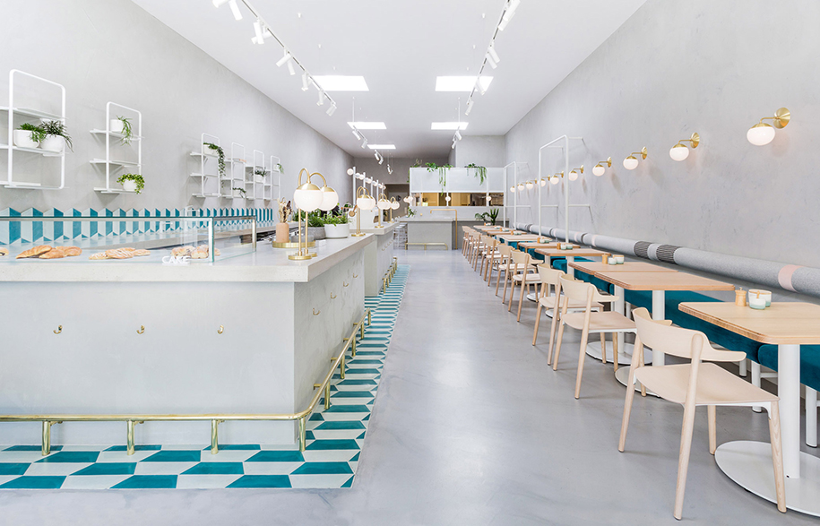
There’s nothing wrong with celebrating the golden eras of design, but there’s a fine line before taking it too far. No.19 café by Biasol in Melbourne shows us case-in-point how to lift design cues from our past all the while keeping things contemporary.
Tribute design can be a tricky game to play, all it takes is a client brief that mentions New York Deco and suddenly you’re replicating the Chrysler building. There is a fine line between modernising a traditional design archetype and flat-out copy-pasting it.
Story continues below advertisement
In their recent effort for hospitality space No.19, local Melbourne studio Biasol have successfully produced a nostalgic design with subtle design cues – without overplaying their cards. Having already designed one café for clients Domenic and Diana Caruso, the duo asked the studio to find them a property for their second venture.
Story continues below advertisement
Australia has a rich and diverse immigration history, where cultures from all over the world came seeking opportunity. This has impacted our design heritage immensely, where immigrants from Mediterranean areas of Europe in particular – such as Italy and Greece – meant that they brought with them their own aesthetic traditions that quickly became blended with a kind of Australi-ana twist. “Our concept was inspired by the Greek delicatessens that flourished around Melbourne in the 1950s,” Team Biasol notes. “Materially, concrete surfaces – the counter, walls and floor – give the space a warmth and sophistication.”
Though certainly inspired by vintage Greek-Australian eateries, Biasol worked to inject elements of nostalgia into the space while still producing a more modern, refined space in line with current hospitality culture.
Story continues below advertisement
“Its 4.5-metre-high ceilings and skylights allow daylight to flood the space throughout the day,” says Biasol, “while the rectangular layout offers a variety of possible layouts. We chose to combine pale concrete surfaces with warmer elements such as brass and wood. The concrete service counter is definitely the heart of the space, accented with the hand-painted teal tiles, which were sourced from Morocco to add a level of Mediterranean authenticity.
“Brass lamps sit atop of the counter, with a footrest in the same material snaking around its base. The golden material is used again for a sink set into the concrete surface, where customers can serve themselves water.”
“We took an integrated approach to this project, to make sure the architecture, interiors, branding and products worked well together, and produced a cohesive and memorable dining experience,” added the team.
“The minimalist concrete surfaces give the interiors an elegant and sophisticated feel, offset by a vibrant colour palette, beautiful upholstery and a little greenery to make it feel welcoming.” Guests sit at timber-topped tables, with bench seating and chairs running the length of the space. Upholstery adds colour in shades of teal, grey and pink – a soft but playful palette commonly associated with those areas of Europe.
Biasol
biasol.com.au
Words by Sophia Watson
Photography by Ari Hatzis