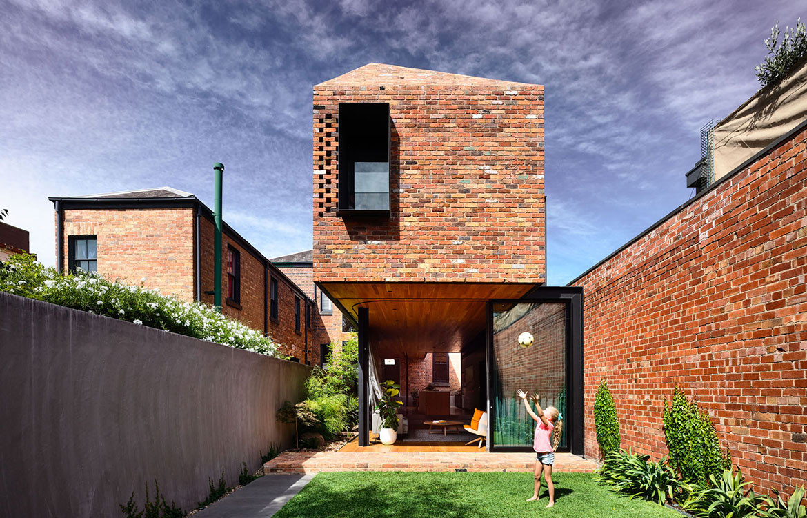
Matt Gibson Architecture + Design has updated a heritage-listed Boom Style terrace to tell the story of past and present for years to come.
The story of this house begins in “Marvellous Melbourne” in the late 1800s when the big, cosmopolitan city (by world standards) was fuelled by the prosperity of the gold rush and an influx of migration. With this boom in wealth and people emerged an architectural style unique to the place and era. Aptly named the Boom Style, Victorian terraces became ornately detailed and highly picturesque with English and Italian architectural influences.
Story continues below advertisement
This A1 heritage-listed Victorian terrace was built in the Boom Style and its exterior remained virtually unaltered. Matt Gibson Architecture + Design (MGA+D) updated the house for a family of five, bringing in natural light and ventilation, repurposing rooms and adding new living space where planning and heritage guidelines allowed. “We wanted to ensure the original fabric remained true to its time and told a story of its past,” says Matt Gibson, “and that new work was born from this story, bringing the home into the current day so that the story could be told for years to come.”
Story continues below advertisement
In keeping with Victorian-era tradition, the drawing room at the front of the house observes the “best room in the house” edict with dark walls accentuating the height and detail of the ornate plaster mouldings. The hallway has been restored with exposed original brickwork and a curving timber balustrade. White lacquered cabinet doors extend from the staircase through to the new addition, mediating the transition between old and new.
The two-storey rear extension accommodates the kitchen, dining and living area downstairs and children’s bedrooms upstairs. “As part of our heritage investigation, we catalogued and researched the history of this house, but also the evolution and iconography of building fabric and forms in the neighbourhood,” Matt explains. The lower volume is open and transparent, “like an undercroft that brings the landscape inside,” says Matt. The upper volume is a contemporary interpretation of the neighbour. “It reads as one simplified form with a brick-clad roof, no fascia, mouldings or gutters,” Matt says. Expressed steel and hit-and-miss brickwork provide privacy, depth and interest.
Story continues below advertisement
Setbacks allow for gardens around the living space, and curvatures in the ceiling allow light and ventilation to filter deeper inside. Oiled local Australian timbers and burnished concrete floors define interior and exterior spaces, while varying levels differentiate functions and modify ceiling heights: lower over the kitchen and dining for a sense of intimacy, and higher over the living area as it flows to the garden.
MGA+D reused bricks from the original building so that the new house emerges from the old and continues to tell its story. The brick wall provides a backdrop to the dining table, which sits beneath a carved-out void in the ceiling. This brings in daylight and connects to the hallway above, with pendant lights suspended through the void accentuating the verticality.
Across the room, a black joinery wall and timber-lined ceiling stretch the length of the kitchen and living area, and furnishing, lighting and art is inspired by a recent Danish trip.
“This house is about the finer detail and craft. A home where the narrative envelops you, where one element is not complete without the other and a story of the past is adapted for the future,” Matt says.
Matt Gibson Architecture + Design
mattgibson.com.au
Photography by Derek Swalwell
Dissection Information
Toss B white pendant lights from Hub Furniture
Borge Mogensen leather chairs
Arne Jacobsen Mayor Velvet sofa
Kerry Armstrong Bird on a Wire painting
Muuto ‘Under the Bell’ felt pendant from Living Edge
We think you might also like Halo House by Breathe Architecture