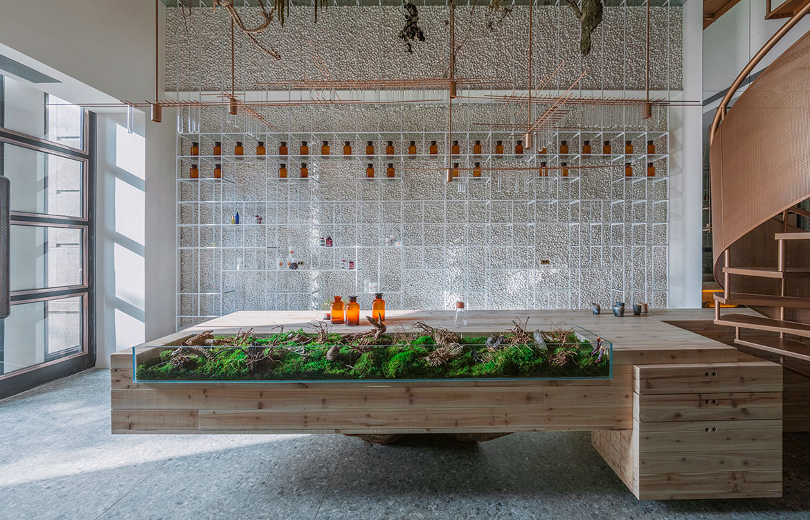
Waterfrom Design breaks down traditional concepts of what a pharmacy should look like with Molecure Pharmacy in Taiwan – a space that speaks to both the historical and modern understandings of health.
Some buildings, universities for example, are expected to push boundaries and manipulate the physical space to merge the functional with the conceptual. But some buildings, a pharmacy by contrast, is assumed to linger safely in line with traditional stereotypes. But why can’t design permeate all of these spaces and employ artistry to challenge and excite the everyday? That is the question that founded Molecure Pharmacy in Taichung, Taiwan.
Story continues below advertisement
The owner of Molecure is a third-generation pharmacist, stemming from a long family lineage in the industry. And true to members of the younger generation, he wanted to break away from what he perceived to be the stale and uninspired setting that had become synonymous with his practice. The owner reached out to Waterform Design, an interior design studio in Taiwan and China, to visually express his vision for the contemporary store.
Molecure is an amalgamation of both old and new connotations of health. Simultaneously playing out the ancient role of the pharmacist: the eternal concern for health, and the gains achieved with modern technologies in the one space. This sense of elements merging together is established right from the name ‘Molecure’; a portmanteau of molecule, an organic component of science, and cure, closer associated with the benefits of modern medicine.
Story continues below advertisement
Waterfrom Design wanted to evoke a sense of returning to nature and to the historical understanding of pharmacy. This is achieved through a heavy motif of nature that extends throughout the store. Cement is applied in combination with cobblestones over the walls to the left and right side, emphasising the rough worn textures to give a sense of age and of nature.
Story continues below advertisement
The centre laboratory table continues in the same vein, constructed gracefully out of stacked pieces of solid timber, all above and revealing a sculptural base from a more than 100-year-old trunk. And in addition, hanging greenery adorns the walls and falls from the ceiling to exude a sense of being within nature and a more eternal understanding of health.
The contemporary, scientific perception of pharmacy, however, is created in the design details that adorn the space. The lightweight metal and acrylic display racks extend outwards in straight lines alike the structural formation of molecules. And further, the twisting copper staircase is an allusion to the spiral form of DNA.
Waterfrom Design breaks down not only the look but also the feel that is expected of a pharmacy. Rejecting the strict separation of the white coat wearing pharmacist and the client between a counter, the space is dominated rather with a centre table where professionals and visitors can communicate at ease. Molecure exemplifies the role of design in engaging the public in spaces of any purpose, and helps to illustrate the evolution of – in this case – health and technology, and help a business respond to the knowledge and aesthetics of the modern day.
Waterfrom Design
waterfrom.com