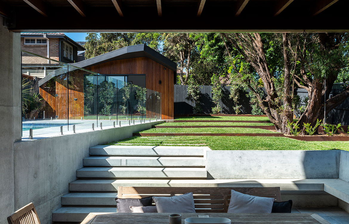
Bijl Architecture has renovated a family home using deliberate folds and geometric forms, obscuring the addition from the street while strategically opening it up to the back garden.
From a quiet and unassuming street in Sydney’s Hunters Hill the Stealth House, designed by Bijl Architecture, stands true to its namesake.
Story continues below advertisement
Maintaining the heritage charm of the original 1930s California bungalow at the front, the only indication of what lies beyond is a glimpse of a darkened steel roofline peeking above the traditional façade. Conceptually, the idea of ‘stealth’ drove the form and presentation within its suburban context. Director and Principal of Bijl Architecture, Melonie Bayl-Smith, explains the design thinking as being more than what first meets the eye. “It’s the idea of what you see and what you don’t see.”
The owners, Brad and Anthea, live in the home with their two teenage kids, and part of the brief was focused on making an efficient and flexible use of space – no more and no less than what is needed to live comfortably. The other was to emphasise the connection to the outdoors, where Brad could see his passion as a landscape designer come to life.
Story continues below advertisement
Stepping inside the house over the preserved vestibule, the true nature of the home’s extensive redesign comes to light. From the entrance hallway is a direct sightline to the back garden, bringing plenty of light and an instant connection to nature.
Story continues below advertisement
The front two bedrooms, which face out to the street, form part of the original dwelling, and where possible details such as cornicing have been restored. But that is where the old ends, and the new begins.
A large six-metre void over an angular staircase and hallway at the centre of the home offers an expansive spatial experience. Funnelling through the hallway into the main living spaces, the indoor/outdoor connection is amplified by a large semi-undercover outdoor area. Slightly sunken, the outdoor space sits level with the indoor living room yet has a seamless transition once the floor-to-ceiling glass doors fold back.
Concrete from the balcony above folds and wraps around, creating built-in seating that tapers out to a series of concrete blade garden steps. While not overused, concrete is a key material on this project. Melonie explains, “The landscape comes up and holds the house in a way where the concrete becomes an extension of the ground plane.”
Having the opportunity to be his own client with the landscaping, Brad designed a series of grassy levels encased in steel retainers. A major one of these rectangles encloses a large, existing tree (Willow Myrtle), which then sets out the rest of the yard, stepped in a way where the grassed platforms gently come down to meet the architecture.
Appearing to sit diagonally opposite the main house in the backyard is a self-contained cabana, where the angular roof form mimics the folding geometry of the main house. The result is a visual sense of flow and familiarity, while creating a point of interest. “These lines create a dynamic feel and train the eye to move in different places, making the space feel bigger,” shares Melonie. Functionally, the cabana includes a multi-use room and a bathroom, allowing it to be used as a self-contained guest house, or a separate office.
Flexibility has been brought into other spaces within the main house; a spare bedroom doubles as a games room, or a study, while a landing at the top of the stairs is a light-filled office space leading into the master suite. “Versatility is created by zoning spaces rather than making them prescriptive,” says Melonie.
The same type of dual purpose is evident in smaller details, such as a joinery piece that breaks up the kitchen and living spaces, while incorporating storage and a message board.
The main bedroom, walk-in robe, ensuite and study are positioned on the upper level, where the folded forms of the roofline punch their way through to the interior. Nowhere is this more apparent than in the blunt angles of the ensuite, where the complex folds intersect and tessellate to create faceted walls and ceiling.
Piercing through the roof is a skylight, the combination of angles making a series of what Melonie describes as “micro views” or visual prospects when relaxing in the freestanding bathtub.
There was a lot of “collaborating with builders on site” in order to translate the drawings accurately. “It doesn’t take much in the existing building for something not to be where you need it and all of sudden everything has to be changed,” shares Melonie. The same type of angles can be found in the bedroom – albeit lined in spotted gum timber – adding a soothing warmth and retreat-like quality to this private room.
Other touches of warmth can be seen scattered throughout the home with a collection of artworks acquired from travels to exotic places like Rwanda and Borneo.
Adding further charm throughout is a selection of quirky, designer lighting choices – another passion of Brad’s – which bring in an unexpected layer of personality. For example, hanging over the void in the stairwell is the eclectic ‘Torch Bunch S10’ by Established & Sons, and ‘Aplomb’ pendants in the kitchen by Foscarini.
While the heritage and character of the original dwelling interfaces respectfully with the street, essentially hiding in plain sight, it’s the contemporary interventions and personal elements that combine to make this home more than stealthy. From the lighting, furniture and art, to the modern landscaping and thoroughly modern folded forms, this is a truly unique home.
Bijl Architecture
bijlarchitecture.com.au
Photography by Tom Ferguson
We think you might also like Cnr Virginia by Studio Prineas