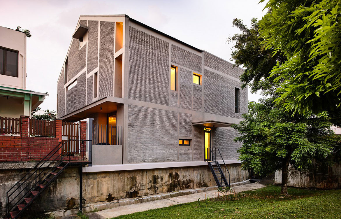
Surprising Seclusion is a suitable name for a house in Singapore’s Binchang Rise, where Hyla Architects has designed an oasis away the hustle and bustle of life.
With both the front and rear of the house facing busy city roads, the prospect of creating a private and relaxing home was a difficult one for Hyla Architects. For the Surprising Seclusion home though, the solution was to look inward – which is house the house was designed.
Story continues below advertisement
The design of a triple volume court, covered but naturally ventilated, became the focus of the internal space. With a pool at its base to create a relaxing and oasis reminiscent aesthetic, the busy roads surrounding the property become an ancient memory.
On the home’s side, a striking sculptural staircase cantilevers from the wall to reach up to the second level family room. The open space in the home’s centre can’t help but draw you upwards, and as you continue on another staircase, stepped planters on the walls are lit from the above light. The aesthetic here is a clever mix of strong urban style with the grey concrete, softened by the natural light and greenery.
Story continues below advertisement
The Master bathroom continues this aesthetic, with brick openings that allow ventilation and breath life into the room, but are angled so as to ensure privacy for the residents.
Story continues below advertisement
Hyla architect Han Loke Kwang describes the space as “inward-looking and hermetic”, a property which is juxtaposed by the bathroom, porous and sunlit design. “Normal windows would have made it quite exposed, so we created openings in the brick that allow air to go in and out but that keep it completely private through the interlocking pattern of three layers of brick,” says Han – the Surprising Seclusion name makes more sense at every turn.
In a long, narrow bathroom space, a sense of space is achieved through more luxurious high ceilings, recalling the overall design of the home, as well as clever storage, and the creative eschewing of an enclosed shower for a column.
“Originally the shower was just to be a regular column, then the client came back and said, There’s no way I’m going to be able to put my shampoo and body wash there, so it became a crucifix shape instead,” says Han. “We joke that showering is like a religious experience.”
Hyla Architects
hyla.com.sg