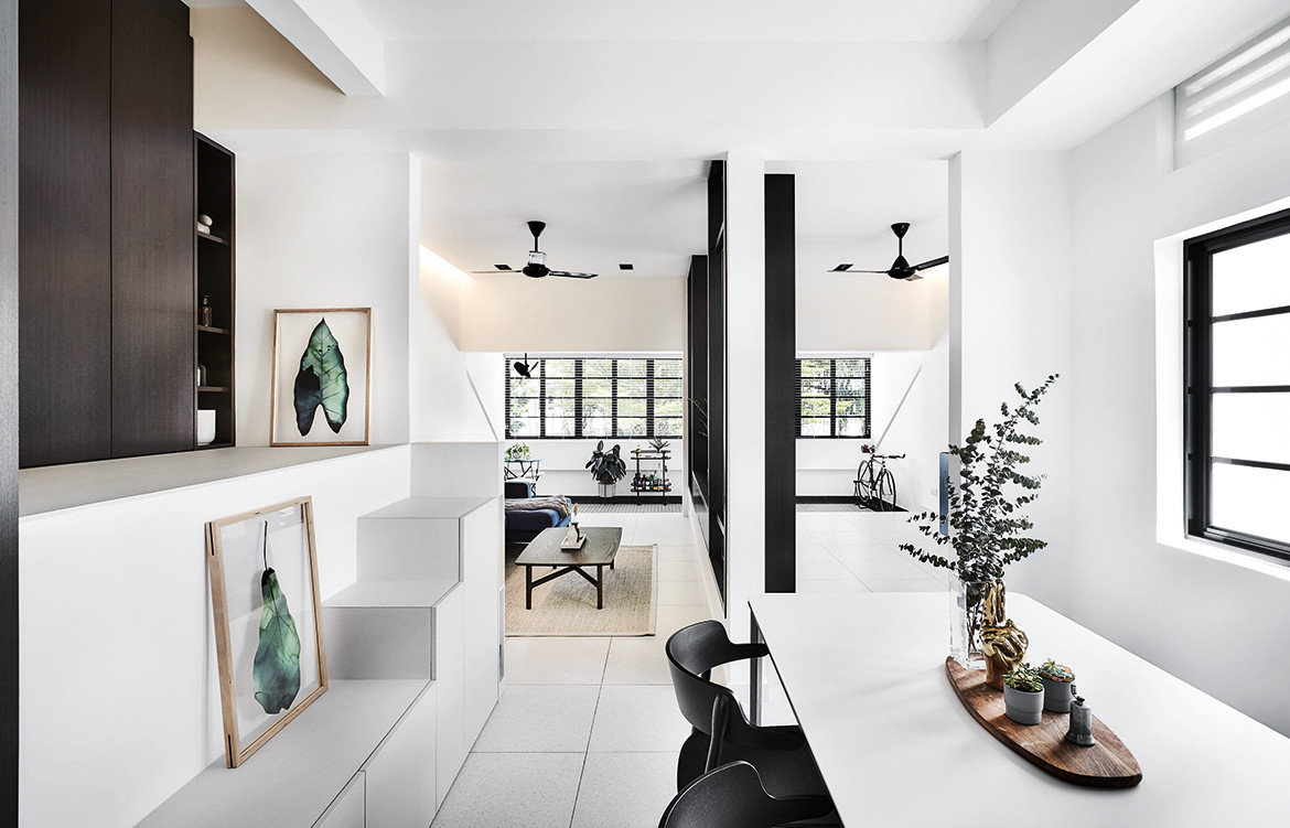
With artful strokes that bring in light and open up space, this old Tiong Bahru walk-up apartment is now someone’s dream home.
When merchandiser Denise Thomas bought this conserved Tiong Bahru walk-up apartment, she knew it was going to be a major renovation exercise. “I bought it from the original owners. Given the spatial configuration, it was really dark inside and you couldn’t even read in the living area during the day without turning the lights on,” she recalls.
Story continues below advertisement
The designers from HABIT were enlisted to help Denise realise her vision of a bright, open and airy home – one that still remained connected to its history and heritage.
“We managed to keep a portion of the original mosaic flooring in the balcony. We also cleaned up and whitewashed the old ventilation blocks, along with the walls and ceiling to make the space appear bigger, wider and higher,” says HABIT’s co-founder Li Yanling. Elements such as terrazzo-look homogeneous tiles, louvred panels, and a colonial-inspired white and dark wood scheme also allude to the apartment’s rich past.
Story continues below advertisement
In the foyer, the apartment’s original platform area has been transformed into a cosy nook to house a shoe cabinet; the steps leading up to this raised level are also storage cabinets. To achieve the spacious and light-filled home that Denise desired, the designers from HABIT have taken down the walls leading to two of the bedrooms, turning one of them into the living area, and the other into a yoga zone. With this new arrangement, the original, modestly-sized hall/living area now serves as a dedicated dining space, and all three zones and balcony are seamlessly connected.
Story continues below advertisement
Yanling shares that they had originally intended to build sliding doors between the living area and yoga space, to ‘open up’ the apartment even further. However, a low-lying structural beam that they discovered during the renovation process meant a trip back to drawing board. “Tiong Bahru flats are not identical, and each one comes with its own set of challenges,” laughs Yanling. “You won’t really know what to expect until you start hacking the walls.” As an alternative, the designers built in its place a sleek TV console flanked by glass panels, which still allow light and views through. Panels of textured glass louvres offer ventilation and further the see-through quality between the spaces, whilst ensuring privacy when needed.
“When we designed this home, it was with the idea that the owner could possibly wish to rent out the apartment some day,” Yanling reveals. “As such, the yoga space can be easily converted back into a guestroom should the need arise, simply by fixing a door at one end, and sliding door panels where it leads to the balcony.”
In the master bedroom, one wall has also been replaced with textured and clear glass louvres to encourage more light through the apartment. Beyond that, the room has been made slightly smaller to allow for a wider common corridor that can accommodate a storage cabinet cum extended wardrobe space.
The original walk-through bathroom that led into the kitchen was dark and narrow. The designers shortened the length of the separate shower and WC cubicles, thus carving enough room for a good-sized vanity – which had previously been non-existent.
Overall, this Tiong Bahru walk-up apartment exudes a quiet and laid-back aura. “I like the idea of negative space, and this house has that,” says Denise. “It’s comfortable, and a calm oasis to return to at the end of the day.”
This story first appeared on Lookbox Living Issue 59, May-July 2019.
Photography by Wong Weiliang
We think you might also like… is living large out of vogue?