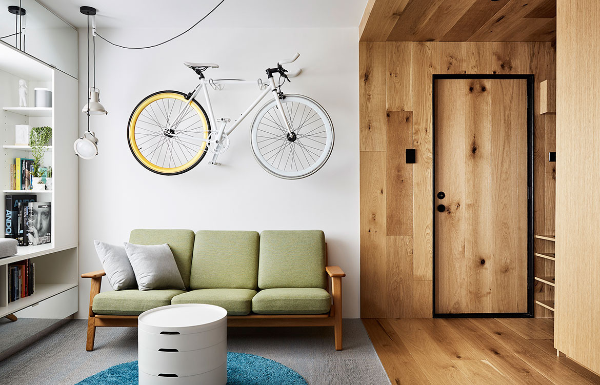
This 35-square-metre one-bedroom apartment with home office demonstrates how to live well with less.
With the increase in apartment developments comes the move towards living with less: less space, less belongings, but smarter design. When Jack Chen of Tsai Design was posed with the challenge of transforming a 35-square-metre unit into a one-bedroom apartment with home office, he created a clever multi-purpose timber joinery box that serves all rooms and offers the luxury, comfort and detailing found in a normal house.
Story continues below advertisement
To overcome the constraints of the existing apartment, Jack concentrated on creating multi-functional spaces, de-cluttering, and maximising natural light. “Layering and overlapping is the key to planning for small spaces. Two different functions can co-exist in the same space at different times. It then comes down to detailing of the joinery to make it an effortless transition between the two functions,” Jack explains.
Story continues below advertisement
Jack designed timber joinery that stretches the length of the apartment and connects all spaces seamlessly together. “The timber joinery is conceptually a puzzle box that contains many functions, and it depends on how you interact with it to activate the different uses,” says Jack.
With hidden and integrated appliances, the 4-metre-long galley kitchen provides a backdrop to the living space. Recessed LED lights on open shelving create a bar display, and a wine-storage wall made with timber dowels also provides space for hanging coats and storing shoes and umbrellas. The folding dining table is integrated into a sliding door between the kitchen and living area so that it can be hidden away when not in use.
Story continues below advertisement
The timber box extends into the bedroom where it becomes the bedhead and a small cut-out panel folds down to form a bedside table. The end wall panel is the bathroom door, while an internal window with switchable film replaces the wall between the bathroom and kitchen, improving natural light and providing a view of the feature green wall. “This green wall is in your direct line of sight as you open the door to the apartment, setting the mood as a space that is organic and relaxing, and creating the illusion of outdoor space,” Jack says.
Smart, multifunctional design continues in the living room where the television and home office are concealed behind cabinet doors. The A/C unit is hidden at the top of the built-in wardrobe in the bedroom, and a clothes-drying line folds out in the bathroom.
The white, black and timber palette is simple and calming, so as not to overwhelm the small space, and the silvery blue woven vinyl flooring is a contemporary reference to traditional tatami straw flooring.
In architecture and design, we often refer to “less is more” in terms of the modernist ethos: simple, uncomplicated forms and no superfluous decoration. Today, it also aptly describes the move towards living well in smaller dwellings and the desire to live without excess.
Tsai Design
tsaidesign.com.au
Photography by Tess Kelly
We think you might also like this Singaporean apartment by Mimimology