A connection to the outdoors is highly desirable in any bathroom design. Habitus looks at three projects that blur the boundaries between inside and outside in understated yet effective ways.
Australian architects and designers have mastered the art of bringing the outside in. Our climate calls for it and to ignore this would make for an ill-informed design completely out of touch with its context. The best responses have a degree of nuance to them, where light and ventilation can be regulated through controlling the boundaries of a home’s living areas so the occupants are always comfortable, no matter the season.
Story continues below advertisement
In the bathroom, the same applies, albeit on a much smaller scale and with a heightened attention to privacy. While there may have been a time where bathrooms were made to resemble life sized terrariums, these days the approach is subtler. Architects and designers are creating bathroom spaces of sanctuary and calm and while they understand the role nature can play in realising this outcome, it’s not about giving clients a jungle retreat (unless they ask for it, of course). The following bathroom design blurs the line between inside and outside in ways that are understated yet effective.
Story continues below advertisement
Christopher Elliott’s Eaglemont House is situated within the garden suburb of Eaglemont, once home to artists of Australia’s famed Heidelberg School of Art. The area may be much more heavily developed than when Arthur Streeton and Tom Roberts were painting landscapes en plein air, but it’s no less pretty. Elliott certainly looked to the natural surrounds when designing the four storey home’s interior architecture and this is especially evident in the upper level bathroom.
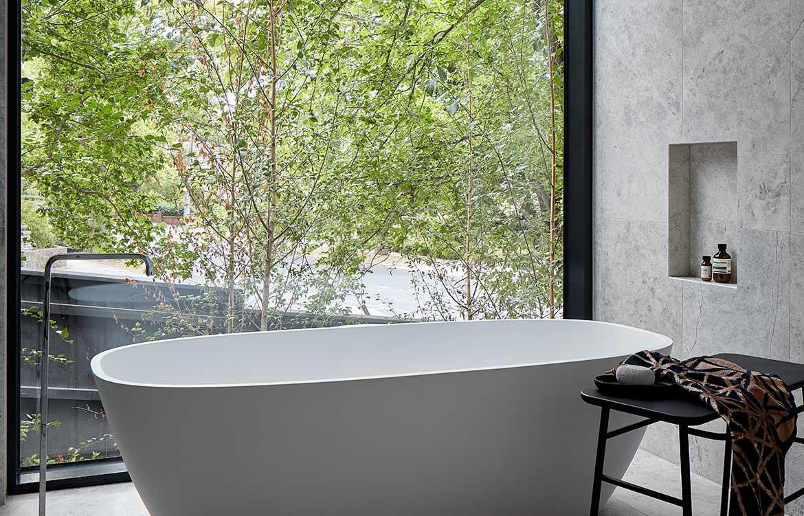
Its bathroom design is daringly pared-back, with light grey marble tiles wrapping the floors and walls in one cohesive expression. This palette provides a neutral background for the unadorned freestanding bathtub, which takes pride of place in front of a full-height window. The opening lets in the greenery and natural light and almost reads as wallpaper, such is the seamless visual connection between inside and out. Christopher addresses issues of privacy with a retractable blind, while the trees’ foliage acts as a screen. It’s incredibly neat design that makes the space feel all the more user-friendly.
Story continues below advertisement
Pool Pavilion, as the name suggests, sits at the end of the pool on a property in rural Victoria. It houses the guest rooms, home office and a bathroom, each with Modernist sensibilities that have informed the design’s overall material palette and spatiality. For the bathroom design, black steel detailing frames the vanity mirror, shower screen, door and window, making a strong statement against the predominantly grey interior. The opening to the outdoors may be full-height, but it’s strategically placed to deliver just the right amount of privacy, depending on where guests stand. It also provides a subtle flourish to the austere interior, without detracting from its minimalist aesthetic.
This freestanding accommodation pavilion located on the edge of a vegetated area within the Pumphouse Point site in Tasmania is a stunning sanctuary that’s as cosy as it is high-end. The architects have lined the interior walls and ceiling with timber boards, creating an immersive environment that most guests will never want to leave. Elsewhere in the interior, robust dark materials punctuate the scheme, adding to the design’s experiential nature. The same material palette is used in the bathroom, where two light wells have been carved out of the space’s corners. They offer connection to the earth and sky and serve to instil a strong sense of place yet are discrete enough that the interior’s enveloping quality is not lost.
We think you might also like Inside-Out House by Tamara Wibowo Architects