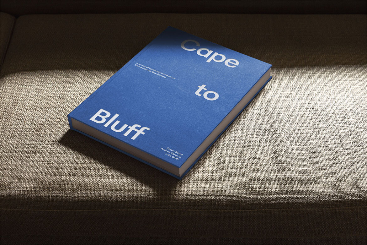
We hear from two of Habitus' long-time New Zealand contributors – writer Andrea Stevens interviews photographer Simon Devitt about the new book they've collaborated on.
There has been a long lead-in with this book. I started thinking about the idea of a long, slow walk through the New Zealand landscape during the period I was making one of my previous photobooks, Rannoch (2016).
Story continues below advertisement
I have worked with graphic designer Luke Scott on several other design projects, including my photo book series Ripe Fruit and All Things Considered.
Writer Andrea Stevens and I have worked on several books together, including Summer Houses (2012, Penguin) and Beyond the State (2014, Penguin). It is important to me that I collaborate with people who are not only amazing at what they do but are fun to work with too! Although the idea for Cape to Bluff is mine, we are each a stakeholder in this publication. We are the publishers.
We live in a young, small island nation deep in the South Pacific. The terrain is hugely varied, with a few pockets of population and financial density. Our New World attitudes were very outwardly focused until recently. This has meant we looked to the Old World (and some newer worlds in between) for inspiration and a pat on the back.
Story continues below advertisement
More recently I think we’ve cottoned on to the fact that we’re pretty bloody good and have begun looking more inward with a sense of self-assuredness. We make world-class architecture in tricky geology with not much money.
I love our country and our landscape, and I’ve been lucky enough to travel throughout Aotearoa New Zealand over a long period of time and have seen a lot of houses – big and small, falling down and falling up, big budget, no budget. Consented and no code. It felt like the right time to show an aspirational view of how New Zealand architects respond to the varying nature of our landscape, from Cape Reinga south to Bluff. And it’s a contemporary view curated to convey not just different places in New Zealand, but also different ways of living.
Story continues below advertisement
Shooting at various times of the year over the span of a decade, I encountered what felt like twelve seasons and not the calendar four.
Without fail, on a shoot, it is always about arriving early and leaving late. And when a location is deep into Central Otago in the South Island, there’s always a bit of preparation. And then you have to find the location, in the dark.
Black Quail House (which features in Cape to Bluff) is located within a vineyard beside the Kawarau River in Bannockburn. The black rock tailings from the old gold mining prospect trail out of site toward the river. It’s a location you’d dream about. Mountains, river, vineyard, and incredible architecture. What else do you need to make it an amazing shoot day? A terrifically talented architect (Bergendy Cooke), a great publishing client, and two genuinely wonderful homeowners made it pretty special.
I enjoy a flat hierarchy in my creative process as a photographer. There’s beauty in all things, and so when asked for my opinion on the best of this or that, it doesn’t serve much and doesn’t interest me. I love the spirit this book intends, and the celebration of architects and architecture in our beautiful country. The convergence of people, landscape and the constructed I find very interesting and inspiring.
Each house was carefully chosen to allow the reader a view of our beautiful country, a view they may otherwise never get to see or experience. The strength of this is engrained in the relationship between architecture and photography: the buildings are rooted in the land, but the photographs and the stories they tell can travel anywhere.
The landscape alone cannot provide the full picture. It is when people, structures, and the landscape that holds them combine that a wider truth is revealed. These brilliant architects are creating context for the aspirations that fulfil us. High-reward architecture in a brave new world.
Luke Scott: Conceived as an art book about architecture, its design is plain yet considered. Everything about the design recedes in service of the photograph. With its oversized proportions, the physical book has a presence as a display object and provides a generous canvas for the images inside. A classic grid with uncluttered layouts puts the images centre-stage, while typographic details such as captions are contained to as few pages as possible. This makes both deep-diving and casual reading equally joyful.
Easter eggs can be found throughout the book’s design, such as the cover typography arranged in the shape of our three main islands – white-foiled forms floating in a blue cloth sea. Or the order of the houses themselves, arranged as a tour from north to south. The experience of the book, while seemingly restrained, is punctuated by smile-in-the-mind moments.
Photography – Simon Devitt
Design – Luke Scott
Publisher – Simon Devitt Photography
Words – Andrea Stevens
Distributed in Australia by Manic
We think you might like Bivvy House, photographed by Simon Devitt, which won Habitus House of the Year 2019.