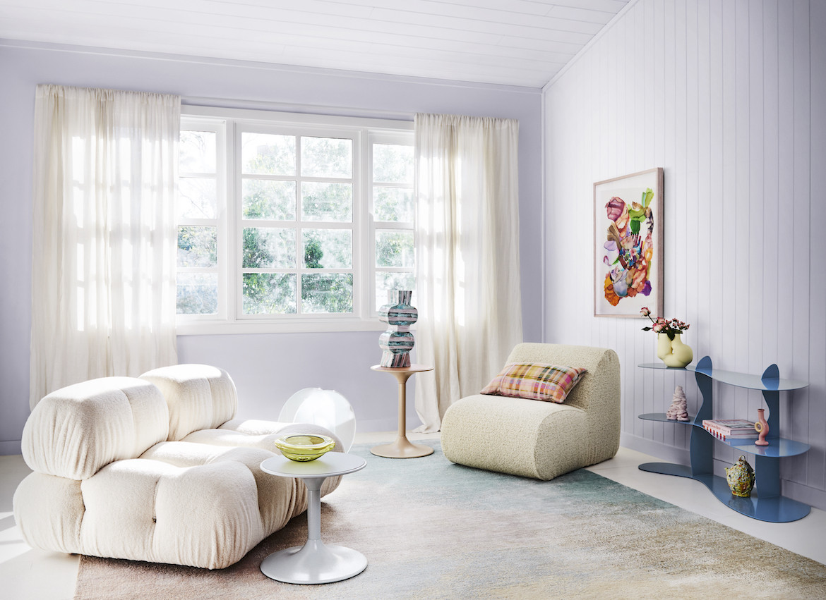

We look towards colours that embody authenticity, empowerment and hope and will shape our interiors for the coming year.
Responding to humanity’s current era of uncertainty, one in which the home has become expected to accommodate all aspects of our personal lives, education and work, the Dulux Colour Forecast has predicted three palettes to shape the tones of our walls, fittings and furnishings in the year to come.
Story continues below advertisement
The forecast is determined by collaborative research between Dulux colour and communication manager, Andrea Lucena-Orr, colour forecaster and stylist, Bree Leech, and the Dulux Colour Marketing Group. The outcome? Tones that inspire feelings of authenticity, empowerment and hope, to reflect what humans have been looking for in recent times.
“The impact of the pandemic is undeniable; it is the predominant influence on everything, from global trends to domestic concerns,” says Lucena-Orr. “Naturally, it has impacted the Dulux Colour Forecast 2022 too, and the resultant palettes highlight the colours we need as a collective community and as individuals: calm, optimism and empowerment.”
Comforting, luxurious and natural, the Restore palette is determined by earth-based colours and whites and neutrals with warm undertones. The selection is driven by the concept of interiors as a cocoon and a place to practice wellness and self-care rituals, according to Lucena-Orr.
Story continues below advertisement
“We seek comfort above all else, are choosing less however making better choices, driving our appreciation of the power of simplicity. Minimal but meaningful,” adds Lucena-Orr.
Using hues like Dulux Natural Flora and New Penny along with soft furnishings and elements of stone and ceramics, tactility plays a major role in this palette, highlighting textural interplay between natural materials.
Story continues below advertisement
Bold, decadent and somewhat hedonistic, the Flourish palette provides a dramatic statement. The colours of deep Dulux Kenepuru Sound blue, grounding Basic Coral and warm Red Terra, says Lucena-Orr, celebrate the human potential for creativity and expression.
Being slightly more adventurous and inventive than Restore, Flourish is rich, sensual and a little surprising, thanks to pops of Gold Vintage.
“These colours can reflect that uncertainty doesn’t always equate to a loss of power when it comes to our ability to celebrate life,” says Lucena-Orr.
Last, but certainly not least, Wonder is playful yet also embraces a hint of serenity. The light, fun and experimental palette is reminiscent of bright spring bouquets, and includes a variety of pastels such as Dulux Pinkham, Ice Lemon and Celery Green.
“Expressing our reconnection with the natural world and the sheer joy of Spring and Summer, of light and warmth, the Wonder palette is uplifting and hopeful,” says Lucena-Orr.
Styling — Bree Leech
Photography — Lisa Cohen