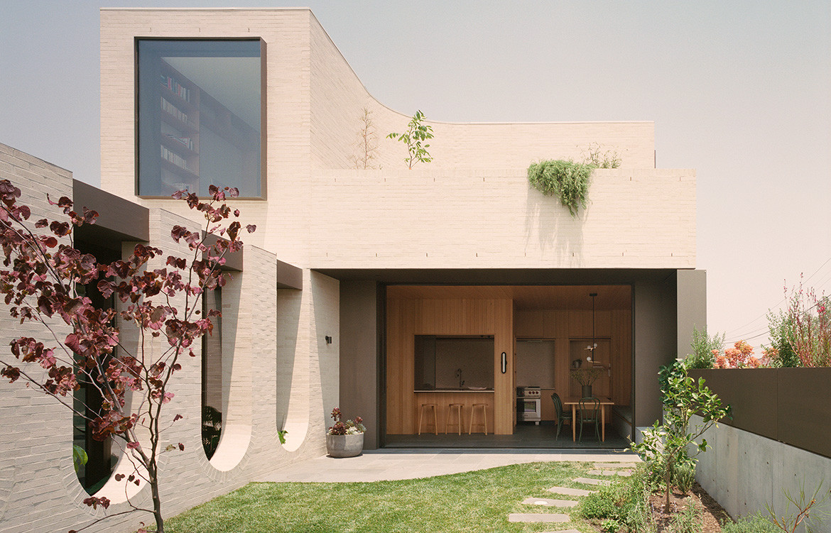
This Edwardian house has been given an entirely new lease of life by Studio Bright. The contemporary wing, with its telescopic picture window and curvaceous walls, embraces the garden and neighbourhood.
Located at Ruckers Hill, one of the highest points in Northcote, Melbourne, and abutting a side street, this award winning home (Australian Institute of Architects Victorian Chapter 2020) displays a strong whimsical edge. “Our clients wanted something that was slightly playful, given they have three young children. But something that would also carry them though as a ‘forever house’,” says architect Mel Bright, director of Studio Bright.
Story continues below advertisement
Studio Bright restored the original Edwardian red brick home, removing the 1980s “faux-Edwardian addition”, together with the garage and sheds along the property’s southern boundary. The house’s flimsy aluminium windows were also removed, along with the unusual decorative choices from the 1950s. “We wanted to free up the back garden (orientated to the north) as well as allow the original home to breathe,” says Mel, who aligned the new covered link with a swimming pool to the east of the original corridor. This link, with its inverted brick arches, not only provides seating for the children and their friends but also a place to dive into the pool (in the form of built-in alcoves) from the other side.
There’s clarity to the floor plan, with the original home now comprising four bedrooms and bathrooms, including the main bedroom, with the new contemporary wing entirely given over to the kitchen and living areas. Unlike many contemporary extensions that take the form of a large glass box, the Ruckers Hill House comprises a series of thoughtfully interlocked spaces that have several functions. The music room, for example, located on the ground floor, is used to store one of the owner’s record collections and a place to play his music. But this also doubles as a living space for the family. Upstairs, there’s a library that also contains a foldout bed should guests stay over. The kitchen has two dining areas – one in the kitchen for the family, the other a smaller setting overlooking the pool, where the children often do their homework.
Story continues below advertisement
Studio Bright took a similar approach in the delivery of the new outdoor terraces. Rather than creating one area on the first floor, there are two, one located to the south that benefits from city views and is more protected from inclement weather, the other to the north, taking advantage of the winter sunlight and views over the neighbourhood.
Story continues below advertisement
One of the most innovative parts of this home is the kitchen, with its sliding doors allowing it to feel integral to the garden. Lined in timber, with a moveable mesh screen over the island bench, it exemplifies the bespoke nature of this design. “Our client didn’t want to be continually cooking in the kitchen, preparing snacks in between meals. The screen was her way of saying ‘The kitchen is now closed!’’’ says Mel, who provided a similar mesh veil to a side window in the kitchen, elevated above the pavement. “It’s lovely to be able to feel part of the streetscape, but still maintain a certain level of privacy.”
For Mel and her team, this project is a reminder of the subtle nuances played out in a house of this nature. It doesn’t have the massive extension and simply fill an aspirational wishlist. “The house operates on many levels. There are spaces here for the entire family because they fulfill a function, and importantly, give them pleasure in the process,” she says.