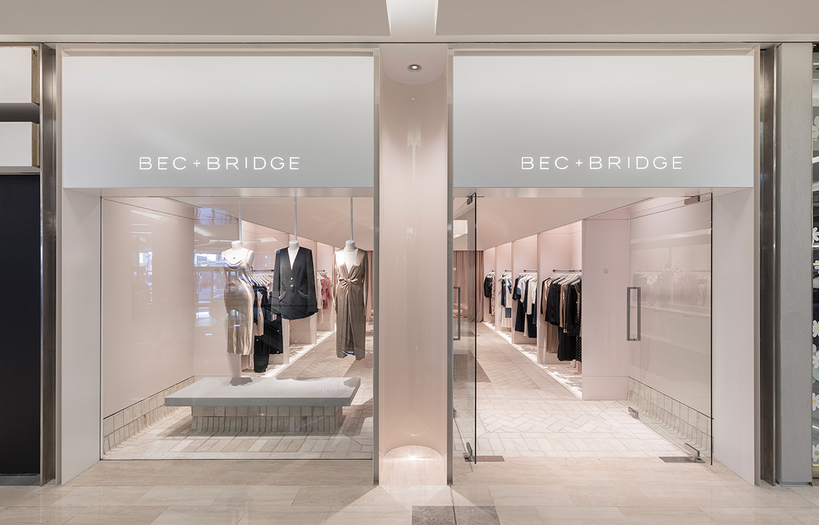
Interior Architect George Livissianis takes a brief to speak to an audience so far removed from his own experiences and delivers the first incarnation of a dedicated Bec+Bridge retail space in Sydney's Bondi Junction.
Since 2003, Australian fashion designers, Becky Cooper and Bridget Yorston, of Bec+Bridge have enjoyed incredible success with women from across the computer screen and through various stockists. Up until now they had never had a physical bricks-and-mortar store.
Story continues below advertisement
The duo enlisted the help of George Livissianis, the man behind the interiors for restaurants The Apollo (Potts Point and Tokyo), The Dolphin, and retail stores for Jac+Jac, among many others. All spaces applauded equally for their style as for their offering of food and garments respectively.
With no existing retail store to draw reference from, George had to work closely with Bec+Bridge to hone in on exactly what the core of the brand is, realise who exactly the Bec + Bridge customer is, and how the brand connects them to their lifestyle. Then translate all of that into a physical space.
“This is their first [store], so everything was on the line,” says George. “As a male, it’s quite hard to click with a brand that’s for 20 year old girls. We kind of worked through an exercise of trying to create a brief and a lot of that came from seeing their lookbooks and their images.”
Story continues below advertisement
Imbedded in the brand, George saw a uniquely Australian – and more specifically Sydney – aesthetic, established through the brand’s connection to the outdoors, insinuated by repeated reference to the pool, the garden or a terrace.
Story continues below advertisement
The store, a tenancy within Bondi Junction’s Westfield, needed to exude a subtle sense of the outdoors while retaining the sophistication echoed in the clothing. Paving was inlaid into the flooring to capture a sense of blurring indoor and outdoor spaces. And further, George constructed a European-inspired vaulted ceiling – borrowing from a landscape frequenting their Instagram – to conceal and diffuse the lighting and emulate natural sunlight.
Being situated in a shopping centre, the overall design had to deliver the soft blush hues of Bec+Bridge into the starkly lit context.
“Everything in there is artificial,” says George. “You can’t have what I would say is the right lighting in there because the next store is going to be bursting with light. [And] you’ve got this competitiveness in that environment to try and grab everyone’s attention.”
Despite constraints, the store is girlish and romantic; accenting a base Himalayan Salt pink with creamy pavers, polished chrome, onyx counter top and hairy textured furnishings.
Still, George hesitates slightly when trying to put the Bec+Bridge aesthetic into words. “It’s all about that feeling that you get inside the store,” he says. “You need to experience it.”
Photography by Tom Ferguson