Iva Foschia heads IF Architecture’s design for Jardan’s Sydney flagship, creating a space encrusted in the colours and character of Sydney’s key artistic families.
“Colour is expressive light, and Sydney has light like no other place in Australia,” says Iva Foschia, Founder, Principal and lead architect at IF Architecture.
Story continues below advertisement
Iva headed the design of Melbourne furniture brand, Jardan’s, recently opened Sydney flagship store. Her inspiration for the space turned to the decadent colour palette of the emerald city to align the colour and vibrancy of Jardan to that of its New South Wales location.
Borrowing hues from the deep blues of Sydney Harbour, greens from the canopy-draped streets of Rose Bay and the autumn reds and yellows strewn through the trees of the surrounding Surry Hills and Paddington, Iva wanted the store to physically illustrate the influence of colour on the identity of the city.
Sydney’s reputation entrenched in ripe colour is largely due to the artistic creatives who have sketched out its dense skyline to eyes overseas. And thus, to honour the palette of the city, Iva’s concept for the store also saw homage the prominent design families that made it so.
Story continues below advertisement
The ultramarine strokes of Brett Whitely, and continued artistry of wife Wendy and daughter Arkie; the bold colours of John Olsen, and graphic shapes now offered from his daughter Louise Olsen, as one half of Dinosaur Designs; and eclectic contrast of texture in the interiors of Marion Hall Best, are all honoured in the layering of Jardan’s interior.
“Colour and family are big parts of the Jardan story,” says Iva. “We wanted to use a palette derived from the tastes and styles of iconic families, and in turn, find something unique for Jardan.”
Story continues below advertisement
Situated on a prime corner block in Paddington, the bright display window wraps around the sightlines of two streets and beckons one in through the entryway, delineated in gorgeous veins of blue and rust marble.
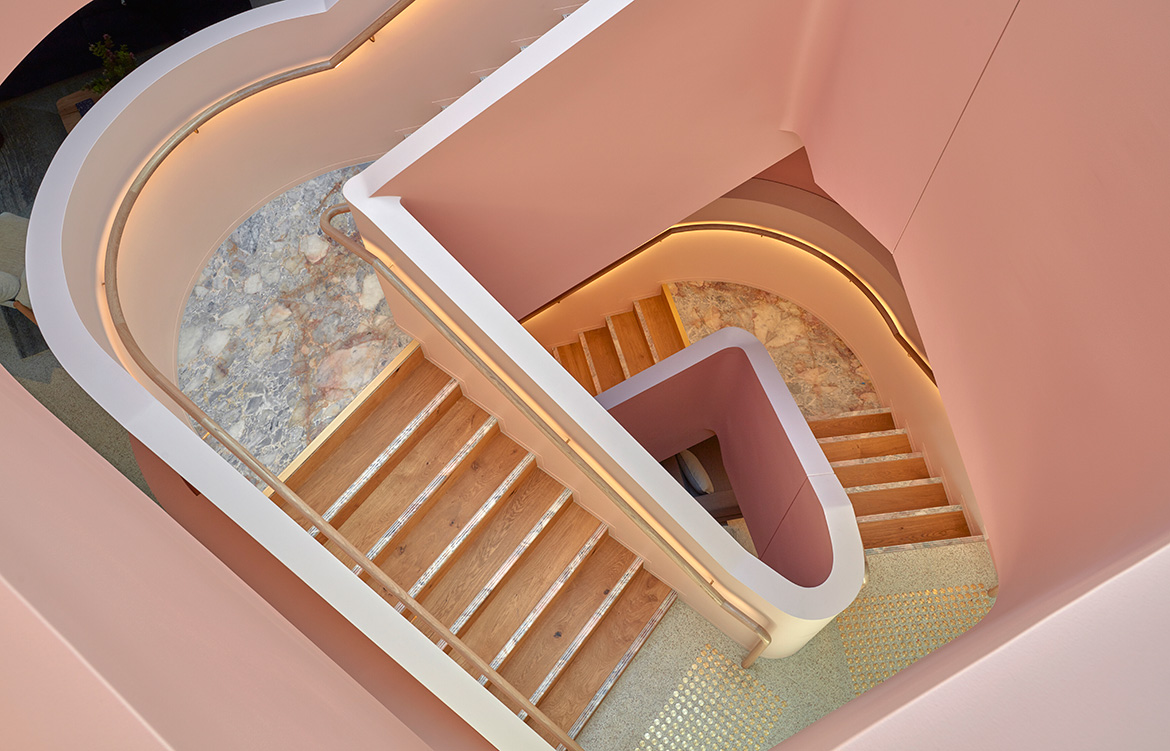
The store is dispersed over two levels and sectioned off into exemplary room arrangements, offering innovative takeaways for one’s own home. The entirety of the space is dominated and unified by an angular staircase, encrusted in more marble and coated in a soft pastel pink to ease its geometric proportions.
Merging buoyant colour and shape, Jardan’s new flagship is bold enough to pull you right in off the street. And that is because the interior is not only loud, but it speaks to its audience and to the tones that have become the backdrop to Sydney life. And this is the genius in Iva and IF Architecture’s design, the store is at once both unique and iconic – something that we all strive to create in our own homes.
Jardan
jardan.com.au
IF Architecture
ifarchitecture.com.au
Photography by Sean Fennessy