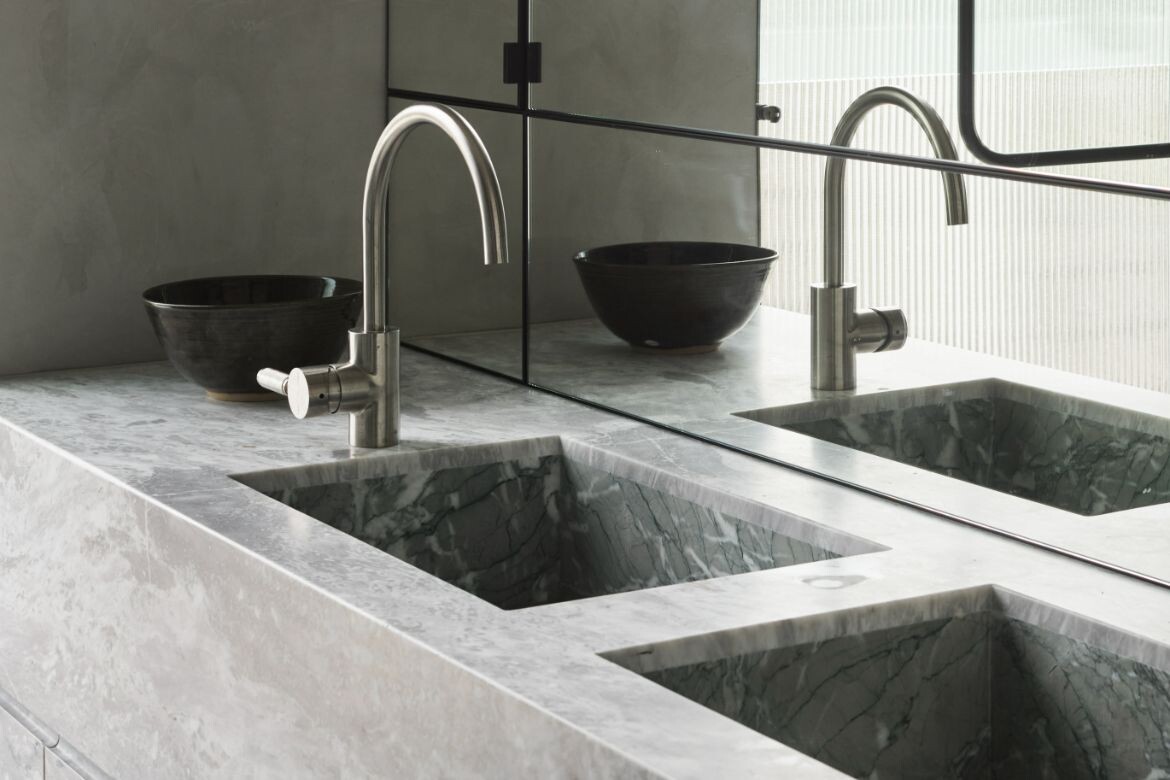
Impressive in every sense of the word, the powder room in this Dover Heights home uses the blank space under a sweeping stair to great effect.
Shona McElroy of Smac Studio intentionally veers away from “safe choices”. She also has an impressive talent for re-working even the most complex of three-dimensional spaces. In bringing both attributes together in this powder room, McElroy has created a surprising and sophisticated experience for guests of this stately Sydney home.
Story continues below advertisement
A dramatic curved staircase, which was made possible by Smac Studio’s impressive spatial gymnastics in the foyer, resulted in a small alcove in which to create the powder room. “We didn’t want the powder room to feel like an afterthought, or not match the luxurious nature of the rest of the house, but there was no getting past its tapered ceiling, so we curved any hard angles in the room to make it feel intentionally cavernous,” McElroy explains.
“We didn’t want that to be obvious, and the sharp angle of the ceiling was making it feel that way, so instead we had it wrap around in a vibrant colour that makes you feel really cocooned.”
With that in mind, the team chose a bold teal venetian plaster finish for all the walls, Elba marble for the floor and Verde Antigua marble on the skirtings, which mirrors the height of the skirtings throughout the house.
Story continues below advertisement
“I believe natural materials are so stunning and can’t be replicated; so for me it’s all or nothing. I also think marble is best done in larger pieces so you can appreciate the natural veins and changes in the colour throughout,” she adds.
“The mirror was also hotly debated, as the curved ceiling meant it couldn’t be full height, so we focused on a playful nature of semicircles that mirrors itself to create the illusion of one continuous circle on the side.”
Story continues below advertisement
The curved motif has been mimicked elsewhere in the house, appearing subtly on the ends of wardrobes and on corner details on the upper level. “Curves have been kept quite restrained, but they really speak loudly in the entrance hall and powder room. The rest of the bathrooms are actually contrastingly rectilinear, which I think makes the downstairs feel even more special.”
Stone is a theme throughout the project and the team paired the same two stones, Verde Antigua and Elba throughout, with the only outlier being the striking Esmerelda in the kitchen.
A pink and feminine Petra Sconce, by Melbourne lighting designer Christopher Boots, forms the perfect contrast to the allteal powder room, casting a truly stunning light through the natural Onyx.
“In its opulence, the powder room speaks to the owners’ love of hosting and wowing their guests,” adds McElroy. “It also speaks to their personalities of being bold and trusting.”
Project details
Traditional custodians – Gadigal People
Interiors – Smac Studio
Photography – Anson Smart
We think you might like this story about 5 exceptional bathroom designs