“Each space has an element of anti-conservatism deliberately turning its back on minimalist white interiors. We strove to use colours that clashed in a fun and complementary way – cartoon red and rust with lilac and yellow – to make the house feel fun, but have a common thread bringing it together as a whole,” says Isa Stancourt, IS design director on the thinking behind the studio’s Treehouse project.

Working with a client who pushed the designer to be creative and daring, the home is filled with fabulous moments of surprising colour and form. “It’s so easy to be adventurous when you have a client that helps you push that,” says Stancourt.
That said, Stancourt’s penchant for navigable, practical spaces, while allowing colour enough room to breathe, delivers a house that is as liveable as it is fun. Lilac laundry cupboards with bespoke Memphis meets rustic door handles designed by Stancourt for example, are surrounded by enough windows and neutral spaces to make for a delightful room with massive amounts of storage for a family of seven.

The flow of the house has been carefully arranged to give each of the family a private realm, while central gathering spaces are open and visible from adjacent rooms.
“In the office area, I added an enormous sliding door that divides the space so it can be open and linked by a Juliet balcony to the kitchen area downstairs. Or the family can close it off completely and have privacy and then that also doubles as a guest bedroom,” says Stancourt, complimenting the architect who designed a peephole to link the upstairs hallway to the living area.

Part of Morgan Dickson Architecture’s change was to shift the entrance to the lower floor. Defining this area is an art gallery-like aesthetic of polished terrazzo floors, Memphis style console from Sarah Ellison Studio and minimalist art hangings.
“It has a very low ceiling, so we decided on creating a unique feeling that you’re walking into something that was going to be surprising and fun,” says Stancourt. The space is highly practical with floor-to-ceiling cabinetry for storage, plus under-seat storage below the canary yellow leather banquette. Moreover, the stairs to the main level are beyond the corner, giving the arrival space a standalone presence.

The bedrooms on the upper floor are perhaps the most radical explorations of colour and Stancourt has not shied from her client’s brief. Indeed, the grass-green carpet was a starting point with each room a wild and exciting adventure.
For the main bedroom, a purple bedspread pushes the boundaries of the colour wheel, while timber detailing and extensive cabinetry provide a visual balance. In another room, the chaos of a bright abstracted floral wallpaper is doubled with a mixture of pastel-checked linens.
“We started off just saying more is more, let’s take it as far as we can go,” says Stancourt. And, then there is the room of canary yellow cabinetry with a recessed arch alcove surrounding the bed. Countering all of these are bathrooms of pristine white tiles and large expanses of oversized black and white terrazzo.

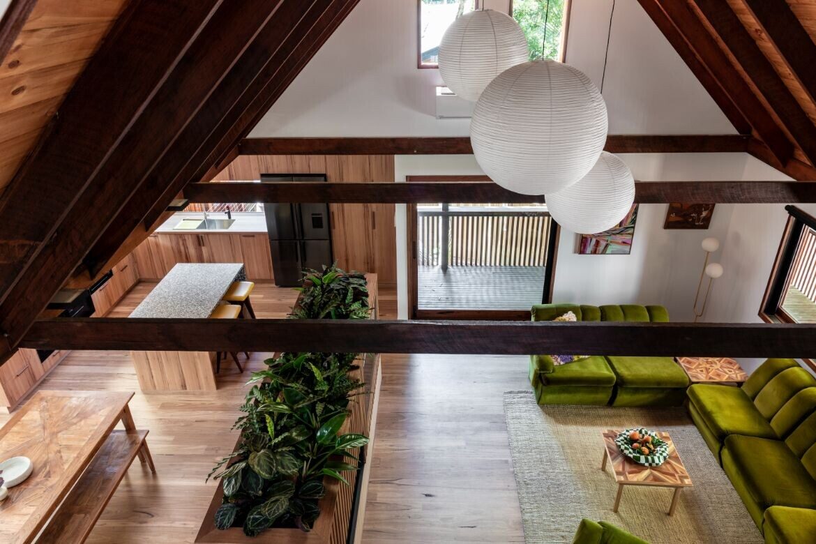
The living area is large with a double-storey volume into a vaulted ceiling giving the whole a generous and open aspect. Breaking the space are huge white rice paper shades from Hay (Cult) that are suspended from the timber-lined ceiling within the exposed beams. These have been weighted to counter the exceptional cross ventilation the large glass doors to each side provide.
Separating dining from living is a short timber and tile wall designed by Stancourt to house the television and fireplace on one side and lockers for the children’s school bags on the other. The top has been planted with quintessential eighties house plants: Calathea and Ctenanthe. Tying back to the grass green carpet that makes its first appearance on the stair risers, the velvet lounge (client’s own) is also vivid green. Perhaps more seventies than eighties, the lounge forms are expansive and comfortable with sufficient gravitas in their bulk to hold the room well.

Opening entirely to a stone courtyard with stacked sandstone walls, the living space is both expanded and contained. For the kitchen/dining portion, timber is used extensively with the timber floored kitchen boasting blackbutt cabinetry and recycled timber benchtops.
The black, white and rust terrazzo of the island travels a third of the way down the sides to add volume. Again, it is Stancourt’s sense of balance that pairs this combination with sufficient space for a clear narrative.
It is also her introduction of a quizzical moment, such as the same lilac of the laundry (Dulux, Lilac Crystal) appearing in a Memphis-style shelf of fat metal tubing. Her selection of the large Bon Bon pendant (Hay, Cult) over the timber dining table is similarly a surprising and delightful interruption.
Wild it may be, and wonderfully so, but underpinning the insouciance are structural bones that shape the way the house is used by the family. Moreover, Stancourt has run with the brief and allowed the fun of the eighties a playful expression throughout.
Project details
Architecture – Morgan Dickson Architecture
Interior design – IS Studio
Photography – Louise Wellington


