For a couple in their mid-thirties who value both their own privacy and family time with their child, the design response for their spacious penthouse seemed straightforward enough – create a private master suite upstairs, and place the main living areas and individual rooms such as the study, guest room, and child’s bedroom downstairs. Yet, the floor plan of this old four-bedder presented other challenges.
Bu Shukun, director of Architology shares: “It’s a very big area with spacious living and dining spaces, however the apartment had a lot of nooks and crannies even after we gutted it. It unfortunately felt very uneven.”
Bu understood that the couple had equally enjoyed vacations both in chic urban hotels and breezy beach resorts, and proposed to create a home that was both swanky and resort-relaxed. Referring to the project’s mood board, Bu says: “It is pensive, urban, and hence the monochromatic palette, the solemnness.” The monochromatic palette was also part of the overall strategy to clarify the plan and to provide a clean and uniform effect.
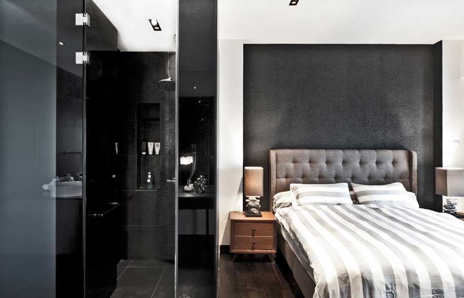
Understanding that the conventional four-sided white box would neither be a viable nor desirable option for the project, Bu introduced a dark L-shaped spine, finished in dark grey textured paint as a strong spatial element to define and anchor the main living areas.
Like most homeowners, the client had initial reservations about having dark walls at home. “It is a myth that dark spaces feel small. A pure dark space doesn’t have to be uninhabitable – if you contrast it with suitable material palettes, like lighter colours and cooler surfaces,” says Bu.
“It doesn’t help if you make [the home] an all white space,” Bu continues, “The whole idea is to create a certain drama, a heightened sense of differentiation. What happens then is that the space can feel larger – when you get a distortion of what the box is. Instead of leaving all the sides of the box white, you choose a certain angle and do a nook, and it distorts the box. You can control the eye by the weightage of colour and tone. In this case, the dark spine strengthens the house; it actually creates more visual white space.”
Throughout the house, finishes such as dark walnut, black granite and matt homogenous floor tiles extend the central spine complementarily, while lighter and cooler textures such as white marble floors, soft silver-grey fabrics and iridescent effects in bathroom wall tiles provide counterweight and balance.
Architology
architology.com.sg
Photography courtesy of Architology


