The average size of a new freestanding home has decreased in recent years, coming in just below 230 square metres for those built in 2018/19. But while it may be less, it is still more than double the average size of houses built in the early and mid-twentieth century.
Located in inner-suburban neighbourhoods, these houses are constrained by the limitations of their site and local heritage controls, so when homeowners want to expand out or up, it often requires clever architectural intervention to do so.
A two-storey extension sits behind the roof ridge line so it is not visible from the street.

The homeowners of this small worker’s cottage in Bondi Junction, Sydney, wanted to create more space for their family with three young children and engaged Clayton Orszaczky to design a substantial two-storey extension. But despite the considerable size of the addition, the 140-square-metre footprint is still well below the average house size, providing the family a lot of “bang for buck” when it comes to space, as Rebekah Clayton, co-director of Clayton Orszaczky, describes.
The existing dwelling had two bedrooms plus an attic and one bathroom. “It was charming but planned terribly, added to poorly and leaked like a sieve,” says Rebekah. The clients wanted three bedrooms, three bathrooms, open-plan living, a large kitchen and a connection to the garden with space for lawn and a pool. “It was a very large brief for a tight little site, compounded by the challenge of site access.”

Council heritage controls required the front façade be retained, which the client also wanted to preserve. The two original rooms of the house now accommodate a study and laundry, while the rear has been demolished and replaced with a two-storey extension that sits behind the roof ridge line so it is not visible from the street.
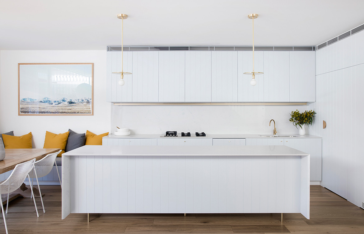
The ground floor may not be large, but it still feels spacious, with a kitchen, dining, living space and built-in joinery. Floor-to-ceiling sliding glass doors open to the deck that seamlessly connects the interior and lawn. There are three bedrooms and two bathrooms upstairs, with two bunk-bed rooms tucked beneath the front roof of the cottage where natural light comes in through the dormer windows.
A timber screen wraps around the master bedroom that overlooks the garden, providing a sense of privacy, while full-height glazing allows for views, ventilation and light. “It is a surprising, interesting and playful element that takes the project to another level,” says Rebekah.
Natural and low-maintenance materials balance robustness and detail.

The clients wanted a relaxed and beachy feel for their home, and gave Clayton Orszaczky free reign for the design beyond that.
Natural and low-maintenance materials balance robustness and detail, with a white and timber palette accented with brass for texture and warmth. “The joinery and interior finishes are the parts of the house that the client sees and feels. They are beautifully designed and built, and also practical and reflect the way our client uses their home,” says Rebekah.
The family have fallen in love with their new home, according to Rebekah: “The openness achieved behind that little façade is surprising, and the kids adore their playful spaces. It affords this family the space they need to grow.”
Clayton Orszaczky
coarchitecture.co
Buildability Constructions
buildability.com.au
Photography by Chris Warnes
Dissection Information
American Oak engineered boards from Nash Timbers
Blackbutt decking
Silver Birch carpet by Tretford
Carrara and Absolute Blanc from Smartstone
American Oak veneer joinery by Intermic
Italian Terrazzo tiles from Surface Gallery
Eco Brass fixtures from Astra Walker
We think you might also like Mosman House by Alexander & Co


