Frame House in Singapore is defined by two courts. One is an outdoor courtyard at the front foyer where a sole Caesalpinia Ferrea tree reaches skyward, sculptural, with wide-spreading, lace-like foliage that soothes the timber deck from the tropical sun.
The second is an indoor atrium, created by extruding the dining and dry kitchen area into a double-volume space. Here, a trio of curvaceous Vertigo Nova pendant lights from Petite Friture dance in the air, their skeleton frames perpetuating a sense of lightness and movement from sunlight that floods in through two tiers of windows.
These two spaces are critical in engaging the home within the tropical context. Indoor and outdoor spaces are blurred through the plan and section such that one or the other is always attuned to nature’s climatic shifts.

The large apertures allow for ample natural lighting during the day as well as cross-ventilation. “[They improve] the whole liveability of the house by incorporating nature into the inhabitants’ living environment,” says Tan Cher Ming, founder of Ming Architects, who designed this three-storey, semi-detached house for a couple and their young daughter.
The introduction of light and wind deep into the plan is important for this home, which is bound on one side by a wall shared with a neighbour. The porosity also connects the various uses.
A small library and reading area overlook the ground floor dining and dry kitchen, acting as a bridge connector between the main bedroom at the front and the two bedrooms at the rear.

The house abstracts the vernacular tropical house trope with elegant extended canopies and panels of screens. For instance, a blank wall on the front elevation offers privacy from the street.
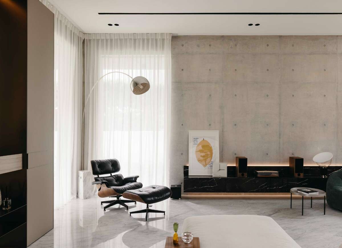
Built with off-form concrete, the wall creates a pleasant aesthetic for the exterior and interior. Concrete was requested by the owner, who was drawn to its industrial feel.
The first floor is defined by a wall of moveable timber screens framed by a distinct portal that gives the inhabitants control of light, air and views, while the second level has an open terrace, set back from the lower volume for a higher degree of privacy.
The façade responds favourably to the context, facing a small park with a children’s playground and sheltered by a row of mature raintrees that form a pleasant green canopy.
The design enables the front-facing rooms to enjoy this view, while the varying degree of solid and open treatments mitigate privacy.
“Maximising the openings on the front elevation [on the first and second storeys] resulted in a strong, rectilinear building form. These stone-clad, stacked frames have infill of timber screens where necessary. We chamfered the structure’s edges to slim it down visually and give the house a contemporary look. We didn’t want the house to look like a [conventional] modern tropical house. Rather, we wanted a subtle look leaning toward more European/Australian contemporary architecture,” explains Tan.

This affected the choice of a lighter material palette with off-form concrete on the ground floor and on the shared wall, while Bulgarian limestone clads the upper floors of the façade. Oak flooring and wall panelling on the interior complement white-painted walls. The effect is calming and classic.
As the owners did not need many rooms, the courtyard at the entrance is generously sized. It forms part of a nuanced entrance sequence. “The entry experience was deliberate and designed to bring one through a procession of spaces before entering the house.
“One passes a covered walkway interspersed with planting, then a water feature to bring in the sound and view of water, and finally into the double-height open courtyard with the single tree before entering the house proper. The change in scale and heights, and of light and shadow is more impactful compared to a direct entry into the house,” describes Tan.

The home’s restful quality and ample privacy reflect the owners’ understated and quiet personalities but is also welcoming and useful for hosting guests, especially the owners’ close-knit extended family who live close by and drop in regularly.
The reduced programming also results in commodious and usable spaces, while the courtyards and verticality shape the overall emotional character. “In our architecture, it has always been our intention to scale down our houses as much as meaningfully possible, while still being able to accommodate the owners’ brief,” reiterates Tan.
“This is not only more economical and less wasteful, but more importantly, allows us to create open voids, courtyards, high ceilings – all of which improve the spatial quality, as well as bringing nature and light into the internal spaces.”
Frame House is a masterclass in how to achieve all of this, executed with refinement.
Project details
Architecture and interiors – Ming Architects
Photography – Studio Periphery
Dissections
FINISHES
Carpet by Woodnotes New York.
FURNITURE
My Taos sofa by Saba Italia. Pumpkin armchair by Ligne Roset. Eames Lounge Chair & Ottoman by Herman Miller. Mikado dining table by Ethnicraft. Muuto Cover side chair, Muuto Cover armchair. About A Stool by HAY (dry kitchen bar). Desert Lounge chair by Ferm Living (courtyard). Zaza sofa, Apero coffee table, Crescent ottoman, all from King.
LIGHTING
Arco floor lamp by Flos. Vertigo Nova pendant lights by Petite Friture. Courtyard lighting – custom-made by carpenter.


We think you might also like this story on Cove House by Ming Architects.


