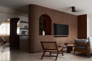
AMP Design Co. borrows from Japanese design elements to fashion a pared-back apartment with a serene ambience for this family. A minimalist aesthetic keeps the interiors easy to maintain. Meanwhile, warm oak and cool grey concrete accents lend a touch of character to the largely all-white space. The result is a tranquil environment that’s ideal to unwind in.
The living room is open and airy, and features a cool palette of white and light oak. There is a series of floating display shelves by the TV feature wall. This design resembles a cascading Japanese waterfall, and brings a sense of calm to the neutral space. To further enlarge the space, a tinted mirrored sliding door conceals the entrance to the study area. The black trimming on this door serves has a sleek handle.

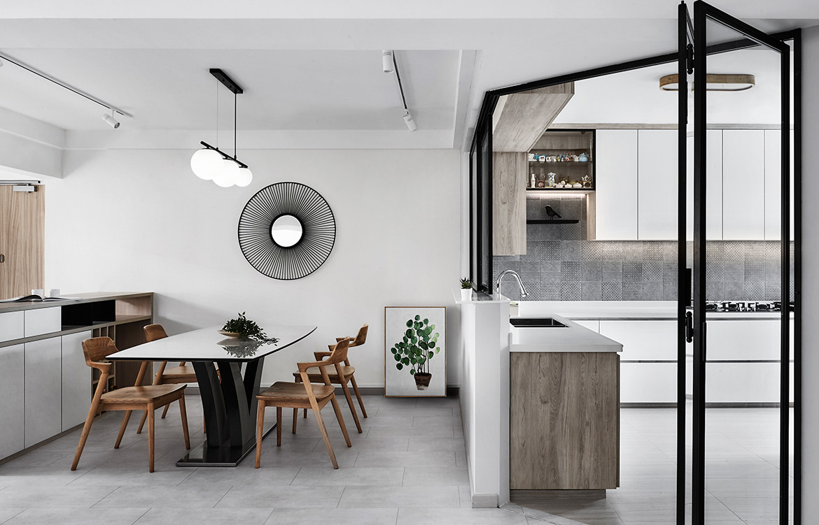
The dining area is bright and open, and largely unembellished. This is per the family’s request for a minimalist home with subtle Japanese influences. Yet, instead of a banal setting, it comes off as quietly chic, thanks to the use of black framed kitchen windows and doors. They add depth and contrast, which breaks the monotony of the interconnected spaces.
“Patterned tiles, with a rugged, concrete texture, were incorporated into the kitchen to offer a sense of playfulness,” say the design team, who opened up the space and improved ventilation with metal-framed glass bifold doors. This also improves the flow between the kitchen and the rest of the abode, and makes access easier.
A suspended glass partition greets visitors at the foyer. The corrugated glass panel injects a sense of lightness and retains the spaciousness of the interiors while offering a sense of privacy. The half height shoe cabinet with recess handles and a bench seating serves a practical purpose, as seen in typical Japanese homes.


The designer created an L-shaped wardrobe in the master bedroom to maximise storage space, and adorned it with custom made handles and white laminate fronts to brighten up the room. To keep the bedroom looking clean, serene and streamlined, the door to the en-suite bathroom is also concealed. Meanwhile, a side table/dressing table with display nooks for the bedhead wall is a space-savvy addition to the bedroom.
Taking slightly more liberties in the bathroom, the design team employed a greater variety of tiles with concrete-like finishes and herringbone patterns – unified, nonetheless, by the same colour. Black-framed glass panels for the shower area and matte black-finished fittings inject a contemporary touch.
AMP Design Co.
amp-d-space.com


