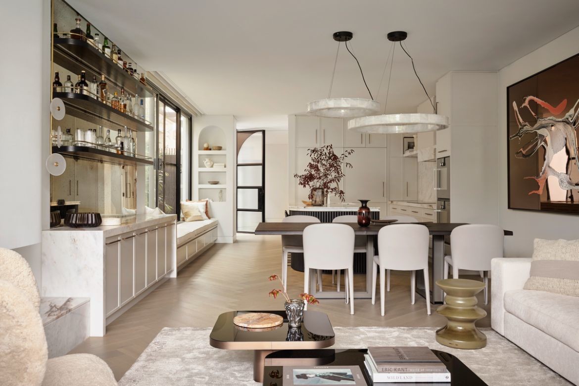
Shona McElroy had a brief of conflicting requirements when designing this family home – but underpinning it all was a space to truly relax in.
Responding to a brief for a relaxed space that would be welcoming and calm, Shona McElroy, interior architect and principal of Smac Studio has created a soft feminine interior of gorgeous tactility, tone and form.
Story continues below advertisement
“There were two young daughters and then by the time we finished the project, Sam [and Michael were] pregnant with another girl. They’ve got a little girl dog too and so there was a very feminine energy!” says McElroy on the process.
Drawn to glamour, but wanting calm, words like eclectic, harmonious, glamorous, zen and feminine created the layers that McElroy has designed into the home. That said, there was a conscious decision for balance towards a family-driven type of functionality. “She’s quite feminine and girly and her daughters are the same and they’re all perfectly put together and really cute… And he has a great eye and a great appreciation for design,” says McElroy.
Taking its name from the tonal variations used throughout, the name also refers to first impressions: “Upon entry you are greeted with just a lovely warm feeling,” says McElroy. Designing for a family that entertained frequently this arrival experience was essential. Moreover, the home has been designed to house the owners’ object collections, cater for up to fifty and still feel intimate and appropriate when the family come together for meals.
Story continues below advertisement
To this end, storage has been a key driver with shelves and a butlers’ pantry affording different options: “They have small kids but they still wanted the space to look very clean. So, while we had places that we needed to showcase things, we also had a lot of places to hide items,” says McElroy.
Creating a sense of arrival, a curved staircase and foyer in grey herringbone timber flooring (Woodcut, Roman Grey) and a Kelly Wearstler pendant (Becker Minty) are framed by a pair of softly unfurling curves. The curving stairs and balustrade on one side are countered by a curved wall containing the kitchen on the other: “It’s funny how curves are. They’re visual guides. They’re visual leaders. I like curves to guide people in a really soft way. It’s not these sharp angles,” says McElroy, who has also used curves to contain the fireplace with a wall that organically flows out of the rendered plaster.
Story continues below advertisement
Concealed within the entry foyer is the first of the truly delightful bathrooms throughout the home. Ostensibly a powder room, and the client’s favourite room, the ceiling has been curved to work with the under-stair arch, but also because it’s “a cool way to do this.” And it is lovely. It is also where McElroy wants to pack a punch: “It should be a real reflection of the overall design of your house and what you want your guests to experience. With our feminine energy and the pink throughout the stone, we really leaned into that,” she says.
Extending the watermelon pink Venetian plaster to the ceiling, the space is further layered with panelled mirrors, a beautiful Luna pendant lamp (DCW, Spence & Lyda), and bronze tapware (Astra Walker) that sits between modern and classic. Marble is however the overriding feature with Calacatta Monet used for the vanity and Epoca Blush by Skheme used for floor and skirting.
The upstairs bathroom is similarly impressive in terms of materiality, but here the scale is much larger – though still within the constraints of the semi-typology. Fitting four bedrooms plus this ensuite into the upper floor gives a good understanding of McElroy’s spatial planning skills. Responding to Sam’s desire for a T-shaped bathroom where the shower is hidden behind a dividing wall with a bath and a vanity on the other side, McElroy has manipulated space artfully: “Those T-shaped bathrooms are very luxurious, and they’re often seen in bigger houses. But we made it work, and we made it work really successfully,” says McElroy.
To this end, a panel of bronze framed mirrors follows the entire length and height of the wall. Murano wall sconces (E Moderno) add glamour without truncating space and translucent drapes add form (Kyoto rice paper, James Dunlop). Marble is again centre stage with Palladian used for the vanity and Epoca Blush (both Skheme) used for the floor… “that beautiful stone with all the kind of pink tones through it and the bronze tones through it. It’s a very harmonious, functional, and really gorgeous place to be. It feels really luxurious and it feels calming and upmarket, like you could just have a bath in there with some candles for hours,” says McElroy.
Large windows and an abundance of light have been introduced to the home through careful planning: “We changed around all the windows and the configuration. And that enabled us to open up all of these side passage windows, which had originally been designed as high level windows, which I despise.” As such, while there is no view, the soft drapes and fluted glass conceal this fact, while filling the home with light.
The kitchen as previously mentioned is designed to handle everything from catering to large parties or a simple family meal, as such, the spaces are curved and inviting, with a large stone island in Palladian marble (Skheme) with a contrasting fluted profile: “She loved that ribbed, fluted look. And I think the whole thing sits together really nicely. And then the bronze handles and taps, I guess just cap it off,” says McElroy.
Curated art and design objects are carefully placed throughout the home in keeping with the feminine, it is however the pink marble that really explores this mood without once stepping into the realm of frothy or froufrou.
Project details
Interior architecture – Smac Studio.com
Photography – Anson Smart
We think you might like this apartment in Tokyo that has curves and Scandinavian vibes