Architect Nick Bell’s recount of the alterations and additions project dubbed Balmain House is truly evocative of a jigsaw puzzle. The relocation of one seemingly innocuous but essential element – the stair – saw everything else suddenly fall into place.
His clients were living in a weatherboard cottage in the desirable, harbour side suburb of Birchgrove in Sydney. Their home had not only a second storey addition circa 1980, but also a lean-to addition to the rear that held the primary living spaces. Despite these two rounds of retrofitted additions, the residence left much to be desired. It was dark from a deep plan, low ceilings and many internal rooms; ill planned (the eastern outlook that boasted views of the Sydney Harbour Bridge was impeded by a staircase); and despite a relatively large site for an inner city suburb, external living spaces were small and pokey.
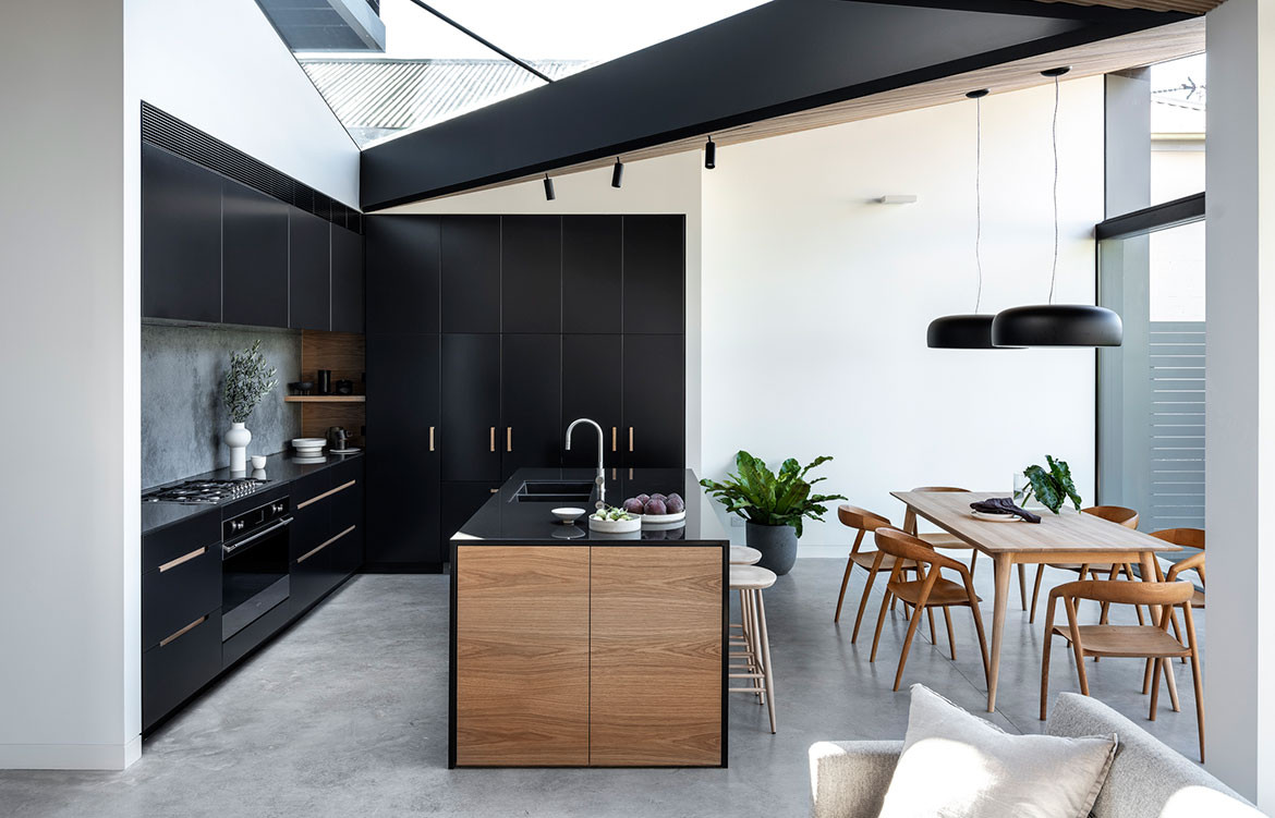
Although the lean-to was removed and replaced, the concrete slab was retained and the form of the new roof pays homage to its previous iteration.

Needless to say the brief was comprehensive. The clients wanted to replace the lean-to and extend the second-storey addition to the south-west boundary of the site. They also wanted better opportunities for outdoor living – including a small courtyard on the northern side – and an internal reconfiguration of the floor plan.
Relocating the stair to the new side addition was key to Nick’s design solution. It freed space from the original plans to give over to a new fourth bedroom and separate laundry room downstairs. This move also meant there was room enough for a double study on the half landing of the staircase. Upstairs a new geometric floor plate creates interest programmatically and highlights the views – uninterrupted.
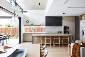
A new L-shaped plan gently demarcates the kitchen, dining and living zones, making them easier to furnish but also define.

Although the lean-to was removed and replaced, the concrete slab was retained and the form of the new roof pays homage to its previous iteration. “Part of the roof follows the traditional form sloping down from front to back whilst the other main section of roof slopes up from front to rear,” says Nick. “Joining these two main roof planes is a third triangular transitional plane. This transitional plane is a large skylight orientated to draw in natural light from the north.”
Internally, a new L-shaped plan gently demarcates the kitchen, dining and living zones, making them easier to furnish but also define. The rear glass sliding doors are fully glazed with a minimal frame, this serves to enhance the connection between internal and external spaces, as well as encourage natural light in (complementing the sunlight sourced through the skylight). The concrete slab continues outside to enhance the sense of life indoors spilling outwards.
Nick Bell Architects
nickbellarchitects.com
Photography by Tom Ferguson
We think you might also like Bronte House by Nick Bell Architects


