From Cliff House in San Francisco to The Imperial Hotel in Clifton NSW, there is something extraordinary about a view that looks straight out to sea. It’s only marginally Instagram-able, but in real-life terms gazing across the sea to a dimming horizon line as the night rolls in, is extraordinary.
Granted The Imperial looks to the rising sun rather than the setting one of Cliff House, but the mood is essentially the same. That is, relaxed, gin and tonic in hand, with not a care in the world.
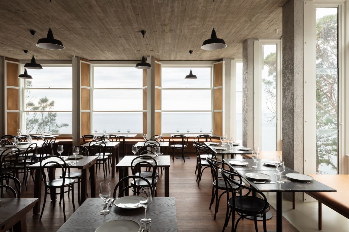
Welsh + Major has the interior to perfection. This is a space designed as much for locals as it is for tourists, and while the town has changed with soaring real-estate prices, the off-season remains typically coastal and low key. What was needed was a dining room that didn’t muck around with too much visual information and would let the view be the hero it should be.

To set the scene, the section of Lawrence Hargrave Drive between Coalcliff and Clifton described by the RTA as “one of the most scenic roads in Australia and one of the most dangerous” collapsed around 18 years ago.
Effectively this catapulted The Imperial into decline and it has sat neglected, but never unloved, to gather dust and some strange misspelt graffiti. With the road now passable and the opening of the Seacliff Bridge, Welsh + Major was engaged to design and document the iconic hospitality venue as a catalyst for rejuvenation in the area.
Working with the council to ensure the Heritage listed property retained original building features, the balconies were restored and brought up to standards while internal spaces were redesigned and two new dining rooms created.

With sweeping views up and down the coastline of the Illawarra Escarpment, the rooms are all about the view with glazing to both front and side with stepped out windows availing the deeper parts of the room with the grand view. The glazing on the side facing the town, however, is fluted to three-quarter height to give lovely framed views of the escarpment and no one a view of the car park.
The new rooms are in keeping with the heritage portion with site poured concrete ceilings articulating the formwork for a raw edgy finish. In the portion where old meets new, this treatment is legible as a direct response to the original brickwork which has been cleaned, but not resurfaced.
Moreover, the history of the building has been captured with a portion presented from behind a new screen of timber to show the layers of aqua, white, sand and grey paint.

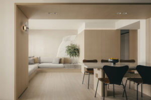
The interiors are bistro style with bentwood chairs and simple tables with dark timber tops. Banquette seating in pale caramel leather is a nice consolation for those seated at the window but not facing the view and has the added benefit of looking sleek and minimalist when viewed from outside the building.
The design is in fact thoughtful throughout with lighting high and unobtrusive to not obstruct the view and screens that can be closed over the windows when they are opened to let the sea breeze in. Simple ply has been used to clad internal walls, which carries through as a warm glow.
Welsh + Major’s design is a clear response to the site and the original building’s history. It is also a response to the changing social needs of a coastal community that has exponentially grown over the last twenty years. To this end, the interiors are flexible enough to enable a wide range of hospitality offering from dining to celebratory events.
As a contemporary take on a classic bistro, the thing it gets right is this. A bistro interior never interferes with the food. Here, the bistro style doesn’t interfere with the view, and if the food is as good as the interior, this may just be the best place to visit on the NSW south coast!


Project details
Architecture and interiors – Welsh + Major
Photography – Clinton Weaver
We think you’d love this home by Welsh + Major featuring gorgeous plywood


