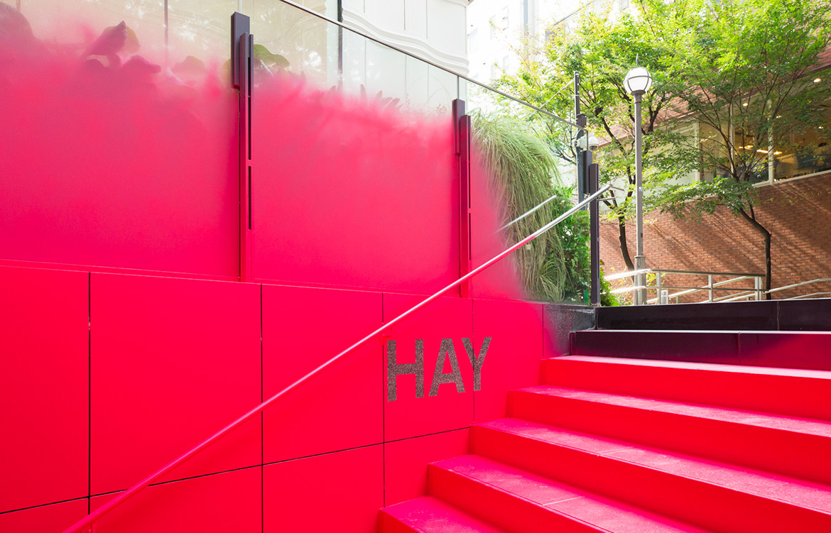
A subterranean space is making its presence felt at street level in Shibuya-ku. Vivid pink spray paint coats a stairway and creeps antagonistically up the surrounding glass balustrade – an unexpected marker of something unconventional happening below. “Instead of guiding people using signs in Omotesando, a district already overloaded with signs, we decided to draw people’s attention by doing something we are not supposed to do in this city – that is, to vividly spray-paint the entire stairway and the existing walls around it,” explains Jo Nagasaka of Schemata Architects.
The stairway is soon to be demolished and the surrounding building renovated, so the unusual invitation to the basement found fruition and now brings attention to a spot that had previously been barely noticed.


It descends to a temporary store for the dynamic Danish furniture and product brand HAY, where Nagasaka has created an adaptable display system that can grow and change as the retail program requires.
“The space consists of what we call ‘interfaces’ or movable furniture systems instigating people’s activities,” says Nagasaka. “These ‘interfaces’ are something between architecture and furniture: they are furniture systems that can be moved only by store administrators who know the mechanism of each system.”


One of the ‘interfaces’ is a wall system composed of overhead channels perforated every 1,200mm along their entire length. Wall panels can be attached with the support of steel pipes fixed to the overhead framework. The channels carry wiring for the lighting as well as power-supply cables that reach down to the floor level.
The other ‘interface’ is a series of furniture pieces. “They are too heavy to lift manually but can be moved by one person using a hand lift,” explains Nagasaka. They include cash register counters, chair display shelves, and plant boxes. The performative aspect of moving these elements adds to the store experience.


Aside from the café area, the Schemata Architects team deliberately designed the store so that it can be cleared overnight. This makes it possible to respond to specific requests, explains Nagasaka, such as the need to clear half the space so a live performance can be accommodated. “Naturally, the store layout can be easily modified in the same way according to market trends on a daily basis,” he says. “These ‘interface’ systems allow the store to expand through collaboration with various designers throughout the year.”
HAY
hay.dk
Schemata Architects
schemata.jp
Photography by Masataka Nishi


We think you might also like Infinity Spa by Space Popular


