When it came to renovating Cherie Maxwell-Gulli’s family home, the kitchen came first. In previous homes the kitchen zone had always felt ‘cornered out’ of the house. For this space, Cherie’s vision was to put the kitchen front and centre, so every family member felt included in the daily rituals of home life.
It also proved to be the tone-setter for Cherie’s working relationship with interior designer and project lead, Carole Whiting.

“I like casual elegance,” comments Cherie. “We were inspired by Scandinavian design. I explained to Carole that I didn’t want anything too pretentious and that the kitchen would really be the hub of our home. I [originally] gave Carole a whole book [of visual references]. It must have given her a very clear overview of what we had in mind, because the kitchen we built was as per her very first drawing – without a single amendment.”
As Carole reflects: “This is a family that likes to cook. We have renovated a good deal of their home over the last two years, but we started with the kitchen – it was the key to cementing our relationship.”
The brief: to update an uninspiring kitchen which reached through an awkwardly angled hallway, and reconcile the small, impractical pantry area.


Carole tackled the two main challenges by cleverly ‘squaring up’ the space through ‘packing out’ the hallway and pushing the kitchen forward, thus enabling a larger pantry. Essential appliances like fridge and freezer are placed practicably close to the entry area. The V-ZUG ovens – an important feature of the kitchen and central to the family’s cooking rituals – have been placed on a side wall, close to the Butler’s Pantry.
“The brief was to go with steam for cooking,” notes Carole. Here, Cherie and family selected a V-ZUG Combi-Steam as well as a Combair oven; they also opted for V-ZUG’s 6 Star energy rated dishwasher – notable for its world-first heat pump technology.
While the V-ZUG appliances were chosen for their superior functionality, they also brought Carole’s aesthetic concept to life.

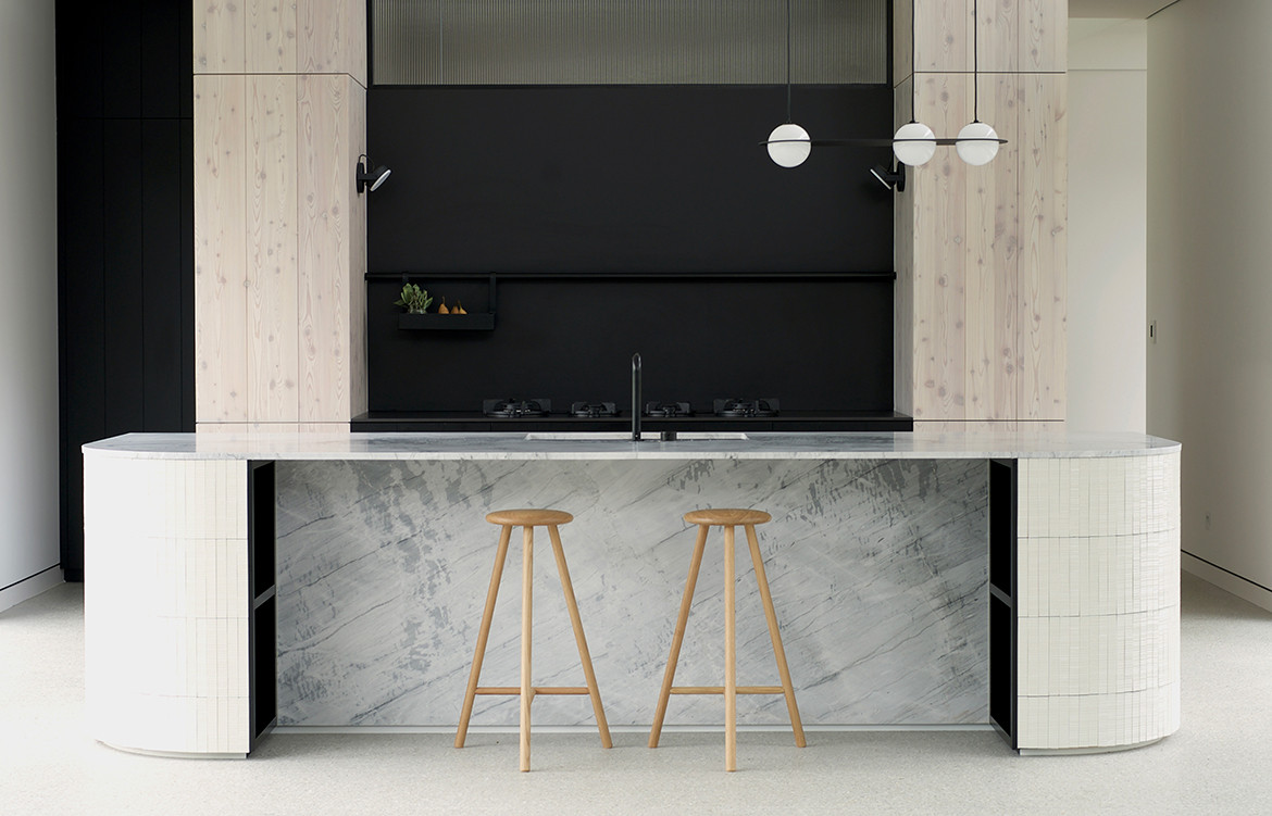
“Cherie gave us direction to design a clean and modern kitchen with a simple and natural palette,” says Carole. “We used larch wood panels in whitewash and black stain for the cabinetry, black large-format porcelain tile which houses the gas hobs, and marble and handmade tiles in the island bench to add texture,” she says.
“The elegant mirror finish of the V-ZUG ovens sits in balance with the neutral palette. The V-ZUG appliances are really on show, while everything else is concealed or blends into the kitchen design.”
Fitting with the clean-lined and minimal theme, Carole freed up some essential overhead space by selecting V-ZUG’s “sleek and discreet” down draft extractors. In doing so she has been able to bring natural light into the pantry through a glass panel inserted above the cooktop area.

The result is a space that really sings, says Carole. And in more ways than one.
As Cherie points out: “In my last home my kitchen was tucked in a corner and I always felt like I was the hired help. Now I’m at the centre of everything. It’s much more fun to entertain, and even the daily cooking grind is a more pleasant experience as I chat to my family, help with homework and get things done.”
V-ZUG
vzug.com
Carole Whiting
carolewhiting.com


