In an Abbotsford street of (predominantly) single-fronted Edwardian cottages, 10 Fold House by Timmins + Whyte both responds to heritage and tradition as well as the need for evolution. “Our client’s brief was pretty simple in that they needed more space; primarily an extra bedroom and bathroom,” says project architect and studio co-founder Sally Timmins.
“They valued the aesthetics, proportions and scale of the heritage houses in the street and were keen to retain the character of the existing house room.”

The team responded by electing to retain the single-storey front room but it required rebuilding given its disrepair and the requirement for added insulation and re-stumping. Undeterred, the team rebuilt the front room in the same dimensions and footprint as the original with the original brick shared boundary wall forming a beautiful textured backdrop.
“From there, the clients were very happy to hand over the reins for us to get the best out of the site in terms of light and views, the flow of spaces, and overall aesthetic,” continues Sally. In response, the team moved the original bathroom and laundry from the rear of the house into the centre of the home, thereby freeing the new kitchen and living room to have an unhindered connection with the garden.

As expected, given the tight, narrow site, a shared boundary wall with the cottage on the east and a large two-storey house to the west, Timmins + Whyte explored numerous venues to create as much space and light in the new build as possible within tight parameters.
“The inspiration for the design was to use the roof planes to fold along the narrow site to address the street pattern and create volumes of space punctuated by light,” explains Sally.
“The upper storey roof folds down to minimise visual bulk to the single storey house to the east and rises up to soften the contrast of the large ‘solid’ neighbour to the west. “It feels dynamic and the client has said it feels like a gallery.”
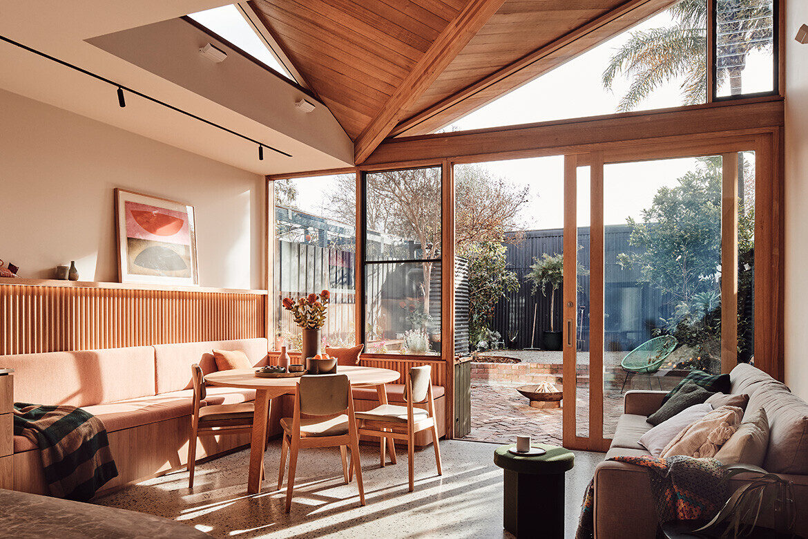
The rear butterfly roof also creates openings on the north and west for light and views to neighbouring trees including a palm tree and a seasonally changing Jacaranda. The angle of the roof lowers over the dining banquette seat, which creates intimacy and then rises up to make a large backdrop for art.

The upper-level main bedroom enjoys views of the city and a stained-glass screen that blocks the neighbour but is fundamentally “intended to evoke the droopy gum tree with its myriad of greens and pinks and yellow hues that are highlighted with the sun shining through it”.
Light enters the room and a continually changing interplay of colours, light and dark animate the bedroom as times and seasons shift.
The living room on the ground floor serves as the family’s primary gathering space and offers a connection to their garden which has a wide variety of edibles as well as decorative plants.

Environmentally, 10 Fold House benefits from a northerly orientation whereby the main living, dining kitchen space receives all-day solar access. By adding a little service yard, the team were able to get light and air into the belly of the house and were able to make the most of the full width of the block by building to the boundary on either side of it.
“The insulation for the roof, walls and floor were also specified higher than the requirements and you can really feel the difference,” adds Sally.

A water tank in the rear yard is used for water collection for both greywater and watering the garden and solar panels on the roof harvest solar energy. Every room has an openable window, a feat not always achievable on narrow plots.
“Cross ventilation has been achieved which helps passively cool the house and an operable skylight over the stair allows hot air to exhaust out of the house,” explains Sally. “The clients have said they are very happy with how the house has performed during the seasons and that the temperature is stable. Generally they have not had to use air-conditioning and heating is limited.”

The interior of 10 Fold House is humble with elements of luxury. Tasmanian oak lines the ceiling of the butterfly roof and the walls of the banquette, the overhead cupboards in the kitchen, and the island bench, which has a veneer base with a quad profile batten detail. The warm tones of the exposed aggregate in the polished concrete floors, original brickwork, natural stone and a generally honey-toned earthy palette ties everything together.
“The stone was used sparingly, only where it is interacted with most,” explains Sally. “It adds luxury to the house, like jewellery does for an outfit. The palette was intended to give the interior a feeling of quality, warmth and playfulness.”


Project details
Architecture & interiors – Timmins + Whyte
Photography – Peter Bennetts
We think you might like this list of projects that bring in hygge, including Lantern House by Timmins + Whyte


