Wellington’s cleaved landscape is based on a visible fault line cutting north-east through the North Island before pitching into the Pacific Ocean. While this geography limits the size of the city, it certainly hasn’t constrained its architects or builders. They have responded with small, tall and interesting houses perched on ridges and clinging to impossibly steep hillsides. 10×10 House by Patchwork Architecture is a talented example.
To be a Wellington architect, therefore, is to be an expert in foundation design and resigned to the fact that large parts of a budget can get buried underground. This small Kilbirnie site is no exception. As well as having a steep contour and awkward triangular shape, it has also been cut and retained for a bend in a busy arterial road. Not a site for the fainthearted, it was tellingly purchased off an architect by a builder. And at only 260 square metres, it’s had several schemes dreamed up but never realised.
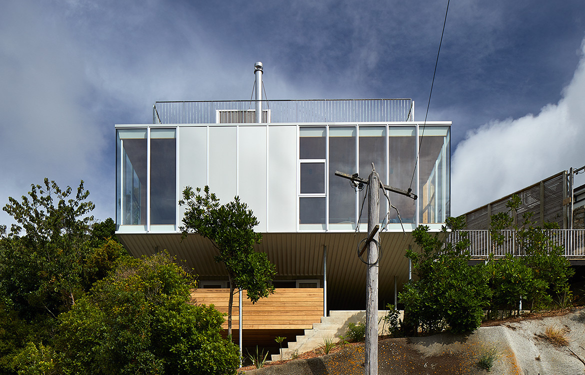
The structure is purposely devoid of recognisable house signs – no eaves, no pitched roof, no window reveals.

Its new owners Adam (the builder) and Alicia Pierson commissioned Ben Mitchell-Anyon of Patchwork Architecture to develop a fresh scheme. “This was never going to be a conventional hillside house,” says Ben. “It would burn too much budget on excavation and waterproofing – money better spent on the house itself.
“We also had a busy road to deal with, so we lifted the house high above the traffic for privacy and to capture killer views of the harbour and surrounding suburbs.” This meant breaking the height-to-boundary controls by up to four metres on the road and public reserve boundary. However, the council wisely approved the scheme so this innovative design would create something unique from a seemingly uninhabitable site.
Ben has designed a 10×10 House – exactly 100 square metres – set three storeys above the site entry. Simple geometry has allowed him to rationalise the site and create a highly efficient plan.
“The brief was for a three-bedroom family home,” he says. “They had no preconceptions about the design and gave us full creative freedom. Having worked with Adam on several houses now, our starting point was the level of detail and perfectionism we’ve seen in his work. A simple square offered an incredibly crisp form – not only relating to Adam’s building interests but also leaving us more budget to apply to the detailing and materials.”

10×10 House is supported by a concrete block core – enclosing a small office, laundry, entry and stairwell – and ten steel poles. The main floor cantilevers past these foundations to not only present a dramatic composition to the road, but also pitch the house out toward the view.
Reminiscent of the L.A. Case Study Houses of last century, the industrial panelised materials and minimal form challenges the stereotype of a home. From the outside, the structure is purposely devoid of recognisable house signs – no eaves, no pitched roof, no window reveals, no shutters, no traditional porch. Enigmatic and as un-house-like as you can get, it could be mistaken for a watchtower or small commercial building. Silver anodised cladding, flashings, joinery, downpipes and gutters – even a full metal underside – create a singular form broken only by vertical panel joints.
“I love it when you get a strange site and it produces an unusual outcome. You wouldn’t look at the site and think a perfect square would be the logical response,” says Ben. “The clients were willing to take a risk with the sketch design and they trusted us to design them a great house. We knew Adam could build it, so we weren’t afraid to try unusual details. He knows what he likes, but also trusts us to do our thing and gave us input for how he wanted to put it together.”
It’s the elevation above everyone else that gives that privacy.

To explore the 10×10 House, you climb seven and a half metres up two sets of external concrete stairs to arrive at the entry deck protected below the house proper. A glass door leads into a timber-lined lobby and stairwell, where the warmth of the interior is immediately revealed by the oiled Tasmanian blackwood. Winding up another level, you arrive in a small lobby leading onto the main living space.
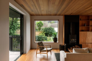
Timber is used throughout the main floor, with a solid oak floor perfectly mirrored in a solid oak ceiling. This luxury is continued in two walls of blackwood cabinetry – the one-wall kitchen and living room unit. Dark grey matt ceramic tiles complete the dark palette. From this warm containment are two areas of floor-to-ceiling glass revealing an outside deck and a long view of Evans Bay from the corner window.
“The main living room is strangely peaceful despite the traffic and wind,” says Ben. “Quiet and warm; it’s the elevation above everyone else that gives that privacy. It is a house to sit and watch a storm.” Bedrooms are distributed on the other three corners of the square with two bathrooms set back-to-back on the hillside.
While it’s essentially a single-storey house, the architects have created useful outdoor spaces at three levels – below, centrally and overhead. The entry deck to 10×10 House provides a covered outdoor area and adjacent garden made private by new planting and with external access up to the main deck above. At the very top, a flat roof forms an open deck with a quirky ‘bus stop’ in the centre. Referencing the arterial road below, it provides a protected room from Wellington’s fierce winds – and fixed furniture that won’t blow away. Access is via a freestanding concrete stair – the fourth flight of stairs! – and across a bright yellow steel gangway.


“These spaces above and below make it very dynamic,” says Ben. “They provide views around the building, up and down – indoor–outdoor rooms that are inexpensive to create and add a lot of interest. The roof deck is a fairly unusual feature in a city known for its wind. But on a good day, there is no better place to be with its panoramic views of the harbour and city.”
This young and emerging design practice run by Ben and business partner Sally Ogle – colleagues from architecture school – is gaining a reputation for striking and innovative buildings. A small and adventurous practice challenging the status quo to find high-quality living solutions.
Patchwork Architecture
patchworkarchitecture.co.nz
Photography by Simon Wilson
Dissection Information
Fiberglass clad white-coated steel for ‘Bus Stop’
Garapa hardwood decking
European Oak from VidaSpace for floor and ceiling
Tasmanian Blackwood wall paneling and joinery
Wall and floor tiles from Winckelmans
In-situ concrete stairs Adelaide barstools, Amsterdam sofa, Veneto chair, Elba outdoor lounge chair, all from BoConcept
Custom-made dining table/island by Dazam Wood Design
Arnold Circus stools by Martino Gamper from Everyday Needs
Moth Lighting throughout
Pyroclassic Mini fireplace on recycled marble hearth
Tapware from Methven
“It is a house to sit and watch a storm.”


We think you might also like to get to know more about Patchwork Architecture


