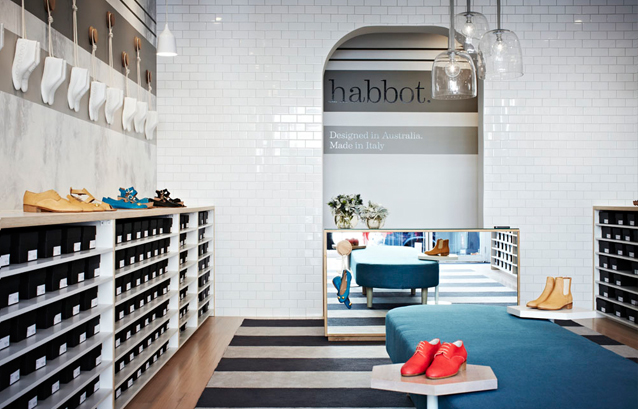
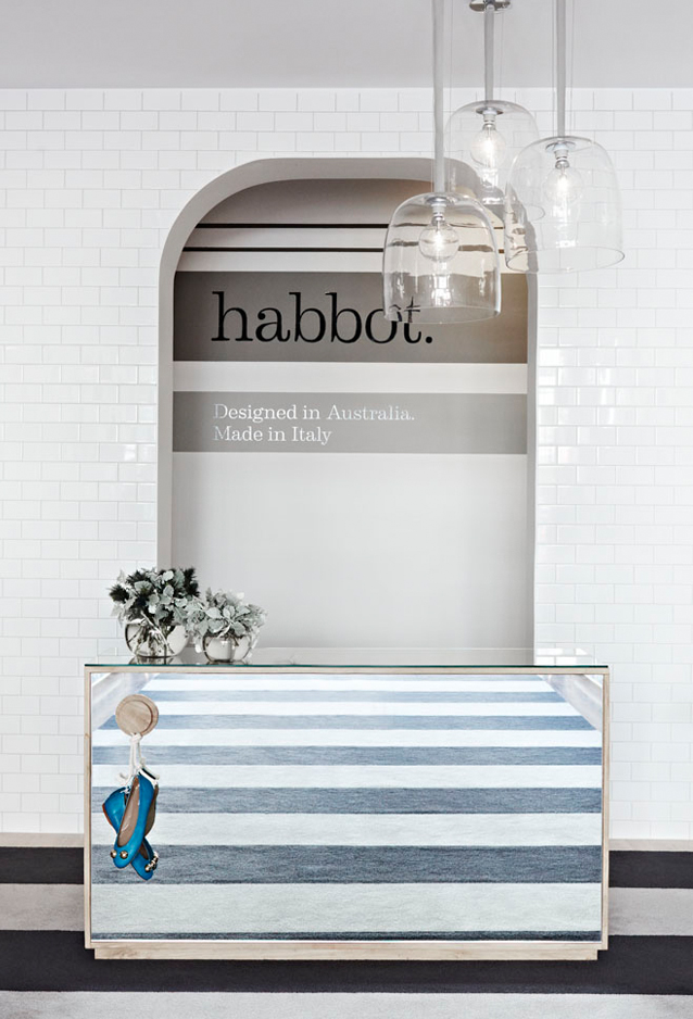
Executed by Mim design, the store was designed to focus on the product and evoke the theme of custom made footwear, with layout and materials reflecting the casual elegance and attention to detail the brand achieves.
Leaving the principal space open in its simple rectangular configuration allows for product to be displayed in a coherent and uncluttered manner and facilitates easy circulation around the extended ottoman in the room’s centre. The pleasing symmetry of the interiors, with coverging perspective lines echoing classical proportions, is a further comfort, and a refreshing alternative to the riot of decoration and furnishing found in so many other retail spaces.
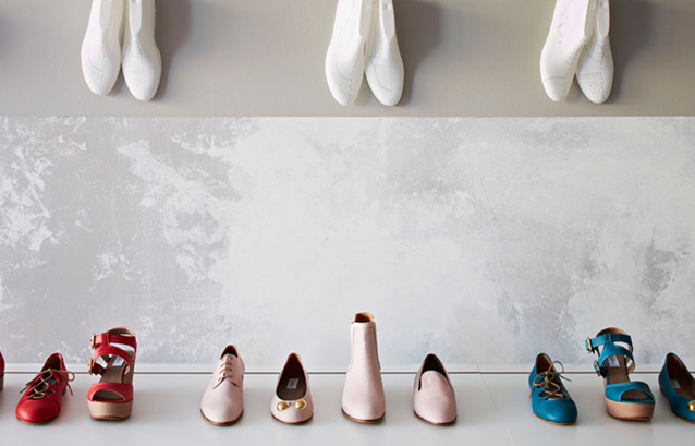
Materiality and colour are used in a subtle and effective manner, with the contrast between the earthy timber floors, crisp white tiles and gently dishevelled paint along lateral surfaces creating a refined, complex feel. The more luxurious textures and colours of the upholstered seat and carpet ensure customers’ comfort as they sit to try on shoes and wander the store browsing (perhaps even barefoot). Small hexagonal tables make for excellent moveable display platforms for the shoes, as well as convenient surfaces for clients to rest their belongings on.
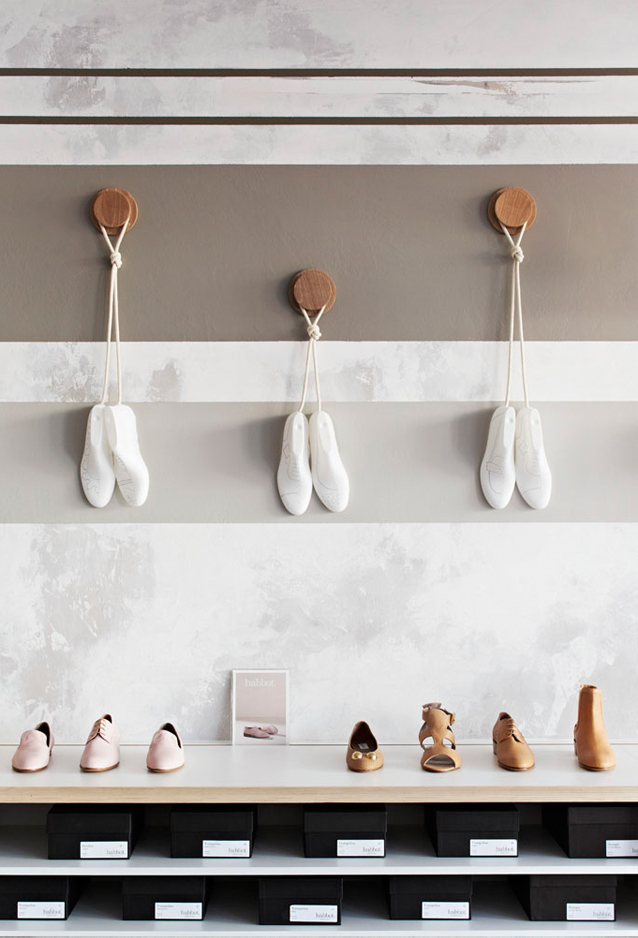
The incorporation of shoe moulds hanging from cord along the walls along ribbons of paint provides a necessary injection of character into the store, elevating it from simply a nice shop to a meticulously curated one. Furthermore, the detail emphasises the craftsmanship and tradition involved in the creation of the shoes, linking the aesthetic context to the function of the space.
Overall the Habbot shop does exactly what a retail environment should – provide an intelligently designed, attractive canvas within which a quality product can shine.
Photography: Armelle Habib


