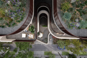
AD Architecture posits an open style of living, where each of the shared spaces directly engages with nature. As such, the L shape of the home allows for river views, breeze and morning and afternoon sun throughout while giving the overall impression of a set of pavilions, rather than a traditional home.
“The L-shaped architectural layout results in endless river views in the core living and functional space. Staying in the villa is more like standing on a viewing platform by the river to enjoy the sunshine and air,” says Xie Peihe, founder and CEO of AD Architecture.
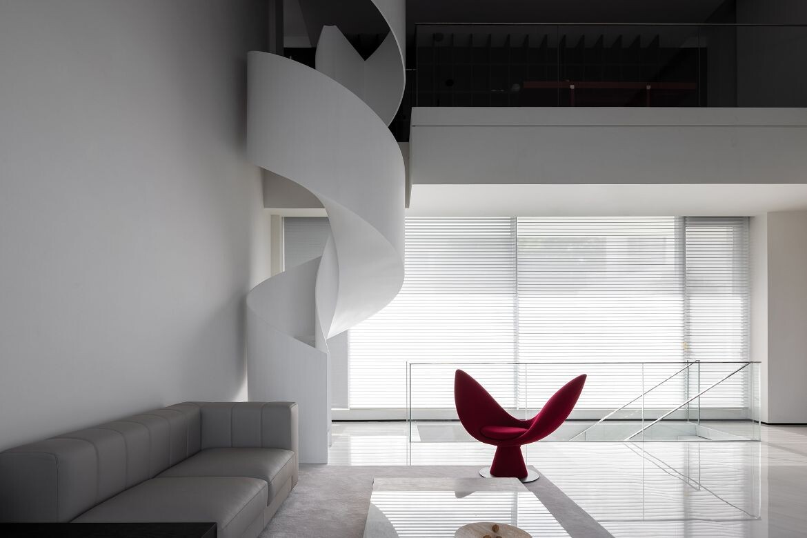
Keeping the material palette minimal, a variety of stone, handmade paint, micro-cement, black timber cabinetry and floors, glass, and steel provide the foundational elements. Within this palette, marble is the only element used decoratively, while all others are used to create form. For example, the spiral staircase that winds through the second and third floors makes a bold statement and is particularly charming.

Narrow and curving twice for each floor the balustrade is a fine wall of near-translucent white concrete, which continues its curve to the ceiling of the top floor. The marble used for the stairs within has been selected for large grey veins across an otherwise white ground, with some stairs only minimally marked or not marked at all. The result is a continuous level of visual engagement, which Xie Peihe conceived as the project’s fulcrum and “emotional transition from the open and extroverted to the private and introverted”.
Countering the sinuous form of the spiral staircase is an expressly minimalist open staircase of cantilevered marble. Connecting the basement to the second floor, the staircase traverses the first floor diagonally before making a return midway through the basement floor as a dramatic feature against the full wall of glazing looking to the pool and open atrium.

“We inserted a swimming pool with an atrium above it, to bring the sunlight and air from the outside to the reception space on the basement floor,” says Xie Peihe, who was adamant that the basement space be as engaged as the upper floors. To this end, a programable lighting system floods the whole with coloured light that follows the architectural lines. The wall facing the basement living and dining area from across the pool, moreover, is a vast screen that can be incorporated into the lighting design, or used to project moving images, a favourite being a nighttime electrical storm with cracking flashes of lightning.
Setting the stage for this area is the very large marble dining table with red velvet chairs and dining bar. The scale here is vast with the dining bar concealing a full catering kitchen and butler’s pantry. A full gym is hidden from view during dinner parties, but can be opened to look over the pool when in use. Likewise, a relaxed music room with red piano and traditional low seating and tables can be opened if the dinner party mood shifts to festive. Polished marble floors and polished chrome artworks are overtly sleek, while the potted palms adjacent to the cantilevered staircase are somewhat Palm Springs and a nice nod to the minimalist design movement.

With the staircases and an elevator connecting all floors, the space is centred by a large living space on the ground floor. “When considering the planning of the living space and the reception space, we tried to vertically divide the relationship of the two areas in the same building,” says Xie Peihe.
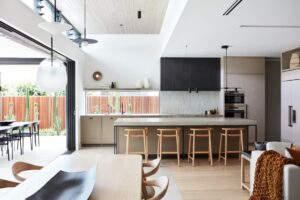
Minimally conceived, the spaces are large and sprawling with the river very much the primary focus. Artworks are proportionally scaled and bring colour and textural nuance, while furniture and lighting bring form. A large open-plan kitchen, for example, is crowned by a large geometric configuration of lighting while an island, cupboards and floor are sparsely executed in black and white.
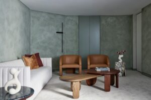
The living areas on the upper floor are perhaps the most relaxed and warm of the spaces. For this private portion the material shifts to pair timber floors with olive green velvet upholstered furniture, stone tables and a generally softer aesthetic that suits the river view well.
“In the residential space, simplicity is not the ultimate goal. Based on the practicality of space, we pay more attention to the relationship between man and nature in space, the living status and emotional appeal at home, privacy and sense of security, and the character and quality of people and the home,” says Xie Peihe. To this end, the bedrooms are more like retreats with large picture windows facing the river, following from bedroom to bathroom, where large curved baths continue to enjoy the view.
Project Details
Architecture and interiors – AD ARCHITECTURE
Lead designer – Xie Peihe
Location – Guangdong, China
Photography – Ouyang Yun, GraspFoto


