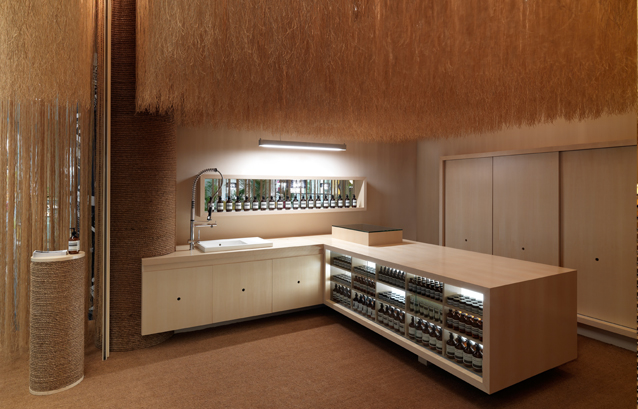
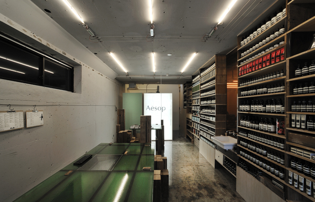
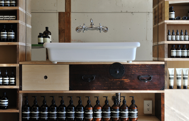
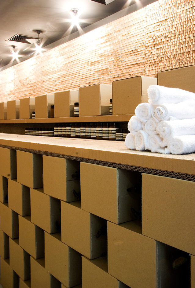
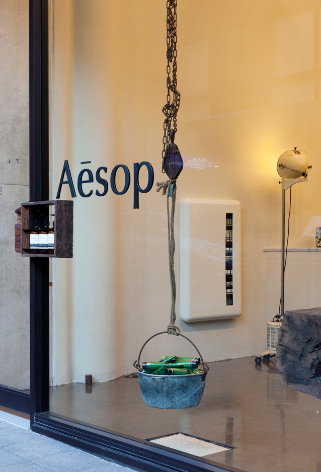
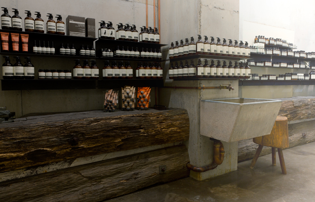
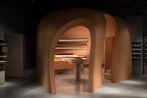
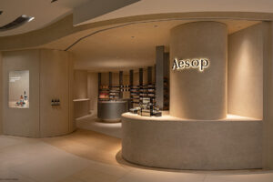
Designing stores around key textures and materials, Aesop has really pushed the boundaries of small store design in recent years. They’ve opened a string of captivating retails stores across the globe, working with like-minded architects to create hearty brand experiences. In Australia and Paris they’ve chosen architects from March Studio, and in New York Jeremy Barbour of Tacklebox. In Singapore they took March Studio to design the Millennia Walk signature store while in Japan they made a splash in two towns with Jo Nagasaka of Sschemata.
Along the way they have succeeded in creating 45 intimate spaces that manage to echo one brand promise. By putting their commitment to good design first, they captured an anti-brand sentiment that sits neatly with their au naturale products.
According to Product Advocate Suzanne Santos, the key to their success lies in maintaining a sense of humour and a healthy respect for expression.
Aesop Ginza, by Jo Nagasaka of Sschemata, Japan.
Suzanne Santos, Aesop Product Advocate
“Aesop partnerships are inspired by relationships with those who hold the same core values as us. Each partnership is carefully established.
“We sell our products in over forty-five international spaces and each of these store openings has had its own architectural feel and brand building significance. There are, of course some Aesop doors that captivate entire cities, such as our Rue Saint Honoré store in Paris, our Nolita store in New York and our first Tokyo store in Aoyama,” but Santos says, they’re all key to selling the brand worldwide.
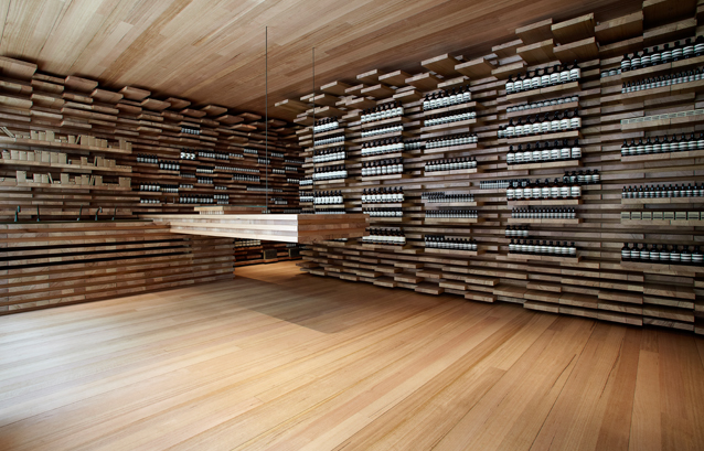
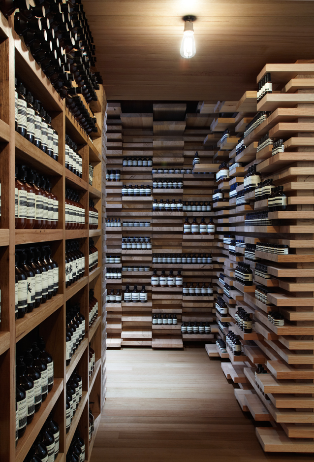
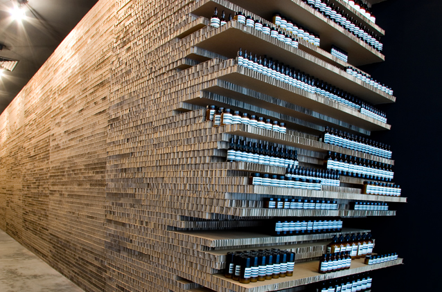
Aesop Paris, Rue Saint Honoré, by March Studio Australia.
“Rue St Honoré for example is one of the most referenced stores by our international customers. It is made up of rudimentary planks of Tasmanian timber laid on top of each other to create an interplay of materiality, light and shade.
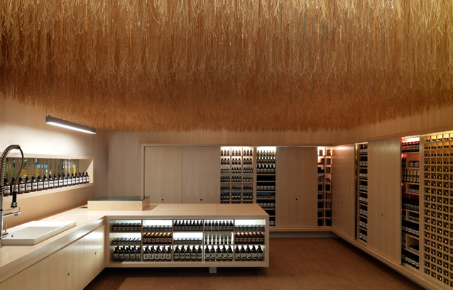
Aesop Singapore by March Studio, Australia.
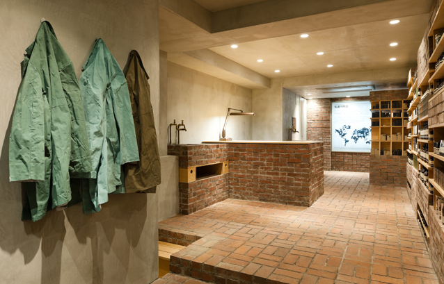
“In Tokyo, our flagship store in Aoyama has a ’lived in’ history in all of its fixtures. The store is appropriated from an old and disused seamstress’s house that lies forty minutes outside of the city, ” says Santos.
Aesop Aoyama, Japan by Jo Nagasaka of Sschemata
Careful not to single out too many of the retail outlets Santos explains that while materials and texture lead design –architects also take visual cues from the chosen site. This notion, she says, will be evident once again when they unveil their up coming store in Collins St Melbourne later this year. In this case their store is being built in a space that forms part of the Athenaeum club.
“The key thematic thread is a male salon with huge and languid leather curtain acting as a key feature. This seeks to create a private and intimate space that subtly intertwines with the history of the club and also speak to the local clientele in a mature and masculine manner.”
After 25 years, the stores have grown ever more awe-inspiring but the packaging remains relatively unchanged.
“Everything supports the products – the architecture, the design, the innovation – they are all constantly developing.
“Our consumer is one who is interested by the contents of our unadorned packaging, and interested the unexpected manner in which we communicate cosmetics.
“The majority of what you see, is generated in-house with a dedicated group of graphic designers, but throughout our history, Dennis has selected individual designers to work on special projects.”
“The packaging remains largely unchanged. But of course with each new subsidiary, and with each passing year, the scale of our production increases and the scope of our product range expands. Since Aesop was founded, to this very day, all our products have been made in Australia and our respect for literature and written expression has continued to form the backdrop to our communication for the entire twenty-five years,” Santos says.
Aesop Flinders Lane, March Studio, Australia.
Aesop Bondi Beach, opened in May 2011, is a relaxed and light-filled space, befitting the location. Tucked away from the crowded foreshore, it speaks to its setting by including aged Geelong wharf timber, fixtures of pale grey and white, and a marble countertop to cool the hands on steamy summer days.
Designed by Zenta Tanaka, an architect and proprietor of Melbourne’s CIBI, the store contains a carefully combined selection of natural materials, including boulders in the walls and dips in the floor. Tanaka says: ‘Dips in the landscape can be beautiful; they’re where things might change and grow. And combining mature wood, marble and varying textures lends a sense of relaxed character and calmness to the space.’
Aesop Bondi Beach
To mark 25 years Aesop is introducing a brand new hair care range. The Black Label haircare Range. “It is the largest single product launch we have undertaken to date, with ten new products to be introduced, all dedicated to the best in scalp and hair health and maintenance, ” says Santos, click here to learn more.


