Re-charged inner city locations are all the rage around Australia’s inner suburbs. Pastiche abounds in the world of re-development. Originality and authenticity are in comparatively short supply, but vital to the oxygenation of old streets made new again. Bellemo and Cat’s fibreglass walled home/studio in Northcote, Melbourne expresses an irresistible street art and presence in its neighbourhood of red-brick Victorian-era warehouses.
Cat: When the house was unveiled and I saw the cladding, I remember thinking it was so beautiful it could as easily be a jeweller’s shopfront in Zürich as a home/office in a Melbourne laneway.
Do you regard the house as sculpture or architecture?
Cat: We see it as a billboard for our practice and as a two- dimensional painting that’s wrapped as an image or a painting we’ve made for ourselves. Because the image goes around corners and becomes three-dimensional, from that point of view it becomes sculptural.
There’s an interesting narrative to the design. While almost every house has a front and back door, this has an office door and side residential door. That’s a hint of the radical design.
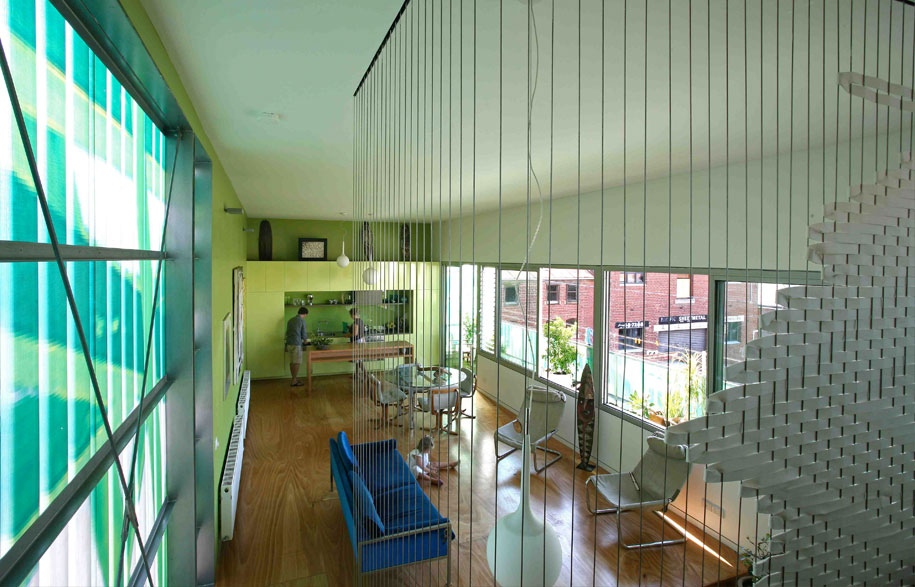
Cat: It’s not a Venetian palace, of course, but it has similarities from the outside. There is some elaborate detailing, not formal but decorative, with cornices and curlicues. You enter on the ground floor and it’s virtually empty. The ground floor is always on the first level. Here the services, garage and office are at ground level, but upstairs there is garden and main living space to capture views and sunlight. Australian houses usually put living areas downstairs.
How important is it for you to pursue the prototype rather than the stereotype?
Michael: Very. I think we would be scared of producing a stereotype of our work. The design should express the clarity of an idea that still looks like an idea. I couldn’t imagine Cat and I repeating the same old thing. Every project we do is an experiment in some way. Life’s too short to do otherwise.
This is almost the ultimate Green House. Is it as fully green as it appears?
Michael: Compared to the mud brick house covered in solar panels it isn’t as green. It uses passive solar principles, has water collection tanks. But this house sends a message from a symbolic viewpoint – that within an artificial jungle, you can create a viable alternative. Its other sustainability attraction is the home/office housed in a very economical container with a small footprint.
So what are the principal green strategies?
Cat: The basics – such as orientation – help overcome the need for the usual artificial heating and cooling. Double-glazing, for example, means we don’t run the heater all day. In winter it might be on for a few hours in the morning and evening and that’s it. We never need lights on during the day. There’s also something about the façade print that has the emotional and psychological benefit of occupying a green leafy environment.
One of the consequences of building light and stepping back from thermal mass is that you expose yourself to greater internal temperature fluctuations.
Michael: If the upper level had a concrete floor, that would further stabilise temperature. But having said that, we achieve pretty good results with insulation. We’ve over-insulated the ceiling, floor and walls and that’s one reason why it works so well. The other is that it’s north facing with a decent overhang/awning that shades the living spaces in summer. There are also louvres for cross- ventilation and a ground floor concrete slab that invites a good flow of cool air throughout summer.
Did you have a real sense of risk-taking?
Cat: When we showed our plans to build a family home and office we received all kinds of gasps. My mother’s response was ‘Yes, well you’re very clever’, meaning that you will need to be because this is not an obvious home or office site.
Well, what you have done is to create this quite large play-house. There is this real sense of adventure that carries right through from the design idea to the spatial experience.
Cat: The local kids definitely see it as this huge playhouse. They also see it as a cool house to hang out in. We had a group of twenty in here on the weekend and they were definitely very excited about exploring the place. Maybe there is something about seeing the colour and print that they think this is somewhere where they can break all of the rules and do all of the things they can’t do at home! While that’s not true, they do seem to see the house as a big adventure.

How did council respond?
Michael: We had no problem, especially because this part of Northcote is designated as an Arts precinct. It’s really just a modern warehouse exactly like all of the others built to the boundaries and it’s straight up and down.
One of your early projects was the well-publicised Pod House on the coast. What did that teach you – especially in terms of skin?
Michael: We’re just as interested with how a house should appear from the outside as from the inside. That comes back to whether it’s sculpture or architecture. The context of the object is vitally important. What does it look like when you come around the corner? That matters to us because we both work as public artists.
It seems that Japanese architecture is a big influence with regard to skin which is almost paper thin. The fibreglass skin is translucent and luminous of an evening and lustrous by day.
Michael: Shigeru Ban is a great Japanese architect, but I wouldn’t say it was uppermost in our minds with regard to influence. We make a point of reading very little media that might influence how we might approach a project. Of course we look at them, but we don’t search them out. Humanism is important.
It’s a great example of being considerate to the street. It might say ‘Look at me’, but it’s not ‘Me, me, me’. Even residential design can be generous and provide social enrichment.
Cat: It’s an interesting point because our neighbours love it. Most of them say: “You must have done it for us.” We’re definitely interested in the idea that it will be viewed and experienced by neighbours. We were quite conscious that we were going to build directly in front of the neighbouring property to the south. What that meant potentially was an overshadowing. By using web-glass we draw a lot of light right through the building and that then cascades out the other side into the laneway and onto their property.
Were you the dream clients?
Cat: We allowed ourselves to spend the money on the outside of the building. In practical terms it was quite unnecessary because we were almost broke. But we put the money into it. We would find it hard to convince a client who was struggling with budget to go to those lengths to support our ambition or vision. Our view was we won’t have a bathroom, but we’ll have the art. So you do what’s important to you.
Are you obsessive?
Cat: Yes, because it means that you’re driven doesn’t it and you’re driven by what’s really important to you. This is a ‘look at me’ house from that point of view. But we’ve done it because it’s important to us. We’re nice and kind to our neighbours, but we’ve really done it to enliven our own lives and it’s really made this house very beautiful.
This house was built as much as an adventure house for our kids as our love of building. Eventually, when the kids grow, we will move on. But it could just as easily be a design studio here with a boardroom where the master bedroom is. Were we to stay here, it’s been designed to allow an extra level. So, there is that flexibility.
Was there the moment of elation when you opened the champagne?
Michael: The most exciting time was seeing the pixel print of the fibreglass sheets and we could read the surface and visualise the completed skin.
That’s the thing isn’t it? When you build a house, the foundation work is really just like pulling on your underpants. It feels okay, but you really want the wow factor and that happens when you put on that final layer that, with some luck, people will take notice.
Cat: You got it!

Do you prefer to design on a sheet of paper or computer screen?
Michael: We almost never do the initial concepts on computer. We almost always do drawings and make models.
Is it simply more intuitive?
Cat: On a recent project we did sketch up on a computer and it all came together quite quickly and easily. We stepped back from it and looked at each other and asked: What has that got to do with anything? We took it to our clients, told them we didn’t like it and asked them if we could start again from scratch. It hadn’t felt like ours and quite frankly any one of ten practices in Melbourne could have come up with that design.
Who’s the moderating influence between you?
Michael: Everything that comes out of this place is collaborative, whether it’s a model or a drawing.
Cat: We both have a bit of that. We’re probably likely to say: Honey you haven’t gone far enough.
Photography by Peter Hyatt
DROPBOX
Architect: Bellemo & Cat
Location:
Parameters of project: 155m2. Deck 27m2
Structural Engineer: Felicetti Pty Ltd.
Construction Material: Corrugated fibreglass with print of firms design
Collaborator/Associate Designer: Michael Bellemo, Cat McLeod, Ashley Every
Bellemo & Cat
bellemocat.com


