A single unit, with the potential of indeterminable configurations, scale and patterning, the ubiquitous concrete breeze block is synonymous with Modernist architecture of the 1950s and 60s. The then popular material skinned residential and commercial buildings in cities prone to much sunlight, providing the assets of strength, easy maintenance, low cost and shade without removing natural ventilation. It also embodied the ‘less is more’ mantra of Modernist architects by combining decoration and structure in one stroke.
Overshadowed subsequently with sleeker materials like glass and steel, the breeze block is making a come back, reflecting the current desire for tactility and simplicity in design. “Many pre-fabricated elements tend to be mass produced but clinical. However breeze blocks, along with the brick, are both pre-fabricated, modular and yet rustic,” suggests architect and founder of Red Bean Architects Teo Yee Chin on the material’s renewed popularity.
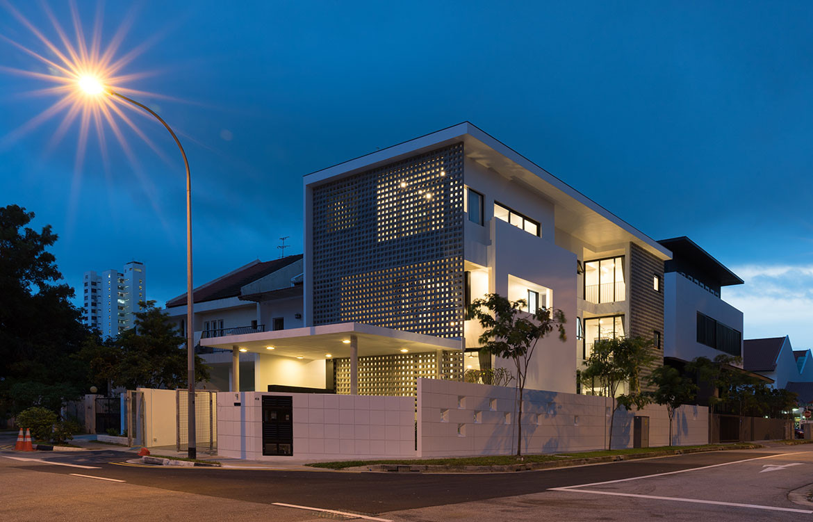
He should know, having given it centre stage in a new residence he has designed in Singapore for a couple who lives here with two young children and a lived-in helper. Within Frame House, the breeze block forms two walls rising up three storeys – at the front elevation and side near the rear where bedrooms are located – defining an architecture governed by white walls and rectangular planes.


This strategy of “framing” drives the design to achieve twin requirements of privacy from its corner roadside location and thermal comfort from the unforgiving tropical sun, especially since the house’s long side faces west. A two-storey gap between the front breeze block wall and the interior spaces allow the interiors to be naturally ventilated. This voluminous void at the foyer also provides an inviting and uplifting welcome into the property.
The full-height windows of bedrooms face the short side of the house, keeping the long façade relatively blank. Setting back the middle of the house allows bedrooms at the rear to obtain more indirect views and light, with deep roof eaves extending overhead to shelter this part of the house containing the common spaces – the study on the second storey and a lounge on the third storey for the couple to hang out near the stars wine in hand – from sunlight, rain and public views.
“Even within a tight plot like this, we made a deliberate attempt to layer the façade elements as different planes, creating recesses of different depths when seen from the long side. Layering is the architectural device here. This creates interstitial spaces that give privacy, shade or create sequences of movement,” explains Teo, referring to the balconies and voids on the different storeys.


The house is governed by a basic budget but is no less interesting. Within, herringbone pattern parquetry and deep blue carpentry laminate detailed with exposed edges pop against a foil of homogeneous tiles, white walls and mild steel railings. In the master bathroom, sea-green tiles exude calm and a vintage feel matching that of the breeze blocks.
Teo shares that that initially the husband wanted a resort house with a relaxed ambience incorporating nature and the wife wanted one more iconic in form. Frame House marries the embodiment of both desires in an abstract, restrained and graceful manner but most importantly conscientiously provides utmost liveability and usability in its design.
Red Bean Architects
redbeanarch.com
Photography by Daniel Koh and Tan Yun Liang
Dissection Information
Breeze blocks from All Well Trading & Transportation Pte Ltd
Bathroom and kitchen from Bravat, Grohe and Rubine
Sockets and switches from Schneider Electric
Interior tiles from Hafary and Ah Huat Trading
Joinery finish from Lamitak Laminates, Admira Laminates and Inspire Quartz
Hardware from Blum


We think you might also like Forever House by Wallflower Architecture + Design


