When the gavel came down to declare Croydon House, in Sydney’s inner west, officially sold to the highest bidder, the auction outcome made headlines.
It came at the height of crippling price inflations and the public was up in arms about what the purchasing party – a couple with two young children – had paid for such a dilapidated cottage.
While others baulked at the value exchange, the new owners called upon family to help realise the modern living sanctuary that it was destined to be.

The call couldn’t have come at a more fortuitous time for architect Ahron Best, whose sister had bought the house with her husband, and who himself had just co-founded an architectural practice, Apto & Best.
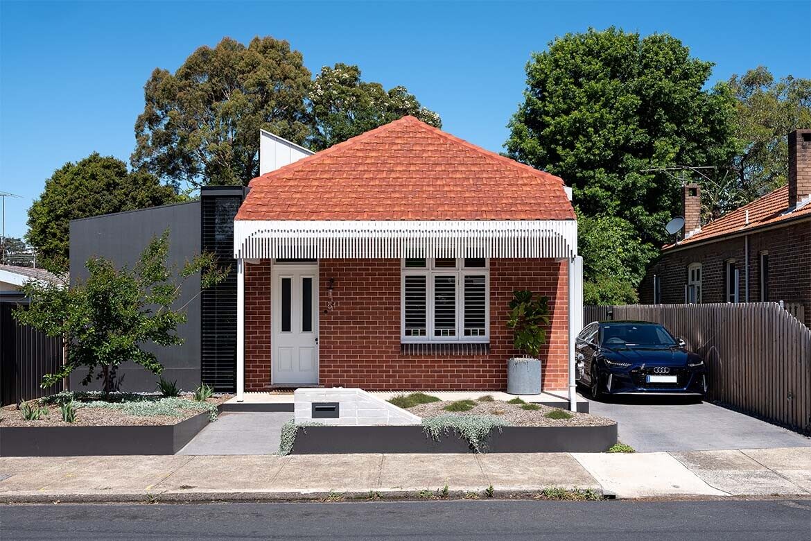
The purchased site consisted of an existing brick worker’s cottage – uninhabitable and without heritage significance – that had undergone several distasteful alterations over its life.
The premise of the brief was to restore the proportions of the original volume, as viewed from the street; reconfigure its layout to suit a young family of four; and create a rear addition, accommodating generous new kitchen, dining and living spaces fit for the lifestyle of a family who love to entertain.

All in all, it was a textbook residential alterations and additions brief. Ahron, however, would have no truck with a textbook response. Especially given the project would be the home of his kin.
“We wanted to resist the urge to simply open the living area to the rear yard when there were viable opportunities for north-facing living and entertaining spaces along the side boundary,” says the architect. “Our intention was to activate the entire site by creating a series of connected spaces inside and outside of the building that respond to the physical conditions of the site and programme.”
Embodied as a single, free-flowing volume, Apto & Best’s extension of Croydon House eschews the mundane. Having been pushed, pulled, twisted and cut out of, the addition comprises a series of subtly demarcated internal and external social spaces.

Without the disruption of internal walls to the programmatic flow, unique spatial characteristics distinguish the family spaces from one another.
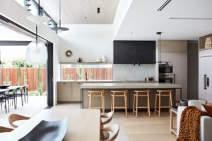
The galley kitchen is pushed out toward the southern site boundary. Its island bench physically transcends interior space, cutting through glazing to ground itself in an intimate, south-facing courtyard.
Framing the view of the discreet garden quad, inhabited by a young maple, the glazed courtyard wall becomes a backdrop for the dining area. Finally, the family living area is defined by its lowered ceiling and slightly tilted orientation.

The subtle rotation of the lounge area gives it a cosier, more subdued feel, compared to the expanse of space that comprises the kitchen and dining zones. The space is punctuated by sliding glazed doors that open out to the rear yard while orientated ever so slightly toward the site boundary, obscuring the view through to the lawn from the rest of the house.
“When looking down through the hall from the front entry you only get a glimpse of the yard at the end of an angled wall, drawing the viewer deeper into the house,” says Ahron, confessing his penchant for angles.
It’s evident in Croydon House that the architect has a knack for using them, where eloquent tilts made at just the right moments in the building’s form bring fresh light, air and perspective to the spaces.

To the north of the living area, a monolithic raised planter box resolves a dog leg in the site boundary while doubling as a bench seat for guests during barbeques, or a piece in an imaginary obstacle course for the kids to jump on and climb over.
Humble as it is, the wide-edged masonry planter physically connects the living space and backyard to another courtyard, to the north of the kitchen/dining spaces, becoming a powerful piece in the spatial puzzle of Croydon House’s new social wing, as Ahron himself can attest.

“Having experienced an entertaining event here, it was extraordinary to see all the spaces being used at once,” he shares, “from people sitting on the planter both inside and out, to kids running over the planter between the spaces, people sitting at the island bench, using the island bench, sitting at the dining table looking over the southern courtyard, standing in the northern courtyard, or occupying the rear yard. These active spaces create a sense of life to the architecture and encourage constant movement between them.”
Dealing with the junction between old and new is a perennial challenge for architects of contemporary alterations and additions, and this one was no exception. In this case, rather than attempting to downplay the juxtaposition, Apto & Best opted for a more sculptural solution.

The original house has been dissected at the opportune moment, where the private spaces – two bedrooms, a generous family bathroom, powder room and a home office – come to an end. The bricks from the dismantled build have been salvaged and repurposed in the form of a momentous wall.
Demarcating the transition between the residence’s past and present decisively with its exaggerated contemporary vernacular expression, the wall now acts as the backdrop for the family’s daily life and the activities that bring them together. As one arrives at the contemporary addition, a large skylight has been inserted and carefully detailed so that it appears to be floating into the brick elevation.

A similarly uplifting effect is echoed where the height of recycled brick redefines the roofline of the original house. Ample voids take advantage of the ceiling’s newfound reach with clerestory windows tactfully angled to reap the benefits of passive solar design and draw light and warmth from the north into the bathroom and hallway.
Fitted with operable louvres, these windows need not be large to have made a profound impact on the habitability of the home.

Though designed and built with all the necessary provisions to be fitted with air conditioning, having now lived in the house for a full cycle of seasons, the residents have honed the art of controlling the microclimate of their home using fenestration and the sun’s energy alone.
Finished with a deceptive air of simplicity, there’s much more to the new Croydon House than meets the eye. But its true measure of success is in how it elevates, activates and simplifies life for its residents, all at once.


Project details
Architecture and interiors – Apto & Best
Photography – Tom Ferguson
This story originally appeared in issue #51 of Habitus magazine – the Kitchen & Bathroom special


