French Fold is the latest in a series of restaurants in Singapore by the Merci Marcel group, known for proffering design experiences that are fresh, immersive and always impeccably designed.
Envisioned as a modern French brasserie, the restaurant is an all-day dining space with a focus on traditional crepes and galettes. Helping to realise this vision was design firm Takenouchi Webb. Set within a traditional shophouse along Telok Ayer Road in Chinatown, French Fold occupies a long, narrow space that is punctuated by a central skylight.

It was decided from the outset that the restaurant should be differentiated from the other Merci Marcel restaurants which are soaked in light. In contrast, French Fold takes on a darker, industrial quality. Put in the hands of Takenouchi Webb, it also puts forward a decidedly more sensual experience. “We sought to create an interior that expressed the unique quality of the existing shophouse building, combined with the feel of a French Bistro, but with a unique tropical atmosphere derived from its location in Singapore,” shares Marc Webb, director at Takenouchi Webb.
Takenouchi Webb is a master when it comes to orchestrating materials and textures in the spaces they design.
They started by gutting the entire shophouse. This revealed a textured canvas of brick walls and arches, raw concrete columns and timber ceiling beams, most of which have been left exposed and celebrated. Keeping the entrance as open as possible, metal-framed glazing that is fully opened during the day creates a sense of welcome. It also introduces light at the front of the restaurant.


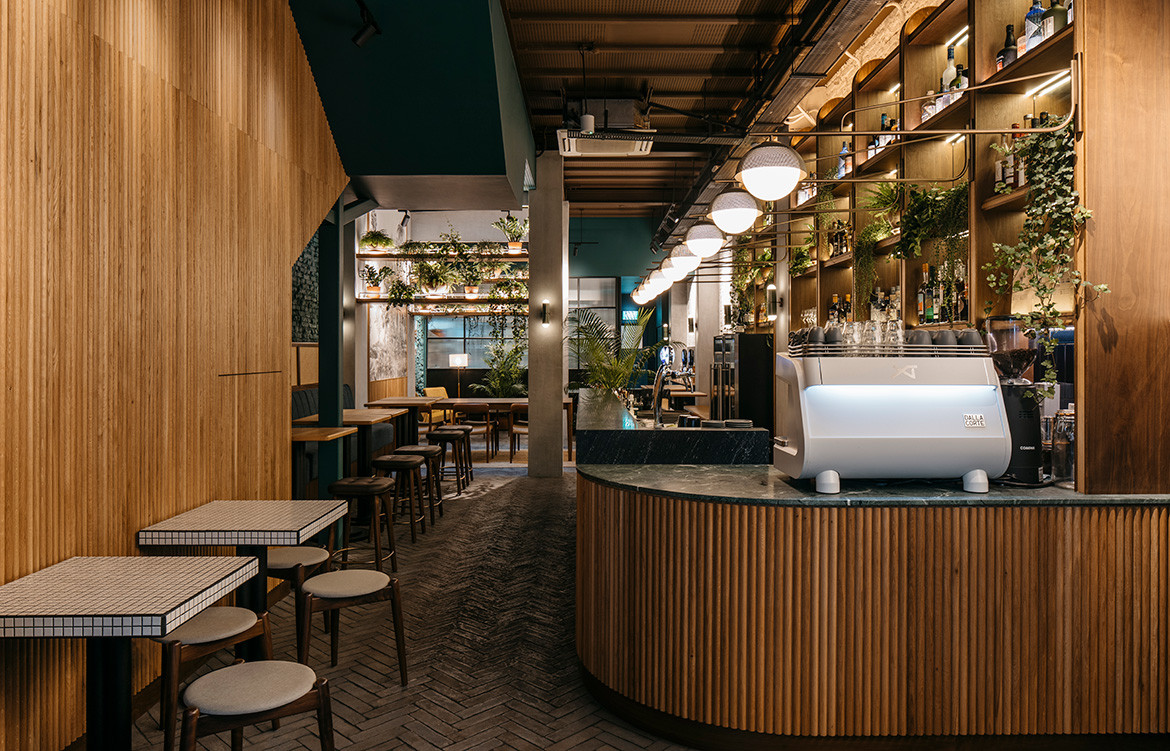
Once inside, a bar sets the tone for an afternoon (or evening) of escape from the city’s hustle and bustle. It is painstakingly clad in slender timber strips and capped with a green-and-black-veined marble. Behind, timber shelves are laden with bottles of intoxicants accompanied by overflowing pots of greenery. Decorative lights hung off the vertical sections of the shelving add another rhythmic layer to the mise en scène.
The clients had also requested for different seating types to be incorporated into the space—no small feat considering the narrow proportions of the shophouse plan. Nonetheless, Takenouchi Webb managed to work in an assortment of seating options including lounge seating, banquette seating, and high chairs.
“It’s very casual. People can sit in the front at the window while on their laptop, or they could go to the back where it’s much more intimate. You can have a different experience every time you visit, even within a small space like that,” Webb says.


Of all the seating types, the large communal table set within the skylight area steals the show during the day. It is illuminated by a rare spot of daylight deep in the plan. Existing columns bridged by open shelving of verdant greenery define the space. By the side, a scenic wallpaper merges both French and tropical influences in one elegant sweep.
Decorative lights hung off the vertical sections of the shelving add another rhythmic layer to the mise en scène.
Takenouchi Webb is a master when it comes to orchestrating materials and textures in the spaces they design. Their work with French Fold is no different. In addition to the textures found at the bar, brick walls have been painted over in white and sea green on facing walls respectively. Skirting parts of the white wall is a lower datum-line of deep blue ceramic tiles. On the floor, handmade dark terracotta tile laid in a herringbone pattern grounds the entire space.

“Although they’re rich textures, they are big statements in the space. We defined how they are used quite clearly too. For example, we used timber slats in the ceiling to define the architecture—it’s all closely related to the architecture of the space. We try not to mix everything up with no reason,” Webb explains.
In the hands of anyone less skilled, the mélange of textures in a small space like this can easily be overwhelming. Not so in this case, where everything sings in pitch-perfect harmony.
Takenouchi Webb
takenouchiwebb.com
Photography by Studio Periphery
We think you might also like Eden, in Bondi, by De Simone Design


