Classical Gas, mulitplicity
Australia
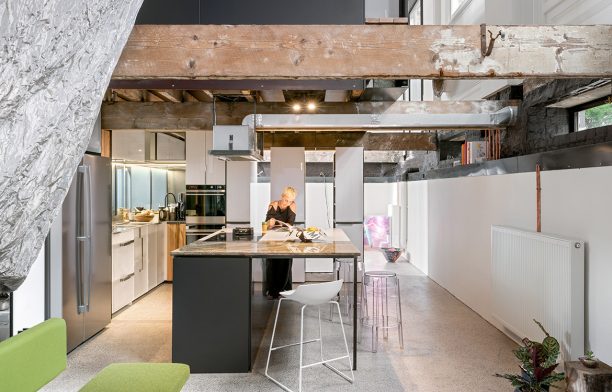
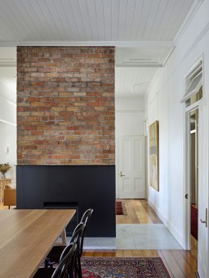
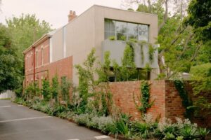
This c.1889 heritage-listed building in North Melbourne, originally occupied by the Metropolitan Gas Company, still stands proud with its arched windows and tessellated brickwork. Re-worked by Multiplicity, what was formerly a shell carved into two levels is now an extraordinary new home.
Although the team faced the usual heritage constraints, they didn’t need to be coerced into retaining the building’s many fine features: rosettes, wide cornices and chunky beams. The 150-metre-squared footprint with the opportunity to create over seven-metre-high volumes is a rarity so close to the city.
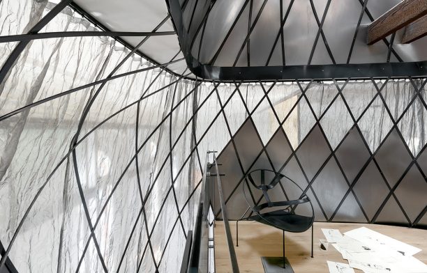
Iconic to the residence is the ‘pod’ which acts as the spine of Multiplicity’s design. It comprises a steel woven basket-like frame, and is fully enclosed with a steel mesh fabric that allows diffused light while still maintaining privacy for the main bedroom.

Words by Stephen Crafti | Photography by Emma Cross
Seed House, Fitzpatrick + Partners
Australia
This is a project that took over eight years, including a design period of three years (and more than 400 drawings) and a construction period of 2.5 years. It entailed, says architect James Fitzpatrick, “exploring new and old and technologies, every material and finish choice (no plasterboard, minimal paint and optimal recycling of onsite materials) to create a low-energy, healthy and natural home, and allowing these decisions to inform both the interior and external aesthetic”.
The spaces within – especially on the entry level (kitchen, dining, sitting rooms) – flow freely into one another and there are many which reveal themselves only when one opens the flush, timber-battened doors, creating a sense of perpetual discovery. It is a home designed to accommodate the different existing needs of the family while also adapting over time as needs change.
Words by Paul McGillick | Photography by Ben Guthrie and John Gollings
Bivvy House, Vaughn McQuarrie Architects
New Zealand
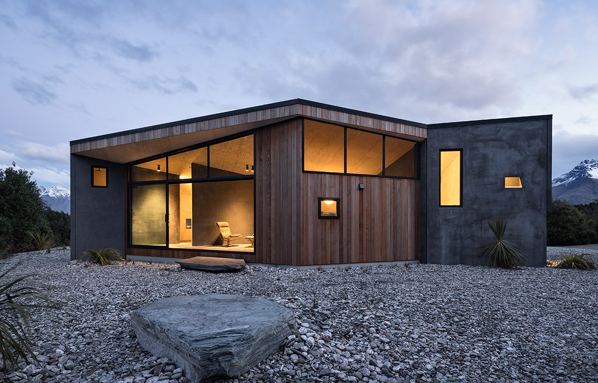
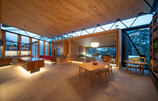
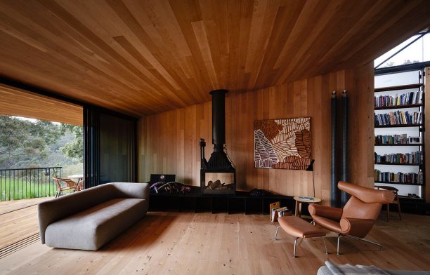
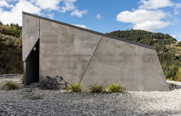
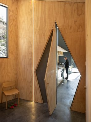
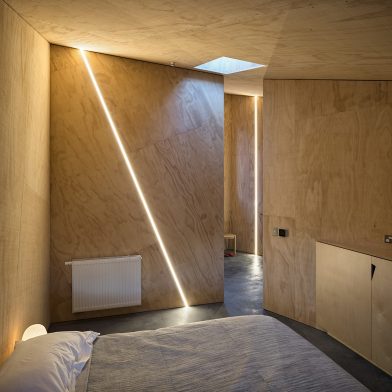
“We began to imagine how we could somehow repair or reinstate part of the site by referencing the original contour. This led to how the house might have been formed around large rock fragments left during the platform excavation. A rock bivvy perhaps,” says architect Vaughn McQuarrie.
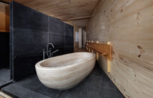
Sensitive use of materials internally creates very different moods according to the use of the room. Vaughn has assigned three areas as the notional rock fragments – the garage and two sleeping spaces. Wrapped in thermally-separated pre-cast concrete, they are coloured the same dark grey as the underlying schist. Spaces in between – kitchen, dining and living – are clad more lightly in glass and cedar.

Words by Andrea Stevens | Photography by Simon Devitt
Teneriffe House, Vokes and Peters
Australia
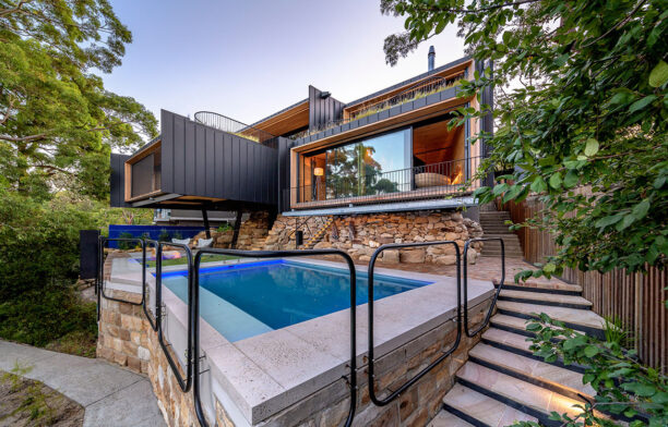
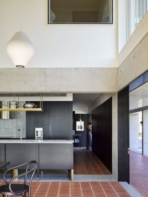
The first step in the re-jig of this beautiful Queenslander built in 1909 was to turn the house 90 degrees and push it back further on the block, easing up generous garden space on the streetside north and offering the length of the house to that aspect.
Reclaiming the undercroft for the main family living spaces is the key intervention in the plan. The kitchen takes up the pivotal ground corner position, facing the pool to the east and the expansive northern garden, replete with a playful amphitheatre for children’s shows. A paved brick arcade extends the kitchen floor space outside. Original timber stumps are replaced by a substructure of concrete beams, and the wide concrete arcade becomes the new support. Black striated screen walls and stable doors recall darkened battens, supporting the more refined white timber and shingle structure above.

Words by Margie Fraser | Photography by Christopher Frederick Jones
House In A Grove, STO.M.P
India
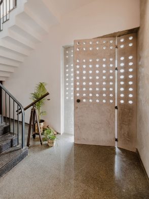
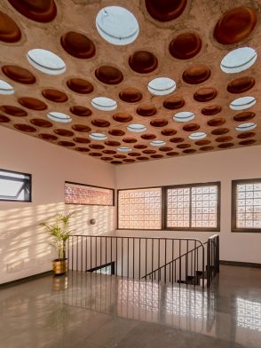
This villa, standing in a kind of raffish no-man’s land, has inherited the rich history of its locale. The clients wanted to modernise the house without sacrificing its links to the past. This involved rethinking the massing of the house, creating an open plan and a hierarchy of spaces linked by corridors and voids, the creation of indoor–outdoor spaces and a strategy to cope with a hot climate.
The upper façade is wrapped in a terracotta jaali – an Urdu/Hindi word literally meaning ‘net’, but used to denote a perforated screen and related to the Islamic mashrabiya with its decorative patterning. This screen, along with generous eaves, provides protection from direct sunlight but lets in the breeze and beautiful dappled light to the private spaces on the upper level. Inside there are skylights and two light wells which draw in further natural light and help generate a satisfying play of light and shadow. This light filters down into the ground floor living spaces generating a reassuring sense of changing light during the course of the day.

Words by Paul McGillick | Photography by Prithivi M Samy
Vote for your Habitus House of the Year in the People’s Choice category to go in the draw to win The Ultimate Design Hunter Package – $40,000 worth of prizes from our Design Hunter Partners Armadillo & Co, Boyd Blue, Earp Bros, Euroluce, Hale Mercantile Co, Nique, Premium Sound, Phoenix Tapware, Project 82, Studio Gallery Melbourne and Tsar Carpets
Habitus House Of The Year wouldn’t exist without the support of our friends, colleagues and regular collaborators in the industry. We would like to extend our sincerest thanks to our Major Partners Gaggenau, StylecraftHOME and Zip and Supporting Partners Armadillo & Co and Earp Bros. Our Trophy Partner Axolotl and our Accommodation Partner Ovolo Laneways.
Habitus House of the Year
habitusliving.com/houseoftheyear


