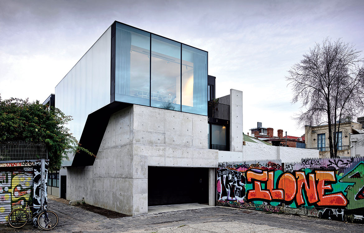
Set in the back block of an inconspicuous laneway on the streets of Fitzroy, Melbourne, is a house that stands strong. It draws the eye down the lane and creates a sense of awe. And that’s just from the outside. Step inside the home of Lucy Feagins and Gordon Johnson and one is transported to a sanctuary for modern living.
“Fitzroy is a very gritty environment, so the requirements for the home needed to offer some sort of refuge from that. It means when you go through the spaces there is always somewhere to look that is peaceful,” shares Kennedy Nolan principal Patrick Kennedy. “It’s amazing how there’s really not much space around this house, it’s a tight block but it doesn’t feel tight, and I think it’s because of the thoughtful little inclusions,” adds Lucy.
The project was a long time coming for Gordon and Lucy, having first acquired what was a “big old tin shed” some 12 years ago. As could be expected, Gordon and Lucy’s life was rapidly changing throughout the design and build process – they welcomed a baby and Lucy’s business (The Design Files) continued to go from strength to strength. “The design adapted to these changes,” says Patrick, making room for the shifting needs of his clients.

Some things that didn’t change over that time were the need for plenty of natural light and outdoor areas. “To get these we gave up lots of space to the void, lightwell, and the upstairs terrace,” says Gordon. Where many people would opt for as many rooms and as much space as possible, Gordon and Lucy chose instead to do the opposite. The resulting sense of spaciousness reveals itself upon traversing the threshold, where stairs lead you both up and down, and a massive void alongside a semi-translucent exterior wall pulls the eye upwards, inviting you to climb the stairs. “[The Ampelite wall] was a really amazing suggestion because if it was all solid it would feel quite dark. Now, it’s just so bright and beautiful even though there are no windows on one whole side of the house,” says Lucy. Patrick elaborates that it was all a matter of “balancing light and aspect”.
The void is a similarly strategic device. What was originally planned as a fourth bedroom was scrapped in favour of a central void space that accentuates the overall height of the building. “The void creates a much more beautiful entrance experience as you come up the stairs. It was more important to us than a room we would never go in,” says Lucy. “Gordon and Lucy were quite happy to carve bits out for outdoor space, vertical space, double-height space, and triple-height space – that’s because they weren’t greedy about the yield. They weren’t trying to max everything out and that means you end up with a much lovelier experience,” notes Patrick.
Fitzroy is a very gritty environment, so the requirements for the home needed to offer some sort of refuge.

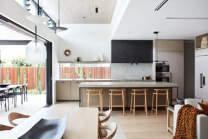
The top floor is the hub of the home, housing the living, kitchen and dining spaces, alongside the necessary inclusion of a terrace space. Full-height glass, large sliding doors and semi-operable windows coalesce to make for what Lucy describes as a “well-proportioned but generous-feeling space”. And despite the “postage stamp size” grassy nook, Lucy and Gordon are chuffed to have a veritable green lawn within such a densely urban environment.
Moving down to the second floor, the feeling becomes more intimate, as it should since it holds the bedroom and bathroom spaces. Again, nothing has been blown out of proportion, every room is rather modest while remaining comfortable. A notable inclusion in the main bedroom is a show-stopping bathtub, positioned across a balcony-like threshold looking out to a green void. It is at once private yet connected to the outside. “The bath is one of the best things, our daughter bathes in it every night and it means we’re not stuck in a little bathroom, we can actually just hang in the bedroom and watch her,” says Gordon. The idea came from Gordon and Lucy’s stay in a Shanghai hotel. “It works extremely well because you get an extra threshold and depth rather than it being right on the edge. So you actually get a sense of space,” adds Patrick,
from the architect’s standpoint.
Kennedy Nolan has employed many clever considerations that maximise every inch of the home. Other details that may not immediately be noticed but still add to the romance of the whole home include a Juliette balcony that connects the top floor living space to the rest of house by offering a vantage point back down the stairs. “It’s quite an eccentric, tall single space so we wanted to instil a relationship between all the levels,” says Patrick. Likewise a full-height window in the dining room – which extends up above the ceiling and pelmet – creates a dramatic viewpoint to the laneway below. And perhaps the most intriguing thing of all is that when staring at the building’s exterior it is disorientingly hard to decipher which room is which. “There’s a lot of abstraction in this building, particularly in the exterior,” says Patrick. “We were trying to avoid that thing where the house becomes very legible from the exterior. It’s more like an open architectural object in space. You need to create a level of privacy and separation in order to not feel scrutinised as an occupant.”
Ultimately, Kennedy Nolan has created an urban refuge, allowing Gordon and Lucy to stay connected to a suburb they love dearly while simultaneously giving them a home that rejuvenates.
Kennedy Nolan
kennedynolan.com.au
Photography by Derek Swalwell
Dissection Information
Solid oak floorboards with WOCA Neutral finish
Saw cut travertine tiles from RMS
Semi-translucent Danpalon facade system
Lexicon Quarter paint from Dulux
Cabinetry by Gordon Johnson
Le Corbusier dining chairs from Thonet
Lighting from InLite
Tizio bedside lamps by Richard Sapper for Artemide
Tapware from Astra Walker
Laufen living square sink, Vogue stone bath and Momento tile inset from Bathroom Warehouse
Wall tiles from Anchor Ceramics
Circular mirrors by Gordon Johnson


We think you might also like Liverpool House by Kennedy Nolan


