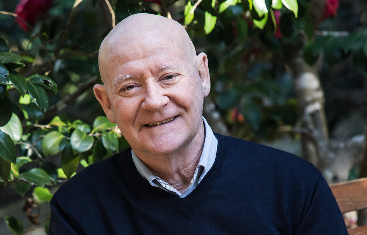
Ian Moore is an architect known for his black and white palette and glass louvres, but his aesthetic is, as he says, basically about “keeping it as clean and simple as possible”. In the case of the alterations and additions to this inner suburban Sydney house, the interventions are so subtle that it is not immediately apparent that anything has been done at all. But the house quickly reveals that he has achieved a highly refined and understated relationship between old and new, respecting the past without indulging it.
Sydney’s Surry Hills may these days be Trendy Central, but it has a past which its new generation of residents value as much as those who were born and raised there. It has always been a quirky suburb, mixing low-income residential with the rag trade, diverse lifestyles and maintaining itself as a connection with Sydney’s 19th century past as well as being a hub of contemporary innovation and experiment. Ian Moore points out that the shops always tended to be randomly distributed rather than forming strips. This property was a case in point – a butcher’s shop dating from 1898 and the only shop in a street of terrace houses and some low-rise commercial buildings.

As a shop it fronted straight on to the street with no setback. It was one-room deep with a cool room out the back. The butcher lived in the next door terrace with doorways linking the two properties at ground level and on the first floor. Over time, the shop became a self-contained residence with a new façade and windows for the front and rear walls – windows which are still there. The original butcher shop tiles are still on the walls of what is now the living room, while the original floor tiles are also still there, but now hidden beneath a raised timber floor introduced by a previous owner to match the level of the back yard.
This project consisted of two stages – or three if you include the fact that Ian Moore and his wife (who live close by) are friends of the clients and actually found the house and urged them to attend the auction which, says Ian, they won by 11 cents! Otherwise, Stage 1 involved a new kitchen and some work on the rear courtyard.

But Ian Moore had done a master plan which indicated what could be done further down the track. In this, he was helped by the existing height regulations in the street which enabled him to add a new level as part of Stage 2 and still remain lower than the highest buildings in the street.
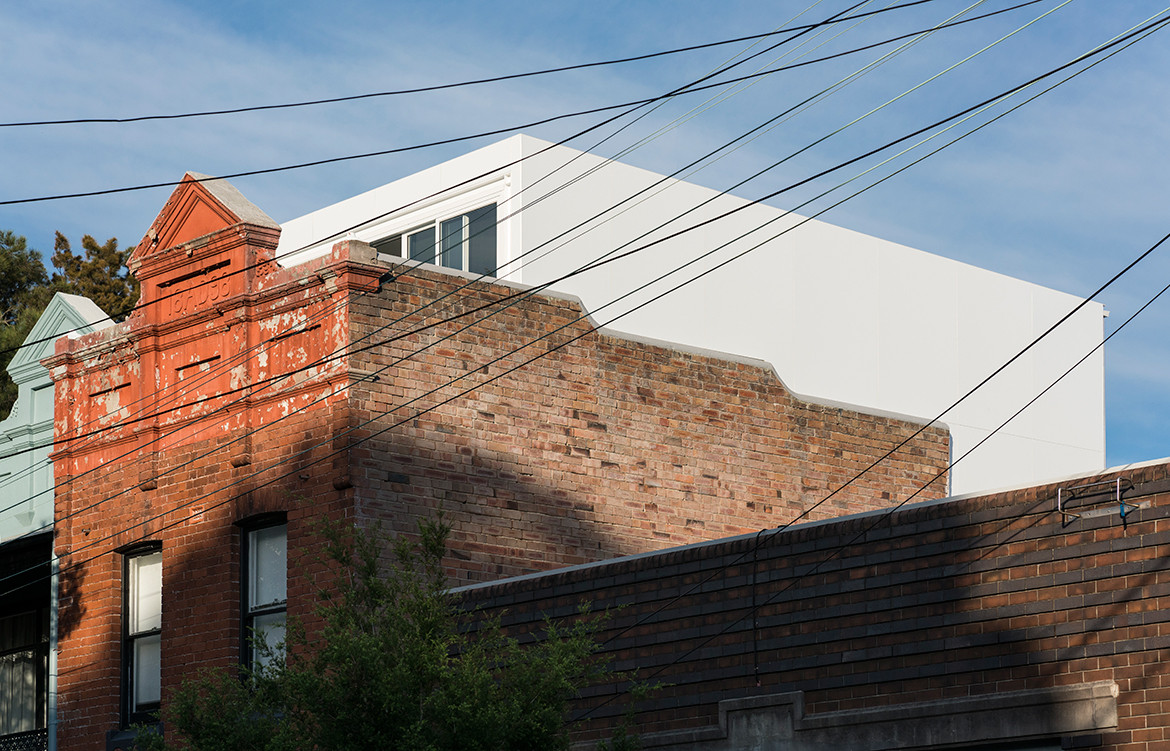
“It was important to make something that was so simple and contemporary that it didn’t compete with the original building,” says Ian. “So, up there we have put a white aluminium box. You don’t really notice it. And it’s set back from the original parapet with a little roof terrace inside (behind the parapet). That’s the main bedroom.” This discreet, private and light-filled little pavilion on top of the original building – along with a sinuous new spiral stairway like a tower linking all three levels of the house – represents Stage 2. The glass louvres for the rear elevation and the handrail for the stairway to be installed.

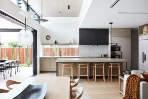
But, as always with Ian Moore, the magic lies in the details. One enters the house straight from the street with the door on the left. Once inside the circulation continues to range left. A wonderfully luminous – and beautifully proportioned – doorway leads into the kitchen. This luminosity comes from the reflected light of the kitchen tiles, themselves illuminated by an oculus in the kitchen ceiling which, with the passage of the sun during the day, projects constantly changing shapes on to the wall. In turn, the kitchen leads out to the rear courtyard through another superbly scaled glass door.
But there had been circulation issues with the kitchen, the existing bathroom and the tight return of the stairway. These were resolved by Ian with an elegant, long dining and preparation bench in the shape of a hockey stick – which Moore calls “the big gesture” because it is both directional and a sculptural device helping to make the kitchen the “hub” of the home and the link to the rear courtyard. The circularity of the ‘hockey stick’ echoes the round oculus, while the hard-wearing black lino flooring sets up Ian’s typical conversation with the all-white finishes.

The clients’ two young boys have their bedrooms (with some Ian Moore-designed mobile cupboards) on the first floor along with an ingenious study nook on the landing. The master bedroom above continues the black-white conversation. Up here, you are amongst the trees, enjoying dappled sunlight from the west as it makes its way through some handsome established trees. Bathed in light from the little roof terrace, its privacy protected by the restored original parapet, the bedroom is separated from the ensuite by a wardrobe unit with a gap between the top and the ceiling which helps to sustain a sense of space and flow. Meanwhile, the bed features customised, Ian-Moore-designed fitted aluminium side tables in the quest to keep it simple by avoiding additional freestanding furnishings. From the outside, the rooftop addition can scarcely be seen, confirming Ian’s agenda to create a functional contemporary addition without compromising the historic character of the building or the integrity of its neighbours.
Ian Moore Architects
ianmoorearchitects.com
Photography by Daniel Mayne
Dissection Information
Vivid white paint from Dulux
Naoto Fukasawa Deja-vu stools by Magis from CULT
Jasper Morrison air folding chair by Magis from CULT
Side chair by Knoll from Dedece
Sobork 3050 dining chair by Fredericia from Great Dane
Tray table by Hay from CULT
Eileen Grey light by ClassiCon from Anibou
Ceiling light by Bega
Bathware from Caroma
Stainless steel linear drains from Stormtech
700 wide oven, gas cooktop, and canopy hood from Ilve
Fully integrated dishwasher from Smeg
Fully integrated freezer and refrigerator from Fisher & Paykel


We think you might also like A Compact, Coastal Home by Topology Studio


