When the clients of Brewin Design Office purchased their apartment within The Keraton at the Plaza building in Jakarta, Indonesia, all they got were the keys to the door and the right to do with the space that which they wished. Units within this building were sold completely bare – “essentially just a large concrete box with windows”.
Furniture and appliances are specified post sale by the new residents, as one would expect. As are the textiles and finishes, also not out of the ordinary. But in the case of The Keraton at the Plaza, even the programmatic layout is at the directive of the residents: the unit is literally and figuratively simply a shell and even the wet areas such as the kitchen and bathrooms need to be planned out by the residents.

For Brewin Design Office, who took responsibility for the full scope of the project from spatial planning to furniture, finishings and hardware, this formed the ideal blank canvas rivalling that of a new build.
The clients were a young family of three with a penchant for art and desire to grow their collection – and family. As such, the brief was for a home that needed to be flexible in its ability to contract and expand. Programmatically and quite objectively, this meant three bedrooms and a family room in addition to the living/dining spaces. It also meant strategic wall coverage for existing – and future – art to be displayed.

The final layout (and there were more than a few considered beforehand) sees the entry vestibule transport residents or visitors through an artwork gallery that doubles as a bridge between public and private zones. With a liberal footprint of 2.2 metres by 15 metres and a generous 3.5 metre ceiling (that’s almost 12 feet), the inefficiencies of a typical hallway are done away with and this gallery-like space is in fact highly functional.
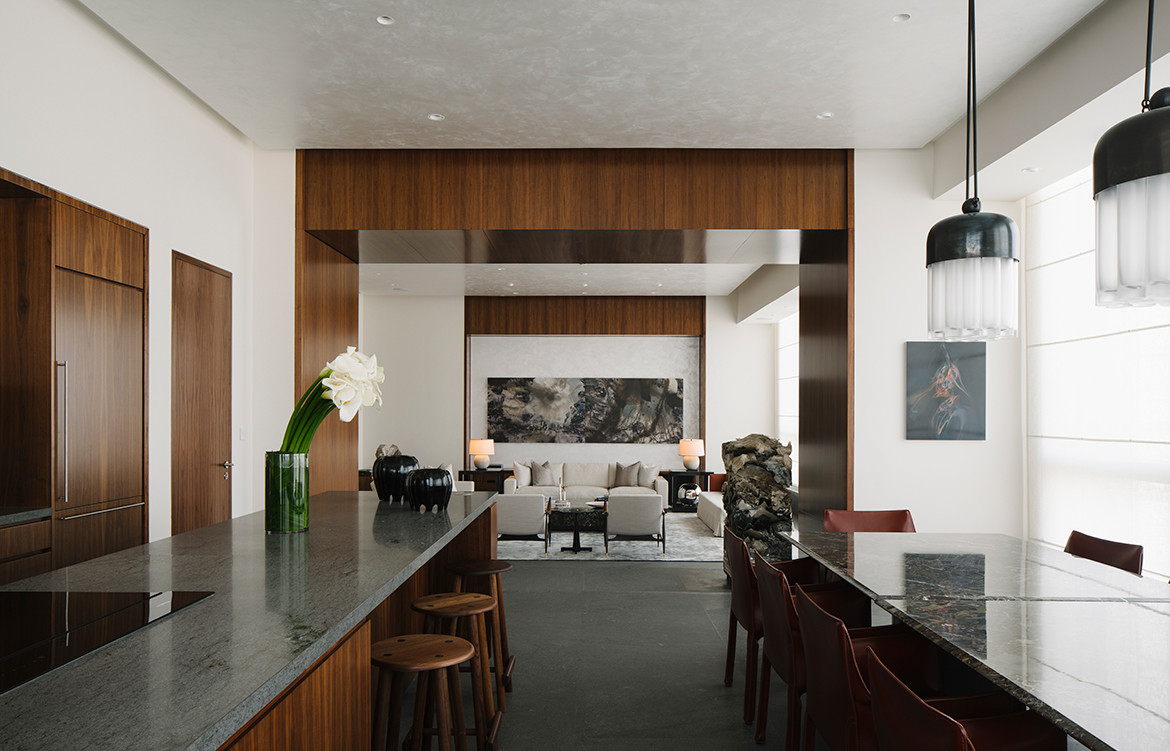
As one exits the artwork corridor they are deposited into the family room that together with the three bedrooms takes up two of the four equal bays that neatly divide the structural layout of the apartment. Moving through the residence, the living room feels bright and airy in comparison to the more subdued family room, due in large part to the lighter furnishings and open-plan connection to the kitchen and dining zone.

Brewin Design Office has accentuated the openings and doorways as one transitions through spaces public to private or public to public. Many of these openings work to frame an artwork, piece of furniture, or mise-en-scene in the connecting room. This is achieved firstly through the significant depth of a 40-centimetre opening, and secondly in the use of dark American walnut timber in thick veneered planks and a timber header. Moving from the living room through to the kitchen or dining area is where this is most noticeable: care of a 1.2-metre-wide opening.
American walnut timber is carried through from accents on the doorways to the kitchen cabinetry, bathroom cabinetry, and the flooring in the bedrooms and family room. For the floor in the public spaces, (kitchen, living, dining) granite stone was chosen. The furniture, much of the loose and all of the inbuilt, was custom designed by BDO using rare marbles and timbers such as figured maple and figured sycamore as well as the previously mentioned American walnut. It was then fabricated by a cabinetmaker in Australia. A standout example is the 3-metre long window sofa in the dining room.

As a resident, guest or even onlooker as you move through the apartment there are consistencies in design that span the interior architecture to interior design to decoration and final touches. Being responsible for the design of the residence in its entirety, and with clients who trusted them implicitly, Brewin Design Office was able to take full ownership of the project and result are palpable.
Brewin Design Office
brewindesignoffice.com
Dissection Information
American Walnut Timber
White Oak Crown Cut Veneer
Venetian Stucco
Quarzite Atlantic Stone
Statuario Chorchia Stone
Travertine
Dinamarquesa Armchairs
Bathroom fittings and fixtures by Lefroy Brooks


We think you might also like Taipei House by Valerie Rostaing


