In a rapidly developing metropolis, spaces that exist simply to provide a sense of space are exceedingly rare.
Metropolitan Manila, like so many other South East Asian cities is strewn with towering condominiums perpetually under construction. Life here can be claustrophobically congested.
The Manila House by actLAB sits at the other end of the spectrum – a notable example of considered spatial design against a backdrop of stifling density. Situated within an old pocket of Makati City and built for a young professional couple, the project was briefed as a nuanced interpretation of the traditional Filipino home.
“It was important to us to not be just one of those new houses following the same ‘modern’ trend,” say the residents.
“They are a contemporary Filipino couple, and wanted a modest, clean-lined house that will sit well in its context,” says Aya Maceda, founder of actLAB. “They knew of my modern interpretations on vernacular architecture and that I was starting my own practice, and they wanted to work with me.”
The inherited existing house had sustained water damage from the last typhoon in the area. For their forever home, the clients wanted to maximise what they could build on the property to include three bedrooms, three bathrooms and a home office, as well as an open plan arrangement to cater to the extended family gatherings customary in Filipino culture.

“There is a Sunday lunch legacy in this family where three generations get together weekly to share a meal. Siblings and parents catch up, children are running around in the background… you know, it’s big!” says Aya. “So I designed for that, with the idea that the many segments of the house would be visually connected.”
The expansion of the structural footprint towards the bounds of the site gave rise to the pivotal courtyard feature at the core of Manila House, which lends the home its uniquely inward-facing quality.
“It always rains in the Philippines, so we wanted a covered outdoor space – a lanai, which is an important space in the Filipino vernacular – our equivalent of a veranda. Traditionally, it is an open air living room that is covered, and facing a garden,” says Aya.
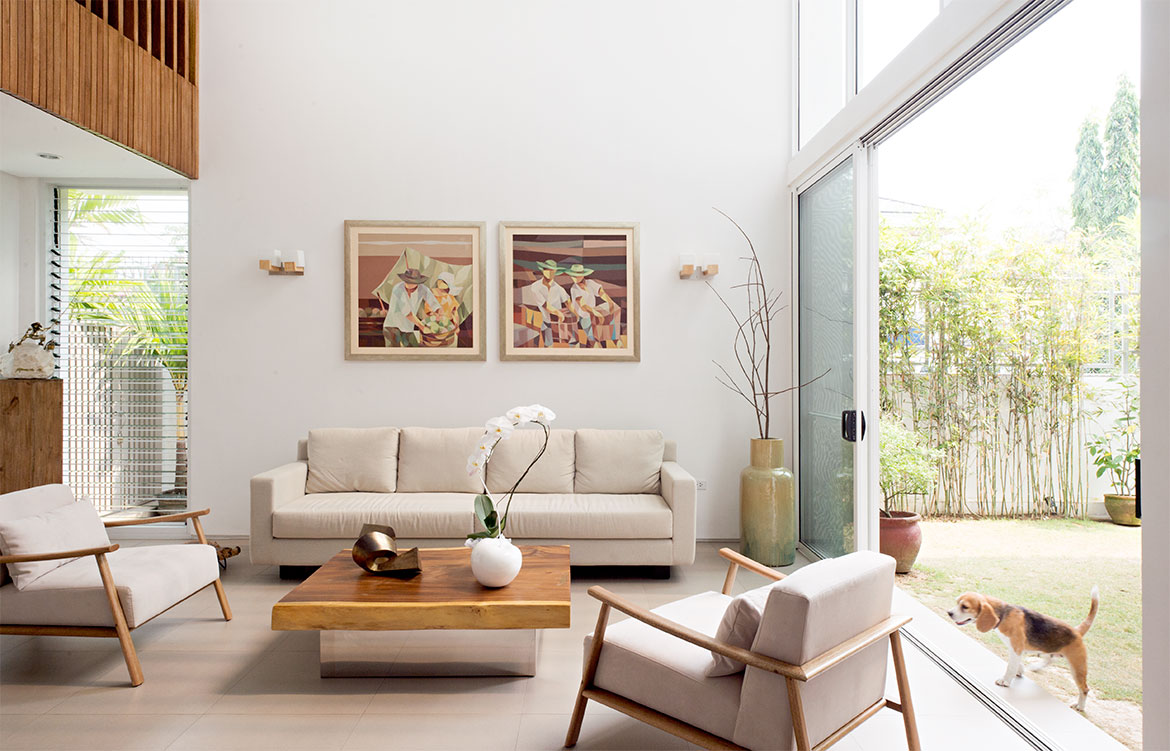
This green space at the heart of the home separates the dining room and double height living area, skilfully compartmentalising the ground floor while enhancing its spacious, sociable feel.
“The house is zoned in clusters. Visually, you feel you are all in one space, but at the same time, the spatial arrangement allows for different pockets of conversations to happen,” continues Aya.
In a culture so rich in celebration and family feasting, it follows that many Filipino households, even modest ones, are commonly served by two kitchens. The dry kitchen inside the house is kept for entertaining and the preparation of simple meals, while the serious culinary grunt work – frying whole fish over a dramatic industrial wok burner, for example – is reserved for the utilitarian wet, or ‘dirty’, kitchen outside. To this end, Aya included an adjoining outdoor service space. “Inside, they have somewhere nice to serve guests and eat breakfast, but it’s so important for them to have a place where they can cook traditional food.”

Natural air flow became another driver of the spatial plan. Bucking the nation-wide trend for maintaining artificial fridge-like temperatures indoors, the client preferred to reduce the need for air-conditioning. The actLAB team ensured lots of opportunity for cross-ventilation, with louvers specified on even the smallest openings.
“Air flow can be released upstairs, and they can purge air into the courtyard,” says Aya. “You can be inside the house and feel a breeze, even on very hot days.”
The furniture in Manila House is entirely produced by local craftsmen. The living room set was designed and created by local maker Milo Naval, a long-time collaborator of Aya’s with a background in architecture. “Besides supporting the local industry and having pieces that fit perfectly, we found the quality and craftsmanship of local artisans to be excellent and reasonably priced,” says the resident.
Milo’s wooden pieces sit well against the Manila House’s restrained material palette of porcelain tiles, compressed stone, masonry and local hardwood timbers. A native timber called Tanguile was used – a largely overlooked, inexpensive hardwood not frequently used in a fine house. The decision was made to use timber only in the places that you would touch, creating a sense of warmth and tactility as you move through the sequence of spaces.
While the Manila House provides a joyful respite for its human inhabitants, it is also a safe haven for its furry occupants. Though stray street dogs are endemic to the Philippines, many prized purebred pets are lamentably kept in cages to protect against escape, or theft. By contrast, the couple’s beagles sleep indoors and are free to roam the perimeter garden, which is screened with live bamboo for privacy.
“Much of the planning on the site was arranged to give the animals easy access to the outdoors, whilst keeping them away from the open front gate,” says Aya.
The house greets the street with an unassuming façade. Its exterior is clad in rendered masonry, with a first floor screened in white aluminium battens echoing the rhythmic timber slats within. This linear patterning is part of an overall strategy to lighten the visual mass of the project at street level, in reference to its context within a gated community.
Likewise, the gate blends in as part of the overall design. Greenery was designed into the façade to soften the frontage over time, with native foliage along the fence line, as well as over the garage canopy and behind the slatted screen.
“I worked for architect Alex Popov for seven years, and I always remember him telling me, ‘if you strip the house of its ornamentation, the design should be able to carry itself.’” Aya says. “This has been a guiding voice in my own practice, and I feel like that’s what this house achieves.” Or more simply put, and in the client’s words, the Manila House is a “happy house”.
This story was originally published in Habitus #37, the Nostalgia issue – out now!
Dissection Information
Living room furniture OMO by Milo Naval.
Other pieces custom made.
Plaster and paint on concrete blocks for the interior and exterior wall.
Concrete and porcelain tiles on floor.
Glass louvre windows and powder coated aluminium windows.
Custom made interior and exterior doors, interior louvres, stairs and handrails using local Tanguile timber.
Custom made exterior louvres in powder-coated aluminum.
Living in Style floor tiles by Cebu Oversea Hardware Company.
Tanguile floorboards elsewhere.
Custom made kitchen joinery, lacquered and timber veneer cabinetry.
Countertops from Caesarstone.
Refrigerator, cooktop and laundry from Whirlpool.
Built-in oven from Franke.
Sink from Creston.
Kitchen taps from Franke.
Bathroom fixtures from Grohe, Hansgrohe, Kholer and American Standard.


