In 1999, the McCabe family purchased a house originally designed by Czech émigré architect, Vladimir Cacala. As with other post-War European architects re-settled in the New World, Cacala brought an International Modernism to his buildings. He designed many houses in Auckland. The McCabes’ features a flat roof, white painted vertical weatherboards and strip windows. The elegantly proportioned spaces and fine detailing display the great skill of the architect.

John developed a love of design while growing up in a modernist house in the eastern suburbs of Melbourne. Regular visits to local art galleries with his father, exposed him to modern art. His Art Deco-furnished student flat was the start of a collection that became ever more diverse following a move to the UK. The collection now comprehensively spans top international and New Zealand designers.

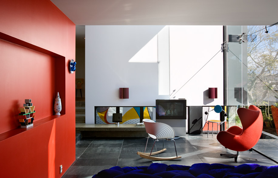
As furniture and art collectors, the McCabes were familiar with Cacala’s work and thrilled to have found one in almost original condition. As their family grew, thoughts turned to extending the house. They had met architect, Daniel Marshall, at a design exhibition some years earlier. His work is characterised by bold conceptual ideas and an artist’s approach to materials and colour. Marshall’s architecture is, in many ways, a large scale equivalent to the design pieces within the McCabe’s collection.

The original house was left as untouched as possible with the addition offset by a metre and linked by a simple glazed walkway. New living, dining and kitchen are created in the new, with the main bedroom and en suite above.
Marshall has designed a two-storey black zinc box with a white box suspended within. The white form is derived from the Cacala house and conceptually and visually links the two. Details and proportions from the original are threaded through the new forms both directly and in reinvented or more subtle ways. White painted vertical timber cladding and a wide recess define the edge of the suspended box. The seams of the black zinc imitate the rhythm of the original cladding. Window proportions, double-height spaces and the colour red recur throughout. This is where the similarities end, for the new forms are incredibly expressive and individual.

Marshall wanted the addition to appear “as if it had just landed” and it does. From a distance the addition looks to be a separate dwelling. Its dark cladding and abstract form distinguish it from the original house and its 1960s neighbourhood. However, the dialogue between new and old prevents the addition overwhelming the original. The three boxes (two white and one black) are in harmony with colour and detail. The height and dark zinc cladding of the addition anchors the whole composition, allowing the original Cacala horizontal form to maintain a strong presence.

Resting on a slate plinth, the folded zinc box has one glazed side that opens the living spaces to a sunny and private northern courtyard. Internally, the dining space is compressed then released into a double height space for living and library. Structural gymnastics leave the white box floating in thin air, piercing the glass skin to hover out over the courtyard. Wall cut-outs in the kitchen and living further play on this idea of weightlessness.

The narrow gap between existing and new is metaphorically a pause in time. A brightly coloured mural by Justin Boroughs demarcates the end of the original house. This colourful salute to the era counter-balances the two storey zinc wall of the addition. A slot window provides a glimpse through to the past. The mural, based on Harry Seidler’s 1948 mural at Turramurra in Sydney, can only be seen in part through the window, or obliquely at either end of the gap. A reflective pool extends between old and new adding a whole other dimension. When crossing the link bridge the water reflection de-materialises the surface of the pool, giving one the impression of being meters off the ground.

The circulation corridor of the original house is extended across the bridge, into the double height space of the new and up stairs to the main bedroom. Although from the outside the forms look separate, inside this corridor integrates them spatially. The view is long – it extends from the far western wall of the original house to the eastern wall of the addition. The differences between old and new create a visual layering of tones, materials and the patina of age.

While so many modernist gems have been lost or re-styled beyond recognition, this Cacala house has a bold new offspring along side. In moving between old and new, the contrast makes one acutely aware of the passage of time, and yet how much good design is timeless.

Corinth Street won the 2007 NZIA National Award and the 2006 NZIA Auckland Award.
Photography by Simon Devitt
Architect: Daniel Marshall Architect
Project Team: Daniel Marshall, Daniel Lewis
Builder: Gracewood Industries
Structural Engineer: Brown Thomson Consulting Engineers
Daniel Marshall Architect
(64 9) 3023 661
marshall-architect.co.nz


