Amy Bracks and Miles Ritzmann-Williams’ recent client isn’t averse to a bit of risk-taking. So when looking for a new home, she bought the oldest building she could find. The 150-year-old Kings Arms Hotel on Queensberry Street in North Melbourne doesn’t have a straight bone in it, according to Amy, who along with Miles has run emerging Kensington-based design practice Ioa Studio since 2016. Certainly, part of the appeal in taking on the adaptive re-use of a hotel previously fit out as a not-so-pretty office was the thrill of the unknown.
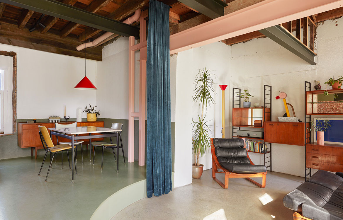
“We initially approached the project via a number of different design iterations. But quickly realised the old pub had its own agenda,” explains Amy. “This meant we ended up on site more, designing within the actual space. And once we started ripping out the clinical office interior, we found all sorts of surprises that we fell in love with and that ended up informing the final design, from old bricks and cracking hardened plaster to Oregon rafters and a gable roof.”


The resulting scheme is a playful yet elegant study in how old and new can co-exist, without one taking anything away from the other. Amy and Miles’ hands-on approach was due in part to their work agreement with the builder, who was reluctant to sign a fixed contract because of the condition of the old building. This proved advantageous, however, with the architects’ able to experiment more with materials and colour than if they’d been off site.
Perhaps the biggest obstacle was dealing with a small footprint that nearly made the client’s brief for a three-bedroom sharehouse impossible. Installing curved walls made the plan feel less cramped and allowed for small nooks and hidden spaces, including a mezzanine reading area, and also provided plenty of room for the client’s mid-century furniture collection. And by removing the ceiling lining and structure from upstairs, Amy and Miles created a whole new double-height level to accommodate the third bedroom.


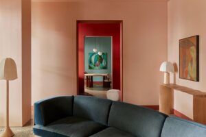
The scheme is informed by the principles of wabi sabi through celebrating the original brickwork, steel support beams and Bluestone lintels, all of which have been left exposed. Another highlight of the design is the use of materials and colour to define the different zones within the home, which allows the small space to be kept as open as possible without compromising functionality. There’s a delightful tactility to the finishes and details, from upstairs’ seagrass-lined ceiling and floor and curved Blackbutt panels to the large blue velvet curtain that closes off the living areas when drawn. Amy and Miles are to be commended for delivering an urban retreat of undeniable ingenuity.
Ioa Studio
ioa-studio.com
Photography by Tom Ross
Dissection information
Terrazzo tiles from Sigorino
Upper level flooring and ceiling lining from Floorspace Seagrass
Blinds and curtain track from Shades in Hawthorn
Big River Timbers Blackbutt Armour panel
Callimaco floor lamp from Artemide
Nomad Linestra wall mounted lights from JSB Lighting


