Having purchased a house at the juncture of leafy Queen’s Park and Randwick in Sydney’s East, Sophie Solomon’s client didn’t want to go with the pre-approved plans.
Shunning the huge second floor and erasure of the ground floor, her client “wanted it to be more modest,” as Solomon explains, with the initial design conversation being “more about a process of subtraction that addition,” that retained the ground floor, removed the roof from the back deck and proposed a modest upper level.

The material palette was an early primary consideration with the existing home of the project ilk, with nice bones but ugly bricks. And, while not a heritage building, the house sits among a mix of heritage and no heritage homes, and is close enough to the beach for its influence to be felt.
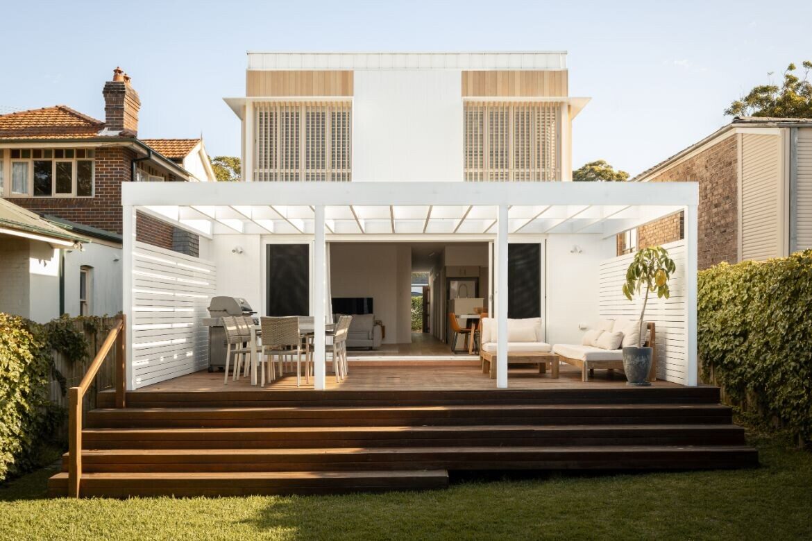
To this end, it was agreed that a simple white cladding (Dulux vivid white painted Selflok Weather Groove), with timber accents and screens (Weathertex and Vic Ash shiplap cladding ASH Sustainable), would allow the house its own character while sitting quietly on the street.

Elongating the apertures of windows, doors and garage by extending the timber detailing above the lintel, the modernist form of the house is shifted: “It had quite a horizontal aspect with the balcony for the bedroom going all the way across. And it was very boxy. I was trying to break the scale of that box down and put the focus on that verticality and elevation of the roof, says Solomon of the timber screens that give the home its name.
Compounding this is a corner detail of glazing, that continues as glass cladding past the window to the roof line: “Although it’s very simple, there’s quite a lot of layering, and you get nice shadows, which the simple material palette helps emphasise,” says Solomon.

At the rear of the property, a large enclosed deck has been readdressed as a pavilion. Painted white, the crisp geometric lines frame and expand the liveability of the ground floor, while screened windows above allow the upper floor to sit back. Flowing from the pavilion are house wide wooden stairs leading to an unencumbered expanse of walled lawn.
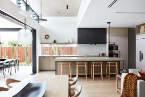
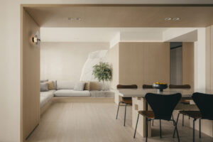
The interior is similarly simplified with natural materials set against stark white walls. Timber dominates with engineered oak flooring (Grand Oak Monarch, Inhaus Living) providing a warm foundation throughout the lower floor. A large green Tephih Neptune rug (Globe West) adds texture and warmth, while furniture (all Globe West) is in keeping with the natural aesthetic.
The upper volume is very much a private area with the large main bedroom at the front and two smaller bedrooms to the rear. The whole of this floor is carpeted in Cavalier Bremworth wool for a luxurious underfoot warmth, while brushed nickel tapware provides an understated polish to the timber detailed bathrooms.
The resulting home is very much that, a home. Simple, refined, elegant, these words come quickly to mind with the architecture and interior sitting with quiet certainty in both the street, and the client’s sustainability ethos and considerations.
Project details
Architecture & details – SSD Studio
Photography – Felix Mooneram
Builder – Vivid Built


