STUDIO WILLS + Architects have designed two new insertions for a 130 square-metre two-storey apartment at The Arris. Located in the Tanjong Pagar district, the original pared-down interiors of the apartment sat in sharp contrast with the surrounding site – a neighbourhood lined with historical shophouses with an overall aesthetic rich in material, texture and decoration.
The double insertions, referred to as ‘boxes,’ were each informed by a dark colour – blue and black. They were created to link the original interiors and the neighbourhood aesthetically. Nonetheless, direct elements were not extracted from surrounding shophouses for the sake of it, rather “they [the shophouses] gave clue that ‘containers’ could be employed [in this project],” says William Ng, Founder and Principal Architect of STUDIO WILLS + Architects.
The ‘boxes’ were treated as premises to accommodate the inhabitants’ love for diverse materials, spanning brass inserts and fittings, mosaic tiles, panelled timber doors, metal-framed glass doors, and white marble.
“This evolved into ‘exteriorised’ objects inspired by elements typically found on building envelopes, such as metal-framed glass doors [incorporated in the new study nook, walk-in wardrobe and bathroom] and windows [forming the new walk-in wardrobe],” says William, explaining how exterior elements were injected into the interiors. “Looking back, this is an interior project that was approached architecturally,” he adds.
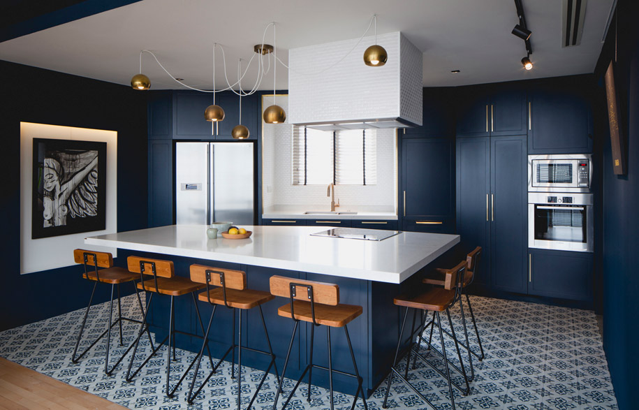
The renovation also sought to “open up the apartment” and “minimise the existing *servant spaces.” On the first floor, a consistent blue shade threads the kitchen and living premises. Both areas are demarcated by flooring rather than walls and doors.
The specific shade of dark blue was selected for its timelessness, and the visual contrast it creates with the lightness of the original space. The open kitchen doubles up as a dining area and takes centre stage, responding to Darren and Sharon’s lifestyle desires – both of them are avid cooks.
One of the challenges faced by William and his team was to find ways to engage and leave traces of the original interiors within the renovation. “The strategy was to work intensively on 50 per cent of the house and leave the other 50 per cent almost untouched,” William says.
Within the original spaces, fixtures barely touch the walls, floors and ceilings. They are cantilevered or supported by steel frames. This is depicted by the detailing of the shoe cabinet, TV console, display ledge, boxes and niches. “The expression is tectonic within the original zone, where joints are expressed,” says William, who adds, “In the new zone, the fitments are grouped and amalgamated into a large volume [blue ‘box’ in the lower level and black box’ in the upper level].” This created subtle spatial differences between the old and new.
Upstairs, the black box continues the principle of allowing a dark colour to anchor itself within the original lightly coloured interiors. Working around the modest floor plan, the walk-in wardrobe functions as an enclosure for the en-suite bathroom and also serves as a bedhead, with the bed thoughtfully positioned to take in views of the city.
*Servant spaces refers to spaces that serve other spaces, defined by American architect, Louis I. Kahn
Photography: Beton Brut (unless otherwise stated)
Studio Wills + Architects
studio-wills.com
Photo by Studio Wills + Architects


