From the street, The Ridgeway sits well among its neighbours, but behind the original façade and front room, a new addition provides a place filled with facility, flexibility and beauty to support an active family life.
Archier was commissioned to design the alteration and addition and has achieved a wonderful result through careful planning and thoughtful detailing. Chris Haddad, a founding director of Archier, has worked the practice’s usual magic and conceived a home with generous spaces and room to move on a small site of just 230 square metres.
With two levels, ground floor for the public spaces that also incorporates the original front room as a rumpus room/guest bedroom and the first floor as sleeping quarters, The Ridgeway feels like a house twice its size.

Archier collaborated with Sarah Trotter, principal, Hearth Design who brings a refined perspective to the interiors through the colour palette and finishes. Working together, Haddad and Trotter’s project is beautifully resolved but also incredibly liveable with playful undertones. This is a home to really settle into, relax in and enjoy with family and friends.
Trotter explains, “Working with Archier is always such a beautiful opportunity because they do such honest work, and at a scale that I don’t often get to work with on my own. In this project, we drew on some of the client’s belongings as well as their active lifestyle which allowed us to have a bit of fun. There was an opportunity to use strong blocks of colour, without too much texture or ornament, like the sunny yellow bathroom and the blue spiral stair. This project is about making small spaces work well and shine, while also being comfortable and joyous.”

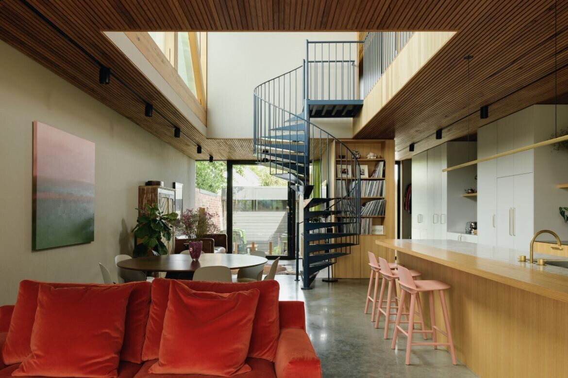
At the heart of the long narrow 162-square-metre floorplan is the open entertaining space that includes dining area, seating and kitchen with an island bench. However, it is the double-height void in this space that is the pièce de résistance.
Light streams in from the glazed wall of the void, complements the glass door at the rear and provides not only visual and physical connection to the outside but also enhances the feelings of depth and spaciousness in the area.
Haddad comments, “The biggest design element of the house is the central double-height void with large north-east facing window. This was done because the site is very narrow and there are issues with overlooking into neighbours’ properties. The tricky thing with a narrow site is to bring natural light into the centre of the home while maintaining enough space to meet the brief programmatically.”
He continues, “By setting the upper form of the house in, back from the boundary an opportunity for extensive glazing was created. This brings ample natural light into the home, making the kitchen island bench the perfect sunny spot for a morning coffee.”

Beside the rear door is a stunning geometric-style, powder-coated, teal blue steel spiral staircase that connects the upper and lower levels. While the public spaces are below, the first level is up in a world of its own and comprises two bedrooms, the main with ensuite and a large bathroom, this area also benefits from the light from the void.
Materiality is robust and authentic with timber used extensively throughout the home. Silvertop ash lines the ceilings and Victorian ash has been used for the kitchen island bench, window systems and in the truss for the glazed window in the void.
Marble features on the kitchen and vanity benchtops and tiles in strong saturated colours differentiate the ensuite, powder room and bathroom. There is burnished concrete and timber on the floors and a lime green open mesh sheer at the back of the home introduces a softness to the hard-edged black steel surrounds of the windows.
Haddad adds, “One of the defining elements of this home is the extensive use of timber. We have the timber-lined ceiling and the main void has a large mass-timber truss, which was engineered and manufactured by local engineering company, TGA Engineering and coordinated by builder Simon Jackson from Creative Living Construction. This truss actually allows the northeastern wall to cantilever across the void space and becomes a strong expression of the building’s structure.”

With soft olive as the base, colour pops of teal, yellow, pinks and green add dimension and give life to the interior. Detailing such as the block colour tiling, the simplicity of the upper-level balustrading and the use of timber on the public side of the island bench to create warmth, all combine to make the finish of this home special indeed.
As with all designs from Archier, sustainability is fundamental, and The Ridgeway is no exception. Intelligent detailing minimises thermal bridging and the build is highly insulated with double glazing and hydronic heating. There is excellent interior spatial planning; air flow and natural light are plentiful.
The residents of The Ridgeway are active and adventurous and wanted their home to reflect their personality, and to this end, the layout has been designed for maximum use with materials that will age well and patina over time.

There are beehives on the roof and a chicken coop in the backyard, while the north-facing front garden produces food for the table – all this, with the amenities of a substantial family home.
Archier and Hearth Studio have created a lot from a little and their clients are the winners with a new home perfectly suited to their lifestyles. The Ridgeway is a triumph in architecture and design that enhances and fulfills requirement but adds that something extra, a home in which to thrive and prosper.
Project Details
Architecture – Archier
Interiors – Hearth Studio
Photography – Thurston Empson
Builder – Creative Living Constructions
We think you might like this home, where Chris Haddad designed a house in Tasmania for his parents


