A year after moving into their new Smart Design Studio (SDS) workspace in Stokes Ave, Alexandria, the positives of the new design are clearly defined and greatly appreciated. Effectively the office on Bourke Street, Surry Hills, was home to SDS for 15 years and saw the company grow from 12 to 40.
“We found over time it was very good to pin up our work and have models lying around so we designed the new studio exactly for how it works with pinboards, model display cases and areas to put working models,” says William Smart, principal of SDS.

“We’re always having samples and bricks and tiles and things on our desk so we made trays for that as well. It was really designed to take the way we work, but in terms of the components, they were pretty much version two of what we had before,” says Smart.
Showcasing the work in a professional manner has also become imperative and the new design facilitates more designated client areas that function as a continuum of the workplace culture that allows clients to be part of the creative milieu.
“The lunchroom and the laneway we’ve made in a way where we’re just really wanting people, everyone, to have lunch together, to mingle. All that works very nicely,” says Smart.
To accommodate this shift in culture the new SDS workplace has twice the floor space, 800-square-metres, for the same amount of people. Interestingly, Smart made a concrete decision to not grow the studio beyond 40 people and has made that decision manifest through a solid brick wall separating a portion of the floor space out of studio use.

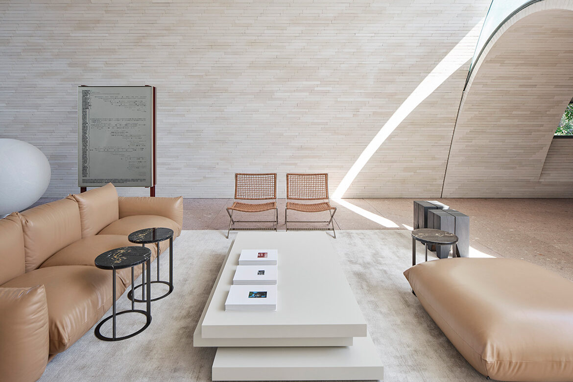
Thinking of the new space as ‘Version Two’ makes a lot of sense, in that, the aesthetic of white minimalist construction remains evident, as does the abundance of ambient light. Version Two amplifies these elements with a single floor construction, which resolves issues of both congestion and disconnection inherent to the Bourke Street office (which was spread over two floors and three buildings).
Light too is amplified with a sawtooth roof flooding the whole with a constant luminescence. “South light is really beautiful. It’s kind of a gorgeous soft reflective light coming into this space, and it’s constant all year round so it’s always beautiful, winter and summer,” says Smart.
Taking learnings from version one, Stokes 14 shares the durable palette of tiles and brick that will see the interior through the next 30 years. This version is however far more mechanised with automated blinds and fans tied into the building’s sustainability platform. Supporting this is an array of 260 solar panels that feed an under-slab cooling system.

“Being able to do a studio with no air conditioning at all has been a really hard thing to achieve, but having got it right, I really completely love it. I’m thinking this has to be the world. Now we have to do this for the future,” says Smart who admits to being “a little bit addicted to just seeing how much energy we make every day. Mostly we make about three times as much as we consume,” he says.
A further aspect that has remained with a tweak is his private residence above the Studio. In Bourke Street, the apartment was accessed via the Studio reception, and the change here is for a private entrance 50 metres down from the studio entrance.

A discreet door does give Smart direct access between studio and home and while invaluable to Smart, it is not used as the entry point. Significantly different, however, is the construction style with vaulted brick arches expressed as a series of volumes across the roof. It is in fact pure Smart aesthetic and very much in keeping with his current body of work. So too is the studio façade.
The former factory follows first principal learnings, with about 80 per cent recycled and the remaining 20 per cent replacing a mix of additions and problematic materials: “Rebuilding that portion gave a diverse opportunity to do something really expressive, a new version of an industrial building,” says Smart who has designed a façade that uses bricks laid in unusual but beautiful shapes.

Galvanised, multi-pane, steel frame windows continue the traditional factory aesthetic, but are exquisitely detailed. Internally the beams and detailing are made from precast concrete structures (to use approximately half the concrete of other versions).
“It’s kind of an homage, and it’s also a kind of beautiful raw aesthetic where you see the chips and you see beams, the things that you wouldn’t normally see. It doesn’t feel like it’s all brand new and super sleek at the front and then a beautiful shed at the back. It feels quite united,” says Smart.

A year into the new Studio tenancy Smart asks himself: “Did we get it all right, I think we pretty much did.” It is an enviable position to be in, but one that is really a testament to his exemplar practice of exacting and focused attention to detail.
Photography by Romello Pereira
We think you might also like Clovelly House by Smart Design Studio


